Scoring genre clarity...

Holy Grain capsule

Holy Grain

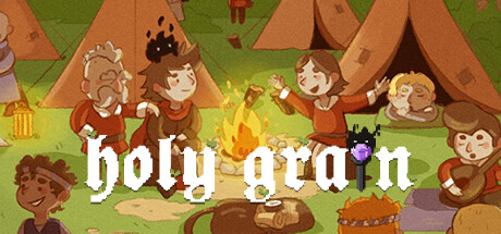
Holy Grain is a celebration of absurdity and over-the-top comedic brutality. It’s a full-on attack against political correctness and wholesome family values. In this roguelike, you’ll team up with two characters: the Counselor and the Entity, to save the world from its impending doom.

$14.99Positive(12)
Choose Your Own AdventureIndieDark Humor
Darkhunter StudiosApr 4, 2025

Holy Grain scores 60/100 — better than 0% of Choose Your Own Adventure capsules (n=951).

Positive (12 reviews) · $14.99 · Released Apr 4, 2025 · By Darkhunter Studios

Quick text summary

Holy Grain scored 60/100 on Steam Analyzer — Solid for a Choose Your Own Adventure capsule. Top priority fix: [contrast_color] Increase title text outline weight or add a dark shadow to boost white-on-green separation and ensure readability at TINY size

Capsule scores by dimension

  • Genre Clarity: 7/10 — Comedy adventure with camp charm. The scene reads as a whimsical camping adventure with multiple characters and a central campfire, suggesting adventure or party-based gameplay. The art style is deliberately cartoonish and comical, which aligns with the game's absurdist tone, though the specific roguelike/strategy elements are not visually obvious at tiny size. At TINY size, the campfire and group gathering remain readable but genre specificity (roguelike mechanics, turn-based strategy) is lost.
  • Title Readability: 6/10 — Readable but low contrast serif. The title 'holy grain' is centered in white serif letterforms against the green forest background. The text remains legible at FULL and SMALL sizes but lacks strong contrast separation from the mid-tone green; at TINY size the serif details collapse slightly and readability drops noticeably. The placement over the campfire scene is safe but not optimally positioned for clarity.
  • Contrast & Color: 5/10 — Warm tones muddy against green. The palette uses warm oranges, browns, and tans for characters and tents against mid-tone greens, creating limited value separation overall. While the characters have some silhouette definition, the earth-toned buildings and background foliage blend together in grayscale, reducing pop against the Steam dark background #1b2838. The white title text stands out but the supporting scene lacks the value punch needed for quick-scroll discoverability.
  • Uniqueness & Polish: 6/10 — Competent pixel art, generic composition. The pixel art is clean and well-executed with consistent style and readable character expressions, reflecting solid craft. However, the camping scene feels like a straightforward genre scene rather than communicating the game's core hook of 'absurdity and over-the-top comedic brutality'—the image reads as wholesome family camping rather than the irreverent tone described. The execution is polished but the visual hook does not differentiate it from other cozy adventure games.
  • Brand Consistency: 6/10 — Consistent pixel style, unclear identity. The pixel art style, character design, and warm color palette are internally cohesive and suggest a recognizable art direction. However, without access to the full brand identity reference (9 store screenshots), the image does not establish a distinctive iconic motif, symbol, or signature visual that would make this game immediately recognizable on a store shelf. The style is competent but not yet memorable as a distinct brand marker.
  • Composition: 6/10 — Crowded scene, weak focal point. The composition spreads attention across many characters and tents with the campfire roughly center-bottom, creating a scattered rather than hierarchical focal point. At TINY size, individual characters blur into a crowded group and the eye does not settle on a clear primary subject—the many small figures compete equally for attention rather than guiding the viewer. The safe margins are reasonable but the visual clutter reduces memorability at quick scroll.

What works

  • Clean pixel art execution. Character designs and sprite work are well-rendered with consistent style and readable expressions throughout the scene.
  • Clear thematic setting. The camping/adventure environment is immediately recognizable and sets an approachable tone for the intended audience.
  • Readable title placement. White serif text is positioned safely over the campfire area and remains legible at FULL and SMALL sizes.

What hurts the capsule

  • Limited value contrast. Warm oranges and browns blend with green background in grayscale, reducing silhouette separation and pop against Steam's dark UI.
  • Scattered focal point. Multiple characters and structures compete equally for attention with no clear primary subject, weakening readability at TINY size.
  • Generic scene, weak hook. The wholesome camping aesthetic contradicts the game's core promise of absurdist and irreverent comedic content, missing an opportunity to visually communicate unique selling points.
  • Serif font legibility at tiny. Fine serif details in the title collapse at TINY size, reducing contrast and clarity when thumbnail-sized on the store shelf.

Priority fixes

  1. [contrast_color] Increase title text outline weight or add a dark shadow to boost white-on-green separation and ensure readability at TINY size
  2. [composition] Establish a single focal character or stronger campfire composition to reduce clutter and guide the eye; consolidate secondary characters into background
  3. [uniqueness_polish] Incorporate a visually distinctive absurdist or comedic element (exaggerated expression, surreal detail, or bold accent color) that hints at the game's irreverent tone rather than wholesome camping
  4. [contrast_color] Add a darker accent color or shadow layer behind main characters to improve silhouette separation from the green background in grayscale

Store copy priority fixes

  1. [uniqueness] Add a sentence articulating the specific mechanical twist in the roguelike formula—e.g., 'Unlike traditional roguelikes, your faction choice alters which bosses and event chains you encounter' or clarify how decisions create branching consequences.
  2. [hook_strength] Move the disclaimer to after the first two paragraphs, or soften it to preserve momentum; currently it signals legal risk before the game's hook is fully delivered.
  3. [audience_targeting] Explicitly signal difficulty or audience expertise level in the short description (e.g., 'for players who love unforgiving strategy games' or 'narrative-heavy roguelikes') to clarify who should buy.
  4. [feature_communication] Expand the Events section with a concrete example of a decision and its outcome to demonstrate how player agency actually works mechanically.

Related guides

Steam app ID: 1651520 · Tags: Choose Your Own Adventure, Indie, Dark Humor, Strategy, Roguelike