Scoring genre clarity...
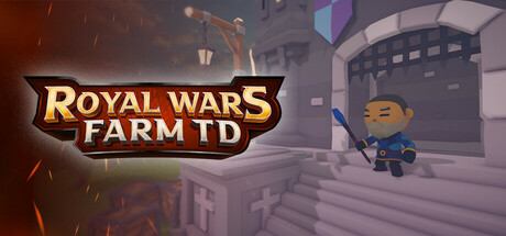
Royal Wars: Farm TD is a tower-defense game with strategy, luck, resourcemanagement and quick-thinking mechanics. Protect your base with Towersto defeat enemies in your path before they destroy it.
Free to PlayPositive(41)
Real Time TacticsTower DefenseArtificial Intelligence
ForgedByteLabsMay 5, 2026