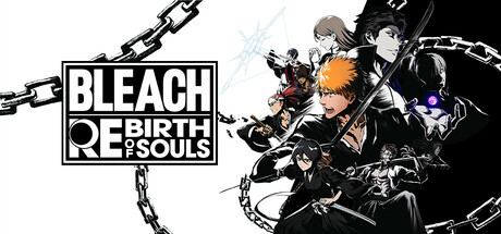
BLEACH Rebirth of Souls scores 88/100 — better than 100% of Action capsules (n=8,534).

Quick text summary

BLEACH Rebirth of Souls scored 88/100 on Steam Analyzer — Excellent for a Action capsule. Top priority fix: [title_readability] Ensure the full subtitle 'REBIRTH OF SOULS' remains clearly readable at 120x45 by testing contrast and letter spacing at actual thumbnail scale

Capsule scores by dimension

  • Genre Clarity: 9/10 — Anime action game crystal clear. The capsule immediately communicates a stylish anime action game through the iconic character pose with a large sword, dramatic half-masked dual-tone face design, and explosive orange-red energy effects. At TINY size, the silhouette of the character with weapon and the energetic color blocking remain unmistakable, clearly signaling fast-paced combat and supernatural themes.
  • Title Readability: 9/10 — Bold white title excellent contrast. The BLEACH and REBIRTH OF SOULS text uses thick white sans-serif lettering positioned in the lower right on a controlled dark background, ensuring strong legibility at all sizes. Even at TINY size, the white block letters maintain clear definition and remain easily readable against the dark field.
  • Contrast & Color: 9/10 — Vibrant orange red silhouette pop. The bright orange left half and deep red right half create exceptional value separation against the dark Steam background (#1b2838), with the white character rendering and title providing maximum contrast. The monochromatic character silhouette in black and white against the saturated warm tones ensures the subject reads clearly even at TINY size, and in grayscale the value hierarchy remains strong.
  • Uniqueness & Polish: 8/10 — Premium anime art direction. The capsule displays high-quality manga-influenced line work, intentional color symbolism with the dual-tone face representing the character's internal conflict, and dynamic energy effects that suggest the game's supernatural combat system. The execution feels polished and professionally illustrated rather than templated, though the anime-action aesthetic is industry-familiar, the specific artistic interpretation and dramatic composition elevate it above generic.
  • Brand Consistency: 9/10 — Iconic character identity strong. The distinctive half-orange, half-black masked face with orange and black hair is the franchise's signature visual motif, instantly recognizable to the anime's fanbase and serving as a powerful brand anchor. The consistent manga art style, color palette (orange, black, red, white), and the iconic sword-wielding pose create immediate internal brand cohesion and franchise recognition.
  • Composition: 9/10 — Clear focal point balanced layout. The character occupies the center-left with the sword extending upward as the primary focal point, while title placement in the lower right balances the composition without competing for attention. The background orange-to-black gradient supports the figure without clutter, safe margins protect key elements from edge cropping, and the depth layering between the character and background creates clear visual hierarchy that holds at SMALL and TINY sizes.

What works

  • Franchise recognition instant. The iconic half-masked face design is immediately identifiable to fans and communicates character identity at a glance.
  • Color contrast exceptional. Vibrant orange and red against dark background create premium pop that maintains clarity at thumbnail size.
  • Title legibility flawless. Bold white sans-serif positioned on dark field ensures readable text across all viewing sizes without decorative loss.
  • Genre signaling unambiguous. Anime style, large sword, dramatic pose, and energy effects communicate action game with supernatural elements instantly.

What hurts the capsule

  • Limited composition innovation. While well-executed, the center-character-facing-right pose is a common trope in anime action game marketing.
  • Tagline visibility marginal. The smaller descriptive text below the main title becomes challenging to read at TINY size due to reduced scale.

Priority fixes

  1. [title_readability] Ensure the full subtitle 'REBIRTH OF SOULS' remains clearly readable at 120x45 by testing contrast and letter spacing at actual thumbnail scale
  2. [composition] Verify that no critical design elements extend beyond safe margins during Steam store rendering across different page widths

Store copy priority fixes

  1. [feature_communication] Add 2-3 sentences after 'About the Game' explaining what Soul Crystals do mechanically (e.g., 'Equip Soul Crystals to customize your stats and abilities—Attack Crystals boost damage, Defense Crystals increase durability') and how the form/blade awakening system works in combat flow.
  2. [feature_communication] Insert a new subsection titled 'Multiplayer Modes' or 'Battle Online' describing available PvP modes, matchmaking, rank progression, and whether split-screen vs online play is supported, since the copy ignores multiplayer entirely despite it being a major tag.
  3. [hook_strength] Rewrite the opening of the 'About the Game' section to lead with a gameplay-specific hook instead of repeating the short description (e.g., 'Master real-time sword combat where split-second timing and character mastery determine victory—unlock hidden forms mid-battle to turn the tide.').
  4. [uniqueness] Add 1-2 sentences contrasting this game's combat philosophy (e.g., 'Unlike other anime fighters, Rebirth of Souls rewards aggressive play with the Reverse Fate system: the closer you are to defeat, the more powerful you become') to differentiate from genre peers.

Related guides

Steam app ID: 1689620 · Tags: Action, Anime, 3D Fighter, 3D, PvP