Portal Walk scores 73/100 — better than 54% of Platformer capsules (n=2,225).

Quick text summary

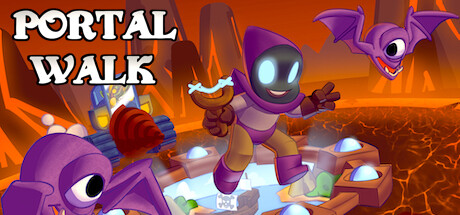
Portal Walk scored 73/100 on Steam Analyzer — Good for a Platformer capsule. Top priority fix: [composition] Clarify focal hierarchy by increasing the scale or prominence of the lead robot or primary character to create one dominant focal point.

Capsule scores by dimension

  • Genre Clarity: 7/10 — Colorful action platformer readable. The vibrant purple robot characters, dynamic action poses, glowing portals, and chaotic lava environment clearly signal an action platformer with fantastical elements. At tiny size, the bright purple silhouettes and orange fire backdrop remain distinguishable, though the specific 'portal' mechanic is less obvious without text. The overall energy and character-driven composition effectively communicate an arcade-style adventure game.
  • Title Readability: 8/10 — Bold white title legible at all sizes. PORTAL WALK uses a strong white sans-serif font positioned in the lower right with a clean dark outline, ensuring readability across full, small, and tiny sizes. The text sits on a relatively clear background region away from busy visual clutter. At tiny size, the title remains clearly legible with good contrast against the orange and purple surroundings.
  • Contrast & Color: 8/10 — Vibrant purples and oranges pop well. The purple robot characters and the warm orange lava environment create strong value separation against the expected Steam dark background. Bright white accents on character features and the glowing portal effects add luminosity that reads at all viewing sizes. In grayscale, the light purple and orange still maintain reasonable separation, though the purple could be slightly darker for maximum contrast at tiny sizes.
  • Uniqueness & Polish: 7/10 — Charming stylized robots with clear personality. The purple robot characters have distinctive rounded proportions, expressive features, and a cohesive cute-but-edgy aesthetic that feels intentional and polished. The dynamic action poses and environmental storytelling (lava, portals, varied character designs) communicate a unique world rather than a generic platformer template. The render quality and lighting effects appear consistent and professionally executed, though the overall concept is within familiar indie platformer territory.
  • Brand Consistency: 7/10 — Consistent purple robot character identity. The purple robot motif appears to be a core brand element with consistent rendering style, proportions, and glowing eye detail across the visible characters. The color palette of purples, oranges, and blues is cohesive and appears intentional throughout the composition. Without reviewing all 7 store screenshots, the character design and environment aesthetic suggest a recognizable visual identity, though the icon could potentially be more distinctly memorable as a standalone brand mark.
  • Composition: 7/10 — Dynamic action layout with clear focal points. The composition arranges three purple robots at different scales and positions across the frame, creating depth and visual interest while maintaining a clear reading order. The foreground robot is prominent, midground action is active, and the background environment provides context. At small and tiny sizes, the purple silhouettes maintain separation and the title placement in the lower right avoids blocking character details, though the scattered character placement slightly diffuses focus rather than creating one dominant focal point.

What works

  • Strong color contrast and visual pop. Purple and orange colors provide excellent separation against Steam's dark background and remain legible at all viewing sizes.
  • Readable, well-positioned title treatment. PORTAL WALK uses bold white text with clear outline on a relatively uncluttered background area, maintaining legibility from full to tiny sizes.
  • Distinctive character design and personality. The purple robots have a cohesive, expressive aesthetic that feels intentional and memorable compared to generic platformer templates.
  • Layered composition with environmental context. Multiple characters at different scales combined with lava environment and portal elements create depth and suggest an interesting world.

What hurts the capsule

  • Divided focal points without hierarchy. Three robots of similar visual weight spread across the frame create equal emphasis rather than guiding the eye to a single primary subject.
  • Portal mechanic not visually obvious. While portals appear in the image, they are not the dominant or most recognizable element, making the 'Portal' part of the title feel disconnected from the visual hierarchy.
  • Purple lacks maximum contrast at tiny size. The purple, while vibrant, is relatively light and could be slightly deeper or more saturated to achieve maximum silhouette separation at miniature viewing sizes.

Priority fixes

  1. [composition] Clarify focal hierarchy by increasing the scale or prominence of the lead robot or primary character to create one dominant focal point.
  2. [genre_clarity] Emphasize the portal mechanic more visually by making portal effects brighter, larger, or more central to the composition to reinforce the core gameplay hook.
  3. [contrast_color] Deepen purple values slightly or increase saturation to maximize silhouette separation and ensure character legibility at tiny thumbnail sizes.

Store copy priority fixes

  1. [hook_strength] Replace 'incredible pixel platformer about an adventure between worlds' with a verb-forward opening that highlights the core hook, such as 'Collect portal fragments across hostile worlds and fight your way home in this challenging precision platformer' to lead with concrete gameplay and urgency.
  2. [uniqueness] Add a sentence explaining what 'between worlds' means mechanically—does the player switch worlds to solve puzzles, avoid obstacles, or unlock progression? This is the game's potential differentiator and needs clarification.
  3. [feature_communication] Expand 'Hardcore Levels' and 'Challenging Bosses' with concrete examples or difficulty context—e.g., 'Hand-crafted boss encounters demand pattern recognition and split-second timing' to help players understand the challenge type and skill curve.
  4. [audience_targeting] Clarify the narrative tone and intended audience early—either lean into the 'help Eugene' story as a motivating driver for harder players, or reframe it to match the precision-platformer audience more directly rather than suggesting accessibility.

Related guides

Steam app ID: 1690190 · Tags: Platformer, Adventure, Action, Metroidvania, Exploration