Scoring genre clarity...

Synthwave Burnout capsule

Synthwave Burnout

The lost highway awaits you to take you beyond the horizon. Relax and let the sounds of synthwave open the way into the realm of neon - a world of revived imagination and fantasy, more real than reality itself.

$1.19Mostly Positive(36)
ActionRacingSports
Whale Rock GamesSep 19, 2025

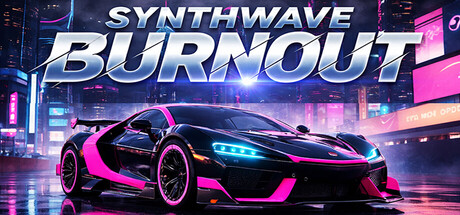
Synthwave Burnout scores 87/100 — better than 99% of Action capsules (n=8,534).

Mostly Positive (36 reviews) · $1.19 · Released Sep 19, 2025 · By Whale Rock Games

Quick text summary

Synthwave Burnout scored 87/100 on Steam Analyzer — Excellent for a Action capsule. Top priority fix: [brand_consistency] Introduce or emphasize a distinctive visual motif or character element that differentiates this game's identity from other synthwave racers and becomes a memorable brand anchor.

Capsule scores by dimension

  • Genre Clarity: 9/10 — Synthwave racing instantly recognizable. The neon-lit sports car, cyberpunk cityscape with glowing pink and cyan accents, and futuristic aesthetic immediately signal a racing game with strong synthwave identity. At tiny size, the car silhouette and neon palette remain unmistakable genre markers that communicate both racing and the specific aesthetic tone without ambiguity.
  • Title Readability: 9/10 — Bold white text commands attention. The title 'SYNTHWAVE BURNOUT' uses a strong italic sans-serif in white with a subtle blue/cyan outline that contrasts sharply against the dark background and neon elements. At tiny size, the letterforms remain crisp and legible due to weight and outline treatment, and the two-word stack maintains clarity even under extreme reduction.
  • Contrast & Color: 9/10 — Vibrant neon pops against dark base. The magenta, cyan, and electric blue neon accents create exceptional value separation from the dark cityscape and #1b2838 background, with the white title providing peak contrast. The car's bright highlights and the glowing road elements maintain silhouette clarity and visual punch at all sizes, and the grayscale test confirms strong luminosity differentiation.
  • Uniqueness & Polish: 8/10 — Polished synthwave aesthetic with craft. The composition shows intentional art direction with layered depth, professional lighting on the car, and a cohesive cyberpunk atmosphere that feels premium rather than templated. The neon color grading and reflective car surfaces demonstrate technical polish, though the core concept (synthwave racer) is not entirely novel—execution elevates it above generic.
  • Brand Consistency: 8/10 — Coherent synthwave identity throughout. The internal palette, neon color language, and typography create a recognizable and consistent visual identity specific to this game's synthwave aesthetic. The car, city lighting, and gradient effects form a cohesive art direction that would be memorable across store screenshots, though no single iconic character or motif dominates recognition.
  • Composition: 9/10 — Strong focal hierarchy and balance. The car anchors the center-foreground as the clear primary subject, with the cityscape and neon lights forming supporting depth layers that guide the eye without competing. The title is positioned confidently at the top with safe margins, and the composition maintains visual interest and clarity from full header down to tiny thumbnail sizes with no awkward cropping or dead space.

What works

  • Immediate genre and aesthetic clarity. The synthwave racing identity is unmistakable at all sizes due to the car, neon palette, and futuristic cityscape—viewers instantly understand both genre and tone.
  • Exceptional contrast and visibility. White title and bright neon accents create strong separation from the dark background, ensuring the capsule stands out in the Steam store even at thumbnail scale.
  • Polished professional presentation. The car rendering, lighting effects, and layered depth create a premium feel that competes visually with AAA racing titles.
  • Readable title at all reduction levels. The bold italic sans-serif with outline treatment remains legible from full size down to tiny thumbnail, avoiding the common collapse seen in decorative fonts.

What hurts the capsule

  • Concept relies on established aesthetic. Synthwave racing is a familiar visual trope; the capsule executes it well but does not introduce a distinctive unique hook that sets this specific game apart beyond the art style.
  • Limited character or icon branding. The car is the primary identity—there is no distinctive character, mascot, or signature visual motif that would make this capsule immediately recognizable weeks later.

Priority fixes

  1. [brand_consistency] Introduce or emphasize a distinctive visual motif or character element that differentiates this game's identity from other synthwave racers and becomes a memorable brand anchor.
  2. [uniqueness_polish] Consider adding a gameplay-specific visual hook or UI element that hints at the 'Burnout' mechanic or the meditative 'relax and drive' philosophy to strengthen the unique selling proposition.

Store copy priority fixes

  1. [genre_clarity] Rewrite the short description to lead with 'Race through neon-soaked highways' or similar verb-forward language that immediately signals this is a racing game, then add the synthwave atmosphere.
  2. [feature_communication] Add a sentence or bullet explaining what 'extract energy from the surrounding world' and 'capture a sound wave' mechanically mean—are players hitting rhythm beats while driving, or is the soundtrack purely ambient?
  3. [uniqueness] Insert a specific statement about how this game differs from standard synthwave racers—e.g., 'rhythm-synchronized driving mechanics' or 'five asymmetric track types' or 'music-reactive visuals'.
  4. [feature_communication] Expand the feature list to include information about progression, scoring mechanics, or difficulty/accessibility options to help players understand the scope and challenge level.

Related guides

Steam app ID: 1693040 · Tags: Action, Racing, Sports, Rhythm, 3D