Scoring genre clarity...
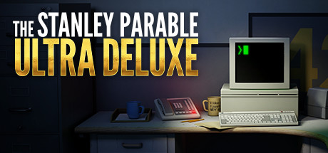
The Stanley Parable: Ultra Deluxe capsule

The Stanley Parable: Ultra Deluxe

The Stanley Parable: Ultra Deluxe is an expanded re-imagining of 2013's The Stanley Parable. You will play as Stanley, and you will not play as Stanley. You will make a choice, and you will become powerless. You are not here to win. The Stanley Parable is a game that plays you.

$8.74Very Positive(468)
Multiple EndingsChoices MatterComedy
Crows Crows CrowsApr 27, 2022

The Stanley Parable: Ultra Deluxe scores 80/100 — better than 96% of Multiple Endings capsules (n=1,783).

Very Positive (468 reviews) · $8.74 · Released Apr 27, 2022 · By Crows Crows Crows

Quick text summary

The Stanley Parable: Ultra Deluxe scored 80/100 on Steam Analyzer — Good for a Multiple Endings capsule. Top priority fix: [genre_clarity] Add a subtle visual cue such as a branching path indicator or command prompt on the monitor screen to hint at choice-based or meta-narrative gameplay.

Capsule scores by dimension

  • Genre Clarity: 7/10 — Retro office setting implies narrative puzzle. The vintage computer, desk setup, and 1980s aesthetic clearly signal a retro-themed game with environmental storytelling cues. At TINY size, the recognizable CRT monitor and office props remain distinct enough to hint at an unconventional narrative experience, though the exact genre (narrative adventure vs. puzzle) is not immediately obvious without context.
  • Title Readability: 9/10 — Bold high-contrast title with excellent hierarchy. The white 'THE STANLEY PARABLE' and vibrant gold 'ULTRA DELUXE' text are highly legible at all sizes due to strong contrast against the dark background and clean sans-serif letterforms. Even at TINY size, the hierarchy between the two text blocks remains clear, and the title does not collapse or blur into illegibility.
  • Contrast & Color: 8/10 — Strong value separation with warm accent. The gold 'ULTRA DELUXE' pops sharply against the cool blue-gray background, while the white title text provides excellent contrast. The retro monitor on the right reinforces the color scheme with warm desk lamp lighting and cool monitor glow, creating clear silhouette separation that reads well at small sizes.
  • Uniqueness & Polish: 8/10 — Distinctive retro aesthetic with strong art direction. The carefully crafted 1980s office environment with authentic-looking computer, cup, papers, and desk lamp conveys a premium, intentional design rather than generic game art. The visual storytelling immediately communicates a unique premise centered on office/corporate themes and meta-narrative, differentiating it from typical adventure game capsules.
  • Brand Consistency: 8/10 — Cohesive retro-futuristic identity with signature style. The vintage computer aesthetic, warm lamp lighting, and cool monitor glow create a recognizable and consistent visual identity that aligns with the original game's theme. The color palette (cool blues, warm yellows, muted office tones) and retro-modern rendering style are distinctive enough to serve as brand recognition markers.
  • Composition: 8/10 — Clear focal hierarchy with effective layering. The desk setup anchors the right two-thirds of the composition with strong depth layering (background wall, desk surface, monitor), while the title occupies the left upper quadrant with breathing room. The title placement avoids the center void and does not crowd the office scenery; the composition remains balanced and readable at SMALL and TINY sizes with no critical edge cropping concerns.

What works

  • Title contrast and readability excellence. White and gold text with clean sans-serif letterforms maintain legibility across all viewing sizes without collapsing.
  • Distinctive retro-office aesthetic. Authentic 1980s desk setup with CRT monitor, lamp, and props immediately communicates a unique visual identity and narrative premise.
  • Strong color hierarchy and depth. Layered composition with warm lamp lighting and cool monitor glow creates clear visual separation and guides focus naturally.
  • Balanced composition with smart title placement. Title occupies upper left with adequate breathing room while office scenery anchors the right side, avoiding center voids and edge cropping hazards.

What hurts the capsule

  • Genre messaging could be clearer at TINY. While the retro aesthetic is distinctive, the exact genre (narrative puzzle, walking simulator, meta-adventure) is not immediately obvious without prior knowledge.
  • Limited visual indication of gameplay mechanics. The capsule excels at atmosphere but does not visually communicate what players actually do or the core mechanic (choice, narration, interactivity).

Priority fixes

  1. [genre_clarity] Add a subtle visual cue such as a branching path indicator or command prompt on the monitor screen to hint at choice-based or meta-narrative gameplay.
  2. [composition] Ensure the monitor screen brightness and glow remain visible at thumbnail size; consider increasing the monitor glow saturation slightly for better TINY size readability.

Store copy priority fixes

  1. [feature_communication] Add a single sentence describing the core interaction loop: something like 'Follow the Narrator's voice through an office building, choose paths that branch into new areas, and discover how each choice reveals different perspectives on your agency as a player.'
  2. [audience_targeting] Include explicit signal to target audience: 'Perfect for players who loved games like Spec Ops: The Line or The Witness—games that deconstruct how we play.'
  3. [genre_clarity] Clarify that this is dialogue and narrative-driven exploration: 'A first-person narrative exploration game where dialogue, environment, and voiceover shape every choice' to set expectations for players seeking action or puzzle-solving.

Related guides

Steam app ID: 1703340 · Tags: Multiple Endings, Choices Matter, Comedy, Walking Simulator, First-Person