Scoring genre clarity...

Pirates of Gravitae capsule

Pirates of Gravitae

Dogfighting seadogs! Command a rocket propelled pirate ship in this aerial combat roguelike, in 2.5D! Equip your ship, train your crew, optimize your build, get blown up, and do it all again!

$2.991 user reviews
SimulationActionAction Roguelike
Innerverse GamesMar 12, 2026

Pirates of Gravitae scores 73/100 — better than 51% of Simulation capsules (n=5,188).

1 user reviews · $2.99 · Released Mar 12, 2026 · By Innerverse Games

Quick text summary

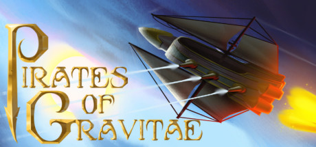
Pirates of Gravitae scored 73/100 on Steam Analyzer — Good for a Simulation capsule. Top priority fix: [genre_clarity] Enhance the ship portal to visually emphasize aerial combat dynamics—add motion lines, weapon fire, or multiple ships in the background to signal dogfighting gameplay.

Capsule scores by dimension

  • Genre Clarity: 7/10 — Clear action pirate theme, aerial hints muted. The golden compass star, pirate captain silhouette with tricorn hat, and ship imagery in the circular portal on the right clearly signal a pirate action game. However, at TINY size the aerial combat and roguelike mechanics are not visually obvious—the capsule reads more as traditional pirate adventure than specifically dogfighting gameplay. The ship in the portal is readable at full size but loses clarity at thumbnail scale.
  • Title Readability: 8/10 — Strong gold serif logo, readable at all sizes. The 'Pirates of Gravitae' title uses an ornate gold serif font with a distinctive compass star emblem that anchors left. At FULL size it is elegant and crisp; at SMALL and TINY sizes the letterforms remain distinct and the compass icon functions as a memorable lockup. The placement on clean light background ensures it does not compete with the character illustration on the right.
  • Contrast & Color: 7/10 — Good separation, warm palette reads cleanly. The warm cream and light background creates strong value separation against the dark pirate character and the golden text, ensuring clear silhouette at all sizes. The circular portal with ship details adds depth layering. At TINY size, the character and portal still pop as distinct elements against the light core, though fine color gradations in the ship interior blur slightly.
  • Uniqueness & Polish: 7/10 — Polished character art, familiar pirate aesthetic. The pirate captain illustration is well-rendered with professional shading, fabric detail, and a dynamic pose holding a ship portal. The art quality is solid and premium-feeling. However, the visual concept—pirate with ship object—is a familiar trope and does not strongly communicate the unique selling point of 'rocket propelled dogfighting roguelike.' The capsule feels more like a traditional pirate action game than specifically aerial combat focused.
  • Brand Consistency: 7/10 — Cohesive golden pirate identity, well-executed. The golden compass star, ornate serif typography, and warm color palette create a consistent and recognizable pirate brand aesthetic. The character rendering style and illustration technique are polished and would likely be recognizable across store assets. The internal visual language is coherent—warm golds, dark accents, classical pirate iconography—though it does not feel distinctive enough to stand apart as a unique indie roguelike identity.
  • Composition: 8/10 — Strong hierarchy, well-balanced focal points. The logo anchors the left in a safe margin, the pirate captain dominates the right-center as the primary focal point, and the circular ship portal at shoulder height creates a secondary focal point that draws the eye without competing. The composition uses depth effectively with foreground character, midground portal, and light background. At SMALL and TINY sizes, the pirate silhouette and golden elements remain the clear focus; margins are respected and nothing critical sits at unsafe crop edges.

What works

  • Premium character illustration. The pirate captain is well-shaded, detailed, and immediately communicates high production quality across all viewing sizes.
  • Readable ornate logo lockup. The 'Pirates of Gravitae' title with compass star remains legible and distinctive even at TINY thumbnail size due to strong contrast and clear letterforms.
  • Clean safe margins and cropping. Critical elements are well-positioned within safe zones, ensuring the capsule remains intact and readable across Steam's cropping and resize patterns.
  • Warm color cohesion. The golden and cream palette creates a warm, inviting, and internally consistent visual identity that reads as premium and intentional.

What hurts the capsule

  • Roguelike gameplay not visually signaled. The capsule communicates 'pirate action' but does not clearly hint at roguelike mechanics, build optimization, or aerial combat—key USPs that should be visually evident.
  • Aerial combat identity underdeveloped. The ship in the portal is small and loses detail at TINY size; the dynamic dogfighting and rocket propulsion concept are not well-represented in the visual composition.
  • Generic pirate theme without indie personality. While well-executed, the aesthetic feels aligned with traditional pirate fantasy rather than a distinctive indie roguelike—missing opportunities to signal genre subversion or unique mechanical identity.

Priority fixes

  1. [genre_clarity] Enhance the ship portal to visually emphasize aerial combat dynamics—add motion lines, weapon fire, or multiple ships in the background to signal dogfighting gameplay.
  2. [uniqueness_polish] Incorporate subtle roguelike visual cues such as upgrade nodes, ability icons, or build layering in the composition to communicate the game's core loop and differentiate from generic pirate action.
  3. [composition] Consider repositioning the ship portal to be larger and more prominent in the right-center frame, ensuring it remains readable and communicates aerial combat focus even at TINY size.

Store copy priority fixes

  1. [feature_communication] Move all feature bullets (Run based campaign, Wield an energy saber, Balance offensive, Come up with a different build, Train your crew, Optimize your build) to immediately follow the short description and before any lore exposition to prioritize gameplay clarity.
  2. [uniqueness] Add one sentence that explicitly contrasts the aerial combat or crew mechanics with similar roguelikes: e.g., 'Unlike grounded roguelikes, your crew and loadout must adapt to 2.5D flight physics and environmental hazards' or similar.
  3. [tone_match] Either condense the Gravitae lore to 1 paragraph or reshuffle it to the end of the detailed description, reserving the opening space for gameplay hooks that match the energetic short description tone.

Related guides

Steam app ID: 1703500 · Tags: Simulation, Action, Action Roguelike, Bullet Hell, Shoot 'Em Up