Scoring genre clarity...

Morsels capsule

Morsels

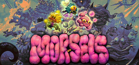
Morsels is a fast-paced creature collecting roguelite with a rotating roster of characters to switch between at will. Overcome a clique of killer cats as you fight your way out of the sewers in this unique, action-packed journey.

$9.74Mostly Positive(524)
Action RoguelikePixel GraphicsAction
FurculaNov 18, 2025

Morsels scores 65/100 — better than 6% of Action Roguelike capsules (n=1,675).

Mostly Positive (524 reviews) · $9.74 · Released Nov 18, 2025 · By Furcula

Quick text summary

Morsels scored 65/100 on Steam Analyzer — Solid for a Action Roguelike capsule. Top priority fix: [genre_clarity] Integrate environmental or mechanical context such as a sewer element, killer cat silhouette, or character-switching UI hint to signal roguelite action gameplay.

Capsule scores by dimension

  • Genre Clarity: 5/10 — Creature design visible, genre ambiguous. The stylized creature with glowing eyes suggests a creature-based game, but the colorful, organic blob aesthetic could indicate puzzle, action, or indie adventure equally. At tiny size, the form reads as a playful character rather than clearly communicating action roguelite mechanics or the creature-collecting core loop. Genre signals like combat pose, UI hints, or environmental context are absent.
  • Title Readability: 7/10 — Title readable at full and small sizes. The title 'MORSELS' uses a bold, chunky 3D extruded font that maintains legibility at small capsule sizes due to thick letterforms and strong outline contrast against the dark background. At tiny size the title compresses but remains recognizable as large blocky shapes, though fine shading detail becomes lost. The centered placement and lack of competing elements supports readability.
  • Contrast & Color: 8/10 — Strong warm-cool separation, clear pop. The coral-to-magenta gradient creature provides excellent value and saturation contrast against the dark teal-to-black background, creating strong silhouette definition that persists at small sizes. The glowing yellow eyes add a bright accent that draws attention. In grayscale, the creature maintains clear separation as a bright mid-tone against darker surroundings, and even at tiny size the shape reads distinctly without edges blending into background.
  • Uniqueness & Polish: 6/10 — Competent character design, generic treatment. The creature itself shows appealing character design with organic bulbous forms and expressive eyes, suggesting personality and charm. However, the presentation is a straightforward full-character reveal on a solid gradient background with minimal environmental storytelling, creature interaction, or visual hook that communicates the roguelite action or creature-collecting premise. It reads as a polished but conventional indie game capsule without a distinctive visual anchor or mechanic callout.
  • Brand Consistency: 6/10 — Single character focus, limited identity cues. The creature design and warm magenta-orange palette appear consistent with typical indie action-adventure visual identity, but without reference to the broader game brand (killer cats, sewer setting, character roster switching) there are no iconic motifs or signature symbols that would be recognizable across marketing materials. The glowing eye detail could become a brand identifier if used consistently, but it is not yet memorable or unique enough to stand alone.
  • Composition: 7/10 — Centered focal point, balanced layout. The creature is centered as the clear primary subject with good breathing room on all sides, ensuring visibility at small and tiny sizes without crop risk. The glowing eyes create a natural focal point within the form, and the solid gradient background avoids clutter and competing elements. At tiny size the composition remains legible, though the centered void space in the lower gradient becomes more noticeable and could be leveraged more intentionally for visual hierarchy.

What works

  • Strong contrast against dark background. The warm orange-to-magenta gradient creature pops clearly against the cool teal-to-black background, maintaining silhouette clarity and visual separation even at tiny thumbnail size in grayscale.
  • Bold, legible title treatment. The thick 3D extruded font 'MORSELS' reads well at small capsule sizes due to chunky letterforms and strong outline definition, with centered placement that avoids competition for attention.
  • Appealing character charm and personality. The creature design shows thoughtful organic forms and expressive glowing eyes that communicate friendliness and character appeal, supporting memorability and brand affinity.

What hurts the capsule

  • Weak genre and mechanic communication. The colorful creature alone does not clearly signal action roguelite gameplay, creature collection, or the sewer vs. killer cats premise; genre reads as ambiguous indie without combat, roster, or environmental cues.
  • Generic presentation without story context. The plain gradient background and isolated character reveal miss opportunity to hint at sewer setting, rival cats, or the character-switching mechanic, leaving the capsule feeling like a generic creature showcase.
  • Limited brand identity and iconography. Beyond the single creature design, there are no distinctive visual motifs, symbols, or palette cues that would make this capsule memorable or recognizable across the broader game marketing.

Priority fixes

  1. [genre_clarity] Integrate environmental or mechanical context such as a sewer element, killer cat silhouette, or character-switching UI hint to signal roguelite action gameplay.
  2. [uniqueness_polish] Add a secondary visual element or scene detail that hints at the game's core loop, such as multiple creature variants, a threat indicator, or environmental storytelling.
  3. [brand_consistency] Develop and apply a signature visual motif such as a recurring symbol, icon, or palette accent that will be recognizable across all marketing materials and brand touchpoints.

Store copy priority fixes

  1. [uniqueness] Replace 'unique, action-packed journey' with a specific mechanical differentiator: e.g., 'instantly swap between captured Morsels mid-combat to chain abilities—no cooldowns, pure tactical timing' to show how the switching mechanic creates novel gameplay.
  2. [feature_communication] Add 1–2 sentences explaining how Morsels are captured, how your roster grows, and how selecting and upgrading your active team before a run affects your strategy and survival odds.
  3. [audience_targeting] Include a clear signal: e.g., 'Perfect for roguelike fans who love fast-paced action and team-building strategy' or 'Challenging but fair difficulty curve with customization options for all skill levels' to help the right player self-identify.

Related guides

Steam app ID: 1719040 · Tags: Action Roguelike, Pixel Graphics, Action, Twin Stick Shooter, Dark Fantasy