Scoring genre clarity...
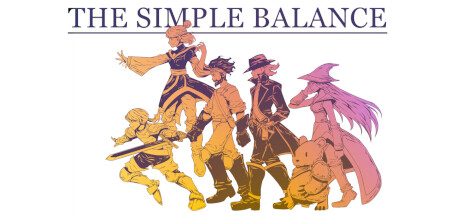
„The Simple Balance“ is a tactical turn-based RPG. Explore a dark fantasy world and defeat enemies with magic spells, mighty weapons, and learned abilitys. Manage your team and deploy them promisingly to win the battle. Find out what is going on in this mysterious world and why you are here.
Free to PlayMostly Negative(11)
Turn-Based TacticsTactical RPGRoguelite
deCode GmbHJul 12, 2025