Bit ESC scores 65/100 — better than 12% of Adventure capsules (n=7,922).

Quick text summary

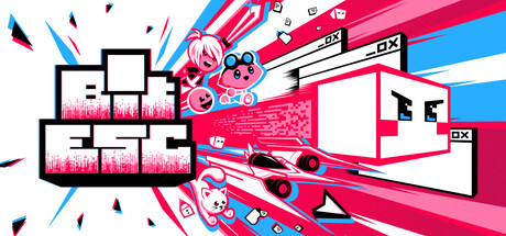
Bit ESC scored 65/100 on Steam Analyzer — Solid for a Adventure capsule. Top priority fix: [title_readability] Reposition or enlarge 'BIT ESC' text with stronger contrast outline so it dominates the composition and remains legible at tiny thumbnail size.

Capsule scores by dimension

  • Genre Clarity: 7/10 — Action platformer with digital aesthetic clear. The vibrant neon pink and blue color scheme, geometric shapes, and dynamic angular composition immediately signal a modern action game with a digital or cyberpunk theme. The stylized character silhouettes and platform-like stacked boxes read as platformer mechanics at full size. At tiny size, the color contrast and geometric shapes remain readable as action-oriented, though the specific platformer intent becomes less obvious due to composition density.
  • Title Readability: 5/10 — Title readable at full, collapses at tiny. The 'BIT ESC' text is legible at full header size with white letters against the pink and blue background, using a clean geometric sans-serif font. However, at small and tiny sizes, the title compresses into the busy visual field and becomes difficult to isolate from the decorative elements, competing with the dynamic shapes and character graphics for attention. The title positioning in the upper left area gets overwhelmed by the layered background noise.
  • Contrast & Color: 8/10 — Strong neon palette pops against dark. The hot pink and electric blue create excellent value separation against Steam's dark background #1b2838, with high saturation and luminosity. The white and black accents in the geometric shapes reinforce silhouette clarity and create clean edges even at reduced sizes. In grayscale, the bright mid to high tones of the neon colors maintain strong separation from the dark background.
  • Uniqueness & Polish: 7/10 — Polished digital aesthetic, moderately distinctive. The execution shows intentional art direction with a cohesive neon-digital style, geometric typography, and layered graphic design that feels premium for an indie title. The color treatment and angular composition signal a deliberately modern, tech-forward identity that differentiates it from traditional action games. However, the neon cyberpunk aesthetic has become increasingly common in indie marketing, reducing the uniqueness score—while well-executed, it follows familiar trends rather than establishing a singular visual hook.
  • Brand Consistency: 6/10 — Consistent style, limited memorable identity. The capsule maintains internal coherence with consistent neon color palette, geometric shape language, and digital typography throughout. The overall aesthetic aligns with the 'Bit ESC' concept of digital rebellion. However, there are no iconic character designs, memorable symbol, or signature visual motif that would make this capsule immediately recognizable as Bit ESC versus other neon indie games—the consistency is functional but not distinctive.
  • Composition: 6/10 — Busy center with competing focal points. The composition layers multiple elements—stacked boxes, character graphics, geometric shapes, and angular strokes—creating visual movement but diffusing focal hierarchy. The eye jumps between the top-left boxes, center character elements, and right-side angular shapes without a clear primary anchor. At tiny size, this layering becomes noise rather than clarity, and important elements cluster toward edges where Steam cropping may cut them off.

What works

  • Strong color contrast against Steam dark background. The neon pink and electric blue have high saturation and luminosity that create excellent separation from #1b2838, maintaining readability at all sizes including tiny thumbnails.
  • Intentional modern art direction and polish. The geometric sans-serif typography, layered graphic elements, and coordinated neon palette demonstrate clean craft and deliberate design choices that elevate the capsule above generic templates.
  • Genre signals action-oriented gameplay. The dynamic angles, stacked box structure, and neon digital aesthetic communicate 'action game' through visual language without ambiguity, even if platformer specificity wavers at small sizes.

What hurts the capsule

  • Title gets lost in visual clutter at small sizes. The 'BIT ESC' text competes with decorative elements and fails to establish dominance in the hierarchy when compressed to small or tiny capsule dimensions.
  • Multiple competing focal points scatter attention. The stacked boxes, character graphics, angular strokes, and geometric shapes create equal visual weight across the composition rather than guiding the eye to a single clear primary subject.
  • Edge elements risk Steam cropping issues. Key graphic components cluster near the left, right, and top edges where Steam's responsive cropping may cut them off on certain display contexts.
  • Neon cyberpunk aesthetic lacks unique hook. While well-executed, the visual identity follows common indie game trends rather than establishing a singular memorable motif that would distinguish Bit ESC from other neon-themed action titles.

Priority fixes

  1. [title_readability] Reposition or enlarge 'BIT ESC' text with stronger contrast outline so it dominates the composition and remains legible at tiny thumbnail size.
  2. [composition] Reduce visual density by simplifying background elements and establishing a single clear focal point—likely the character or central graphic—to improve hierarchy at small sizes.
  3. [composition] Move critical design elements 15-20% inward from all edges to ensure they survive Steam's responsive cropping across different layouts.
  4. [brand_consistency] Develop or emphasize a signature character silhouette or icon that becomes recognizable as Bit ESC's visual identity across future marketing materials.

Store copy priority fixes

  1. [hook_strength] Rewrite the opening line to lead with an emotional or narrative hook—e.g., 'Escape a digital prison where every decision could trap or free you—and everyone you befriend along the way' instead of the generic 'break free' framing.
  2. [feature_communication] Replace vague adjectives with concrete examples—e.g., instead of 'expansive moveset,' specify 'wall-jump, dash, and glitch mechanics,' and replace 'frantic challenges' with 'survive fast-paced platforming sections and puzzle encounters.'
  3. [uniqueness] Add a line that articulates what makes this platformer distinct—e.g., 'Your choices reshape the digital world itself' or 'Unlike other platformers, you can befriend NPCs whose loyalty shifts the story and gameplay,' to differentiate from genre peers.
  4. [audience_targeting] Add a sentence early in the detailed description that clarifies whether this is story-first, action-first, or balanced—e.g., 'Perfect for players who love narrative-driven platformers with meaningful branching paths' to help self-select the right audience.

Related guides

Steam app ID: 1724490 · Tags: Adventure, Choices Matter, Multiple Endings, Cute, Story Rich