Scoring genre clarity...
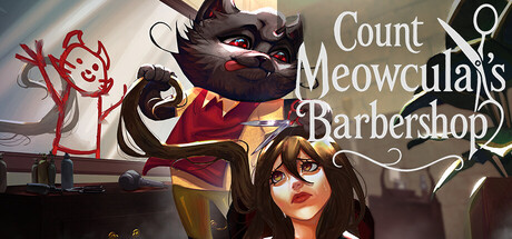
You're Count Meowcula, a vampire cat that opened a barbershop. Wash and cut hairs, also clean your establishment and try not to bite your clients in this creepy cute game with minigames and chaotic controls. Manage your instincts and your reputation. Who said that beauty does not require sacrifices?
$4.99Positive(23)
CatsMinigamesFunny
GabiverseNov 3, 2025