Scoring genre clarity...

Peace Island capsule

Peace Island

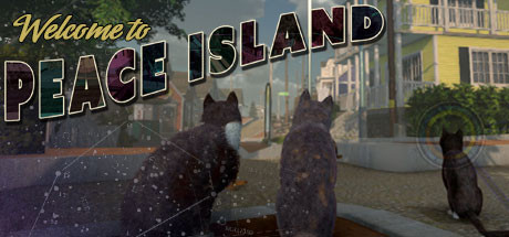
One fine day, in a remote Maine island community, nine cats wake up to discover their humans have disappeared. To survive, they must band together to uncover the mysteries of their storied island home - and ultimately, it is up to them to decide: Are the humans worth bringing back?

$19.99Mixed(34)
Early AccessAdventureIndie
Peace Island LLCFeb 27, 2026

Peace Island scores 68/100 — better than 15% of Early Access capsules (n=3,067).

Mixed (34 reviews) · $19.99 · Released Feb 27, 2026 · By Peace Island LLC

Quick text summary

Peace Island scored 68/100 on Steam Analyzer — Solid for a Early Access capsule. Top priority fix: [title_readability] Convert 'Greetings from' to a minimal icon or remove it entirely, ensuring only 'PEACE ISLAND' remains visible at tiny size with stronger weight and outline definition.

Capsule scores by dimension

  • Genre Clarity: 7/10 — Cat adventure mystery clear. Three dark cat silhouettes prominently featured in the foreground immediately signal an animal-centric narrative, and the serene island setting with colonial houses suggests a peaceful exploration game rather than action-focused gameplay. At tiny size, the cats remain recognizable and the domestic architecture reads as cozy adventure territory, though the specific genre blend (adventure/casual/RPG) is not fully distinct—it could be confused with other pet-focused casual games.
  • Title Readability: 6/10 — Title readable full, moderate tiny. The large 'PEACE ISLAND' text in bold outlined letters is legible at full size with good contrast against the background, and the yellow 'Greetings from' tagline above adds thematic charm. At tiny size (120×45), the main title remains partially readable but loses sharpness; the tagline becomes unreadable, and the outlined style, while charming, doesn't optimize for small viewport clarity as well as solid sans-serif would.
  • Contrast & Color: 7/10 — Strong silhouettes, warm palette. The dark cat figures stand out well against the lighter background architecture, and the warm yellow houses with cool blue shadows create clear value separation that pops against Steam's dark background. The outlined text treatment adds a vintage postcard aesthetic that enhances separation, though at tiny size some of the finer outline detail softens and the mid-tone sky area could offer slightly more dramatic value contrast to the foreground subjects.
  • Uniqueness & Polish: 7/10 — Charming vintage postcard style. The 'Greetings from' retro postcard theme is a distinctive visual hook that signals both the game's tone and its nostalgic Americana setting, differentiating it from generic cat games. The hand-crafted outlined lettering and warm color palette feel intentional and premium, though the scene composition itself (cats in front of houses) is a fairly familiar cozy game trope—the execution is solid but the core concept is not entirely novel.
  • Brand Consistency: 7/10 — Cohesive retro aesthetic identity. The capsule establishes a strong internal identity through consistent use of the vintage postcard framing, warm-cool color palette, and hand-drawn letter styling that suggests a unified art direction. The cat character silhouettes and colonial island architecture appear consistent with a cozy adventure aesthetic, though without access to other marketing assets, it is difficult to confirm whether this capsule's specific visual language matches the broader brand identity across store screenshots.
  • Composition: 7/10 — Clear focal point, good depth. The three cats in the foreground create a natural eye anchor with clear hierarchy, supported by the middle-ground houses and background sky that provide pleasing depth layering. The 'PEACE ISLAND' title placement in the upper-center area is prominent and safe from crop zones; at small size the composition holds well, though the right-side cat feels slightly isolated and the overall composition could benefit from tighter focal grouping to ensure maximum impact at tiny thumbnail size.

What works

  • Distinctive vintage postcard framing. The 'Greetings from' theme is a memorable and thematic hook that immediately differentiates this capsule from generic cozy adventure titles.
  • Strong cat silhouette recognition. The three dark feline figures are immediately identifiable at all sizes and communicate the game's core concept of playable cats without text.
  • Warm color palette appeal. The yellow houses and cool blue shadows create visual harmony and nostalgic charm that aligns with the casual indie adventure positioning.

What hurts the capsule

  • Tagline illegible at tiny size. 'Greetings from' text becomes unreadable below small capsule size, losing the distinctive postcard concept at critical discovery moments.
  • Outlined lettering softens at scale. The hand-drawn outlined title style, while charming, loses definition and crispness at tiny thumbnail sizes, compromising readability against the dark Steam background.
  • Right-side cat spatial isolation. The rightmost cat figure sits at the edge and feels visually separated from the main group, creating mild compositional imbalance at small sizes.

Priority fixes

  1. [title_readability] Convert 'Greetings from' to a minimal icon or remove it entirely, ensuring only 'PEACE ISLAND' remains visible at tiny size with stronger weight and outline definition.
  2. [composition] Reposition all three cats closer together in the lower-center area to create a tighter focal group that reads clearly at 120×45 thumbnail size.
  3. [contrast_color] Increase the outline thickness and add a subtle glow or shadow behind the title text to ensure it maintains crisp separation at small viewport scales.

Store copy priority fixes

  1. [feature_communication] Add a 1-2 sentence summary of the core moment-to-moment gameplay loop (e.g., 'Explore the island, talk to cat characters, uncover clues about the missing humans, and make choices that shape the narrative') immediately after the opening hook, before the bullet list.
  2. [hook_strength] Relocate the Early Access disclaimer and developer backstory to a separate 'About the Game' or 'Development' section at the end; replace with a concise 2-3 sentence paragraph that reinforces the unique appeal of playing as cats in a post-human world.
  3. [tone_match] Remove or significantly condense the AI content apology (move to FAQ or a brief note); it undercuts the game's inviting tone and reads as corporate risk mitigation rather than a creative statement.
  4. [uniqueness] Add 1-2 sentences explicitly stating what makes Peace Island different (e.g., 'Unlike typical open-world games, Peace Island centers the perspectives of nine non-human characters navigating a world shaped by human absence') to help players immediately grasp its distinct identity.

Related guides

Steam app ID: 1753870 · Tags: Early Access, Adventure, Indie, RPG, Casual