Scoring genre clarity...
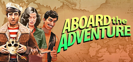
Aboard the Adventure capsule

Aboard the Adventure

Aboard the adventure is a humorous adventure game in which you will be part of the team of the daring Captain Quinn, with the objective of defeating the sinister Professor Weaver in a race to get several ancient and mysterious artifacts that can change the destiny of the world.

Old SchoolStory RichAdventure
Chenke GamesTo be announced

Aboard the Adventure scores 68/100 — better than 18% of Old School capsules (n=1,439).

Released To be announced · By Chenke Games

Quick text summary

Aboard the Adventure scored 68/100 on Steam Analyzer — Solid for a Old School capsule. Top priority fix: [uniqueness_polish] Add a distinctive visual hook or comedic visual element (e.g., exaggerated character expressions, absurd prop detail, or signature color accent beyond title green) that immediately communicates the game's unique tone or selling point.

Capsule scores by dimension

  • Genre Clarity: 7/10 — Clear adventure with comedic tone. The capsule effectively communicates adventure-action through the central character's sailor outfit, ship wheel prop, and period-adventure aesthetic with classical busts in the background. At TINY size, the character poses and prop wheel remain readable as adventure-themed, though the comedic/humorous subgenre is less obvious without the title text. The ensemble cast grouping hints at team-based adventure gameplay.
  • Title Readability: 8/10 — Bold, high-contrast readable text. The bright lime-green title 'ABOARD the ADVENTURE' uses thick, angled letterforms with strong contrast against the sepia background, maintaining legibility at SMALL and TINY sizes. The two-line stacked layout with clear spacing prevents collision and ensures both words parse quickly even at thumbnail scale. Kerning and weight are consistent, though the slight italic tilt adds character without compromising clarity.
  • Contrast & Color: 7/10 — Warm palette with strong title pop. The sepia-toned background (browns, golds, creams) creates a cohesive, muted mid-tone field that provides solid contrast for the lime-green title and the central character's reddish-brown jacket and white cap. In grayscale, the title remains the brightest element and the character silhouettes show clear value separation from the background, though the ensemble cast and background busts create some competing tonal regions that reduce peak silhouette clarity at TINY size.
  • Uniqueness & Polish: 6/10 — Competent period adventure aesthetic. The capsule presents a well-executed vintage adventure vibe with illustrative character rendering, classical architectural framing (busts and map), and a thematic color palette that feels intentional and period-appropriate. However, the overall presentation reads as a solid generic adventure-ensemble setup rather than a distinctly memorable hook; the humor is implied by the title alone, and the visual composition does not communicate a unique mechanic or standout premise beyond 'captain leads team to collect artifacts.' Compared to top peers like DAVE THE DIVER or Slay the Princess, this lacks a signature visual or narrative hook that would make it instantly recognizable.
  • Brand Consistency: 6/10 — Coherent but generic visual identity. The sepia, period-adventure palette and illustrative style are internally consistent, and the central Captain Quinn character design is recognizable across the composition. However, there are no strong iconic symbols, signature color accent (beyond the title's lime green), or memorable motif that would function as a brand identity cue across future marketing materials; the visual language is more 'period adventure game' than 'Aboard the Adventure's distinct world.' Without access to the 7 store screenshots, internal consistency appears functional but not distinctly branded.
  • Composition: 7/10 — Clear focal point, balanced ensemble. The central Captain Quinn figure with the ship wheel creates a strong primary focal point at FULL and SMALL sizes, with the three supporting characters flanking left and right to frame the hero and guide eye movement toward the center. The large busts in background and foreground create depth layering (background, midground, character group, title overlay) without overwhelming the core message. At TINY size, the central character cluster remains dominant and readable, though the flanking busts can become noise; title placement directly below the action preserves safe margins and avoids edge crop risks.

What works

  • Lime-green title dominates quickly. The bright, thick sans-serif title pops decisively against the warm sepia palette and maintains full legibility at TINY thumbnail size, ensuring the game name registers in quick scroll.
  • Period-adventure visual cohesion. Consistent sepia-toned color treatment, illustrative character rendering, and classical architectural framing create a unified, intentional vintage-adventure aesthetic that feels polished and craft-focused.
  • Depth layering and focal hierarchy. The composition uses background busts, mid-ground character ensemble, and prominent title to create clear visual depth, with Captain Quinn as the unambiguous primary subject that guides attention at all sizes.

What hurts the capsule

  • Generic adventure-ensemble premise. While visually competent, the capsule communicates a familiar 'captain leads team on treasure hunt' setup without a distinctive visual hook or unique selling point that differentiates it from standard adventure templates.
  • Humor signaled only by title text. The comedic tone referenced in the game description is not reinforced by visual cues, character expression, or comedic staging in the background, making it rely entirely on readable title text to communicate genre flavor.
  • Background elements compete at small sizes. The large busts flanking the character group begin to blur and blend into background noise at SMALL and TINY sizes, reducing the visual clarity of the secondary composition supports.

Priority fixes

  1. [uniqueness_polish] Add a distinctive visual hook or comedic visual element (e.g., exaggerated character expressions, absurd prop detail, or signature color accent beyond title green) that immediately communicates the game's unique tone or selling point.
  2. [brand_consistency] Introduce a recognizable symbol or iconic motif (Captain Quinn's emblem, ship crest, artifact design) that could serve as a consistent brand identity marker across future marketing.
  3. [contrast_color] Darken or reduce opacity of background bust elements to ensure they do not compete with the character focal group at SMALL and TINY sizes, maintaining peak clarity.

Store copy priority fixes

  1. [hook_strength] Replace the opening line with a more active, curiosity-driven hook: 'Lead a misfit crew of adventurers in a high-stakes race across the globe to claim ancient artifacts before your arch-nemesis does—in this pulp-adventure comedy where every decision matters and laughter is your best weapon.'
  2. [feature_communication] Add a short 'Gameplay' section that explicitly names the core loop: 'Control three unique characters, solve environmental puzzles, engage in turn-based or real-time combat, and navigate dialogue trees that affect relationships and story outcomes.'
  3. [genre_clarity] Explicitly mention point-and-click mechanics early in the detailed description: 'Point-and-click adventure where you'll click to move, interact, and solve puzzles across exotic locations.'
  4. [uniqueness] Add a differentiator sentence that highlights what's specific to this game: 'Unlike traditional adventure games, your choices in dialogue and character relationships directly unlock alternative solutions to puzzles and alter the story's ending.'

Related guides

Steam app ID: 1765670 · Tags: Old School, Story Rich, Adventure, Point & Click, Comedy