Scoring genre clarity...
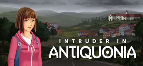
Intruder In Antiquonia capsule

Intruder In Antiquonia

Intruder In Antiquonia is a narrative mystery adventure that will immerse you in the Internet-hostile town of Antiquonia. Sarah does not remember who she is and how she got there. Help her solve the mysteries of her past while exploring beautiful hand-drawn environments.

$6.49Very Positive(93)
AdventurePoint & ClickStory Rich
Aruma StudiosJul 8, 2022

Intruder In Antiquonia scores 73/100 — better than 61% of Adventure capsules (n=8,231).

Very Positive (93 reviews) · $6.49 · Released Jul 8, 2022 · By Aruma Studios

Quick text summary

Intruder In Antiquonia scored 73/100 on Steam Analyzer — Good for a Adventure capsule. Top priority fix: [genre_clarity] [uniqueness_polish] Consider adding a subtle silhouette or visual element of Sarah or an intruding presence to communicate the core mystery hook and differentiate from generic pastoral adventure scenes.

Capsule scores by dimension

  • Genre Clarity: 7/10 — Narrative adventure in rural setting. The hand-drawn countryside landscape with a winding road, European-style village architecture, and misty mountains immediately signals a narrative adventure or mystery game rather than action or puzzle-focused title. At tiny size, the pastoral environment and road composition still read as exploration-based gameplay, though the specific mystery or character-driven focus is less clear without the title. The aesthetic aligns well with indie narrative adventures like those in the benchmark list.
  • Title Readability: 8/10 — Clear, well-spaced sans-serif type. The title 'INTRUDER IN ANTIQUONIA' uses a clean, bold white sans-serif font with generous letter spacing and strategic placement across the middle of the composition, ensuring excellent contrast against the darker landscape. At small and tiny sizes, the title remains legible due to the heavy font weight and white-on-dark positioning, though 'INTRUDER IN' stacks above 'ANTIQUONIA' which maintains hierarchy. The generous spacing prevents letter collision at reduced scales.
  • Contrast & Color: 8/10 — Strong white text against muted tones. White title text provides excellent value separation against the dusky landscape palette of grays, greens, and muted reds, creating clear silhouettes even in grayscale conversion. The landscape itself uses a warm, atmospheric color scheme that avoids harsh neon or oversaturation, allowing the white type to remain the dominant focal element. At tiny size, the contrast-driven hierarchy remains intact with no muddy blending between subject and background.
  • Uniqueness & Polish: 7/10 — Polished hand-drawn aesthetic, familiar approach. The hand-drawn illustration style and muted color palette demonstrate craft quality and intentional art direction that feels cohesive and premium. However, the pastoral village mystery setup is a familiar indie narrative game formula visible in several benchmark titles, and the composition lacks a distinctive visual hook that immediately communicates this game's unique selling point or core mechanic beyond 'mysterious town exploration.' The polish is evident but the concept reads as competent rather than distinctive.
  • Brand Consistency: 6/10 — Consistent illustration style, minimal identity cues. The hand-drawn watercolor-adjacent rendering style is internally consistent and would likely carry through the game's visual identity based on the narrative adventure context. However, there are no iconic character silhouettes, symbolic motifs, or signature visual elements visible that would make this capsule immediately recognizable as 'Antiquonia' on a second viewing—the title carries the brand identity rather than the visual language. The landscape aesthetic is pleasant but generic enough that similar palette and style could apply to multiple games.
  • Composition: 8/10 — Clear focal point, balanced depth layering. The composition uses effective depth layering with foreground tree and road fence elements, midground village buildings, and background mountains creating natural visual hierarchy. The winding road draws the eye toward the center-right village, while the title text anchors the composition at a strong center position without crowding or awkward gaps. At small and tiny sizes, the road leading to the village remains the clear primary subject, and the title placement avoids edge-hugging or unsafe margins.

What works

  • Readable title at all scales. White sans-serif typography with strong letter spacing and contrast maintains legibility from full header down to tiny thumbnail sizes.
  • Atmospheric hand-drawn aesthetic. The muted color palette and watercolor-style rendering create a polished, cohesive visual identity appropriate for a narrative adventure game.
  • Effective depth and composition. Road leading into the village establishes clear focal point and visual hierarchy that guides viewer attention naturally through the scene.

What hurts the capsule

  • Generic mystery-adventure formula. The rural village setting and atmospheric landscape are familiar indie narrative game tropes without distinctive visual elements that communicate what makes Antiquonia unique.
  • No character or iconic presence. The capsule does not feature Sarah or any recognizable character that would build brand memory or emotional connection to the protagonist's mystery.
  • Limited visual storytelling of core concept. The capsule emphasizes landscape beauty over the 'intrusion' or 'mystery' elements—there are no visual cues suggesting the supernatural or unsettling aspects of the narrative.

Priority fixes

  1. [genre_clarity] [uniqueness_polish] Consider adding a subtle silhouette or visual element of Sarah or an intruding presence to communicate the core mystery hook and differentiate from generic pastoral adventure scenes.
  2. [brand_consistency] Introduce a memorable visual motif, symbol, or distinctive color accent that signals 'Antiquonia' specifically and creates recognizable brand identity for future marketing assets.
  3. [uniqueness_polish] Emphasize the 'Intruder' tension through visual language—shadows, architectural unease, or an out-of-place element—rather than pure pastoral beauty, to clarify the narrative intrigue.

Store copy priority fixes

  1. [uniqueness] Expand on the Internet-hostile town concept: explain how this setting affects the story or gameplay (e.g., 'no GPS, no digital records, just face-to-face detective work') to clarify why Antiquonia is distinct.
  2. [hook_strength] Rewrite the opening to lead with the mystery's emotional or mechanical core: 'Uncover why Sarah was left for dead in a town that rejects the modern world' rather than relying on 'immerse you.'
  3. [feature_communication] Weave the GAME FEATURES into the narrative copy by explaining how puzzles reveal character secrets or how character interactions unlock new areas, so mechanics feel purposeful rather than technical.
  4. [uniqueness] Add a specific detail about the conspiracy or Sarah's connection to Antiquonia in the short description to differentiate from generic amnesia adventures.

Related guides

Steam app ID: 1778870 · Tags: Adventure, Point & Click, Story Rich, Puzzle, Mystery