Scoring genre clarity...

Tales from The Dancing Moon capsule

Tales from The Dancing Moon

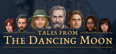
Tales from the Dancing Moon is a mystery adventure game set in a world inspired by portal-fantasy novels and UK culture. After the events of a shadow-beast invasion on a seaside town, complete villager quests and find hidden diaries to understand your role in this mysterious character-driven story.

$17.99Positive(33)
AdventureInteractive FictionExploration
DjMonkeyJun 19, 2025

Tales from The Dancing Moon scores 75/100 — better than 74% of Adventure capsules (n=7,922).

Positive (33 reviews) · $17.99 · Released Jun 19, 2025 · By DjMonkey

Quick text summary

Tales from The Dancing Moon scored 75/100 on Steam Analyzer — Good for a Adventure capsule. Top priority fix: [genre_clarity] Sharpen or enhance the background structure to make the mysterious setting (shadow-beast invasion, portal elements, UK coastal town) more visually distinct and readable at small sizes

Capsule scores by dimension

  • Genre Clarity: 7/10 — Character-driven narrative adventure clear. The lineup of seven distinct character portraits immediately signals a character-driven narrative game with RPG or adventure focus, supported by the UK-inspired coastal setting visible in the background structure. At tiny size, the character diversity and formal presentation still reads as story-focused adventure rather than action or strategy. The mystery/portal-fantasy angle is less obvious from visuals alone without reading the description.
  • Title Readability: 8/10 — Gold serif title crisp readable. The golden serif typography 'TALES FROM THE DANCING MOON' is well-spaced, high-contrast against the dark blue background, and maintains legibility at small and tiny sizes due to strategic centering below the character lineup. The subtitle 'TALES FROM' and main title separation provides clear hierarchy. At tiny size the title remains recognizable though fine serifs soften slightly, but the overall shape and gold color preserve readability.
  • Contrast & Color: 8/10 — Strong value separation golden highlight. The golden title text creates excellent contrast against the dark slate-blue background, with warm tones popping distinctly against the cool palette typical of Steam dark UI. Character faces in mid-tone flesh colors are well-separated from both the cool background and the lighter sky gradient, creating readable silhouettes at small sizes. The value range from dark background through mid-tone characters to bright gold text supports quick visual parsing even under scroll blur.
  • Uniqueness & Polish: 7/10 — Polished but character-portrait standard. The character lineup is cleanly rendered with consistent art style and individual personality in each portrait, suggesting strong narrative focus and casting. However, the character-grid-plus-title format is a familiar trope across adventure and RPG games, making it feel functional rather than distinctive. The background fishing village/structure adds setting context but doesn't convey a unique selling point like a core mechanic or unexpected hook would.
  • Brand Consistency: 7/10 — Coherent character aesthetic identity. The character art style is consistent across all seven portraits with unified lighting, color palette (earthy tones, natural hair colors), and rendering quality that suggests a recognizable visual identity. The golden serif typography aligns with a premium narrative adventure positioning. Without access to the 15 store screenshots, internal cohesion appears strong but a distinctive brand motif or symbol beyond the character roster is not immediately evident from this capsule alone.
  • Composition: 8/10 — Clear hierarchy centered balanced layout. The composition uses a strong vertical hierarchy with character lineup occupying the focal prime real estate and the title anchored below in gold, creating clear focal point progression. The background structure is soft and recessed, supporting rather than competing with the character emphasis. At small and tiny sizes, the character row remains the primary subject with title supporting, and safe margins around the edge prevent crop loss, though the characters approach left and right edges slightly.

What works

  • Gold typography pop and readability. The warm golden serif title stands out distinctly against the cool dark background and remains legible even at tiny capsule sizes due to high contrast and strategic centering.
  • Character art consistency and personality. Seven portraits rendered in unified style with individual character expression and diversity communicate narrative depth and suggest strong storytelling focus without needing text.
  • Balanced composition and focal clarity. Layered depth from soft background through mid-tone characters to bright title creates clear visual hierarchy that survives reduction to small sizes.

What hurts the capsule

  • Generic character-grid visual format. The character lineup-plus-title layout is a familiar convention across many adventure and RPG capsules, reducing distinctiveness in a crowded genre category.
  • Setting context underutilized. The coastal/village background is soft and difficult to read at tiny size, missing an opportunity to reinforce the UK-inspired portal-fantasy setting as a brand identifier.
  • No mechanical or unique hook visible. The capsule communicates 'story-driven adventure with ensemble cast' but does not visually hint at what makes this game mechanically or thematically distinct from peers like Chants of Sennaar or Viewfinder.

Priority fixes

  1. [genre_clarity] Sharpen or enhance the background structure to make the mysterious setting (shadow-beast invasion, portal elements, UK coastal town) more visually distinct and readable at small sizes
  2. [uniqueness_polish] Introduce a visual signature or motif beyond the character lineup—such as a mysterious symbol, moon imagery, or anomalous element—that signals the game's unique narrative hook
  3. [brand_consistency] Consider adding a subtle but recognizable brand element (icon, color accent, or design flourish) that could appear across store screenshots to build visual identity recall

Store copy priority fixes

  1. [hook_strength] Rewrite the short description opening to lead with a player-centric verb and emotional hook: 'Explore a mysterious seaside town after a shadow-beast invasion, rebuild it through farming and crafting, and uncover dark secrets hidden in scattered diaries.' This puts agency and discovery first.
  2. [uniqueness] Add one sentence to the short description or early in the detailed description that differentiates the game: e.g., 'Unlike typical life-sims, your everyday choices directly reshape the town's recovery and reveal the truth about the vanished teenagers.' This clarifies what is unique.
  3. [audience_targeting] Insert a brief sentence after the demo paragraph clarifying the intended player mood: 'Whether you want a mysterious story-driven adventure or a relaxing sandbox to explore at your own pace, Tales from the Dancing Moon adapts to your playstyle.' This bridges casual and narrative audiences.
  4. [feature_communication] Move or highlight the Key Features list higher in the detailed description, or integrate a gameplay-first paragraph before the narrative exposition to clarify 'what you do' upfront for skimmers.

Related guides

Steam app ID: 1782420 · Tags: Adventure, Interactive Fiction, Exploration, Story Rich, Mystery