Monsters Loot Swag scores 68/100 — better than 14% of Action Roguelike capsules (n=1,675).

Quick text summary

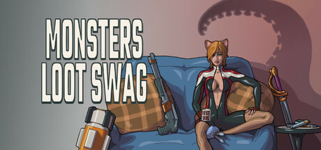
Monsters Loot Swag scored 68/100 on Steam Analyzer — Solid for a Action Roguelike capsule. Top priority fix: [contrast_color] Deepen the value separation between the character's core silhouette and background gradient to improve readability at TINY size and grayscale robustness.

Capsule scores by dimension

  • Genre Clarity: 7/10 — Action shooter with loot focus clear. The twin-stick shooter genre reads well through the character pose, weapon placement (rifle visible left), and loot elements (chest, scattered items). At TINY size, the silhouette of the armed character and treasure chest communicate action and reward loop clearly, though the exact subgenre specifics (top-down twin-stick) require the full image to confirm.
  • Title Readability: 8/10 — Bold white text reads well. MONSTERS LOOT SWAG uses clean, heavy sans-serif lettering with white fill and dark outline, positioned in the upper left on a semi-transparent background. The text remains legible at SMALL size and maintains reasonable readability at TINY, though the outline becomes slightly thinner. Strategic placement away from the central character preserves clarity.
  • Contrast & Color: 7/10 — Warm gradient with good separation. The capsule uses a warm peachy-salmon to cool gray gradient that creates depth and silhouette separation from the #1b2838 Steam background. The character and loot items read clearly against the background gradient, though the mid-tone transition between background and character torso could be sharper. At TINY size, the gradient and character maintain distinct edges.
  • Uniqueness & Polish: 6/10 — Competent but familiar anime-action style. The illustration uses clean anime-adjacent character art with intentional pose and proportions that signal fun, action-oriented gameplay. However, the composition and character treatment feel within expected bounds for indie action games rather than distinctly memorable—no signature visual hook or unexpected art direction that would set it apart from similar titles. The loot and character positioning are functional but not surprising.
  • Brand Consistency: 6/10 — Consistent art style, limited identity. The capsule presents a cohesive illustration style with uniform rendering, consistent character design language, and a clear visual palette. However, without access to the 10 store screenshots, the recognizable identity cues (iconic character, motif, signature elements) cannot be fully assessed. The capsule itself shows internal consistency but reads as generic action-game presentation rather than a strong brand marker.
  • Composition: 7/10 — Clear focal point, slight clutter. The character on the couch sits as a strong primary focal point in the center-right, with the title anchoring the upper left and loot elements (chest, weapons) supporting without overwhelming. The composition creates a readable hierarchy at SMALL and TINY sizes. Minor weakness: the large semi-transparent monster silhouette in the background adds atmosphere but risks reading as visual noise at tiny size.

What works

  • Title legibility and placement. White outlined text positioned on a controlled background region ensures the game name reads clearly from FULL down to TINY size without competing with the primary subject.
  • Character and subject clarity. The seated character pose is instantly recognizable and communicates personality and action readiness, anchoring the composition effectively across all viewing sizes.
  • Genre communication via props. Visible weapons, treasure chest, and loot scattered around immediately signal the action-shooter and collectathon loop without requiring text.

What hurts the capsule

  • Background monster adds noise. The large tentacled creature silhouette in the background contributes atmosphere but creates visual competition that can muddy the read at TINY size and feels tangential to the core loot/action message.
  • Generic anime character style. While well-drawn, the character design follows familiar anime-action conventions without a distinctive hook or memorable visual identity that would support brand recognition.
  • Mid-tone contrast between figure and background. The character's torso and the background gradient occupy similar mid-range values in places, reducing silhouette clarity slightly compared to benchmark titles with sharper separation.

Priority fixes

  1. [contrast_color] Deepen the value separation between the character's core silhouette and background gradient to improve readability at TINY size and grayscale robustness.
  2. [uniqueness_polish] Introduce a distinctive visual signature—unique color accent, iconic prop, or unexpected character detail—that creates brand memorability beyond generic anime-action tropes.
  3. [composition] Reduce or stylize the background monster silhouette to avoid competing with the primary character focal point and clarify the core gameplay message.

Store copy priority fixes

  1. [uniqueness] Add a 1-sentence differentiator explaining what makes this roguelike's loot/cosmetics system stand out (e.g., 'Combining synergistic power-up stacking with cosplay character customization creates thousands of unique playstyle combinations').
  2. [feature_communication] Clarify whether power-ups and cosplay unlocks persist between runs or reset (meta-progression vs. run-based loot), as this fundamentally affects player expectation.
  3. [tone_match] Revise the detailed description opening to sustain the energetic, all-caps tone of the short description for the first 2-3 sentences to eliminate tonal drift.
  4. [audience_targeting] Add a sentence explicitly calling out the intended audience (e.g., 'Perfect for anime fans, roguelike collectors, and couch co-op squads') to strengthen player identification.

Related guides

Steam app ID: 1789310 · Tags: Action Roguelike, Top-Down Shooter, Twin Stick Shooter, Online Co-Op, Loot