Scoring genre clarity...
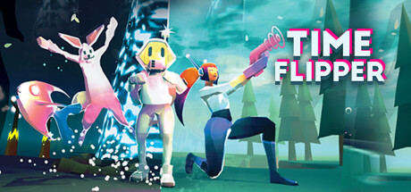
Press one button to switch between timelines. Use this time-flip device to find and liberate missing people. Lead them out by switching the world state. You carry no weapons, so you must time-flip your way around the enemies and violence.
$9.993 user reviews
AdventureMetroidvaniaPuzzle
LushoMar 11, 2025