Scoring genre clarity...

Lokko capsule

Lokko

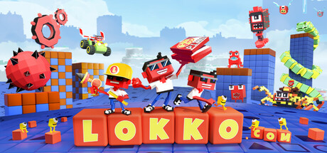
Lokko is a bouncy, action-packed 3D platformer where YOU create the adventure! In Lokko, players race to deliver hot pizzas around the globe while battling the sinister Goobol fast-food corporation.

Free to Play5 user reviews
Early Access3D PlatformerCartoony
Appy Monkeys Software Pvt. Ltd.Dec 18, 2025

Lokko scores 77/100 — better than 77% of Early Access capsules (n=3,067).

5 user reviews · Free to Play · Released Dec 18, 2025 · By Appy Monkeys Software Pvt. Ltd.

Quick text summary

Lokko scored 77/100 on Steam Analyzer — Good for a Early Access capsule. Top priority fix: [uniqueness_polish] Introduce a distinctive visual signature—consider a unique character trait, color accent, or recurring motif that differentiates Lokko from generic platformers.

Capsule scores by dimension

  • Genre Clarity: 8/10 — Clear casual 3D platformer action. The bouncy red cube character with spiky protrusions, bright blue platforms, and energetic pose immediately signal a colorful 3D platformer. The pizza box prop reinforces the casual adventure theme with humor. At tiny size, the character silhouette and platform geometry remain readable enough to convey action platformer genre clearly.
  • Title Readability: 9/10 — Bold yellow type dominates space. The large yellow "LOKKO" lettering with 3D extrusion reads powerfully at all sizes against the blue sky background, with strong value contrast and clear letterforms. The tagline "PIZZA OR DIE!" in yellow maintains legibility even at small sizes due to its positioning below the logo on uncluttered space. At tiny thumbnail size, the blocky geometry of the letters and high saturation ensure the title remains the focal point without collapse.
  • Contrast & Color: 8/10 — Strong value separation and saturation. Bright primary colors—electric yellow title, vibrant red character, blue platforms, and light blue sky—create excellent separation against the expected dark Steam background. The red character pops clearly against both the sky and blue platforms through high saturation and warm-cool contrast. At tiny size, the color zones remain distinct and the silhouette reads well even in grayscale due to value hierarchy.
  • Uniqueness & Polish: 7/10 — Polished cartoon style, modest distinction. The 3D rendered cube character with spike accessories and the playful pizza delivery premise show intentional charm and craft, with clean geometry and consistent lighting. The composition feels premium compared to generic platformers, though the visual style is common in indie casual games and does not establish a uniquely memorable identity that separates it from similar titles. The execution is solid but the core visual hook—spiky red cube—is serviceable rather than iconic.
  • Brand Consistency: 6/10 — Coherent style, limited identity cues. The capsule presents a consistent cartoon-3D aesthetic with coordinated primary colors and a unified art direction that matches the brief glimpse of game context. However, there are no strong signature visual motifs, iconic character markers, or distinctive brand symbols that would make Lokko instantly recognizable in a lineup—the spiky red cube design is functional but not particularly memorable or unique to the brand. The color palette and rendering style appear consistent but generic within the casual platformer space.
  • Composition: 8/10 — Clear hierarchy, balanced focal point. The title anchors the top with strong visual weight, while the red cube character in the center-left acts as the secondary focal point, guided by the platform geometry that creates directional flow toward the right edge. Supporting elements like the pizza box and floating platforms create depth layering without clutter. Safe margins protect the title and key character from crop at small sizes, though the right edge elements risk framing loss on tighter Steam crops.

What works

  • Readable bold title at all sizes. Large yellow 3D extruded letters maintain clarity from full header to tiny thumbnail due to high contrast, letterform robustness, and uncluttered background placement.
  • Strong color contrast and pop. Primary color scheme with high saturation and warm-cool separation ensures the design reads well against dark Steam backgrounds and maintains visual interest even at small scales.
  • Clear genre communication through assets. Spiky character, blue platforms, pizza prop, and energetic pose immediately establish the casual 3D platformer genre without ambiguity.

What hurts the capsule

  • Generic character design. The spiky red cube, while cheerful, lacks a distinctive visual signature that makes Lokko stand out from other indie platformers visually.
  • Right edge element vulnerability. The floating boot and pizza elements on the far right risk being cropped or pushed off-frame on tighter Steam display crops, reducing composition resilience.
  • Limited brand identity markers. No iconic symbol, unique color motif, or signature visual element that would allow players to recognize a Lokko capsule without the title text.

Priority fixes

  1. [uniqueness_polish] Introduce a distinctive visual signature—consider a unique character trait, color accent, or recurring motif that differentiates Lokko from generic platformers.
  2. [composition] Shift key foreground elements (boot, pizza box) more toward center-left safe zone to reduce crop vulnerability on narrow Steam displays.
  3. [brand_consistency] Develop and consistently apply 2-3 signature brand colors or visual markers visible in all future marketing materials to build recognition.

Store copy priority fixes

  1. [hook_strength] Expand the short description to emphasize the player agency angle: "Bounce through a globe-trotting pizza adventure, but here's the twist—build your own levels, design your own challenges, and race friends in real-time across platforms." This leads with both narrative and creative control.
  2. [audience_targeting] Add a sentence after the opening paragraph that explicitly segments the experience: "Whether you're a creative builder, speedrunner, or story lover, Lokko has a mode for you" to clarify who each feature appeals to.
  3. [feature_communication] Reorganize the detailed description to open with gameplay verb first: Lead with "Play through a story-driven campaign, race in local PvP, or jump into creative mode to design and share levels" before listing editor types.
  4. [tone_match] Revise the feature-list sections to use consistently casual, voice-forward language (e.g., "Drop enemies into your level instantly and watch them wreak havoc" instead of "Reshape the look and behavior of every NPC enemy") to match the pizza narrative tone.

Related guides

Steam app ID: 1810630 · Tags: Early Access, 3D Platformer, Cartoony, Level Editor, Sandbox