Scoring genre clarity...

Gravelord capsule

Gravelord

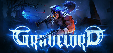
Gravelord is a fast-paced boomer shooter voiced by a badass protagonist featuring hand-crafted levels filled with secrets and hordes of enemies to kill. Dish out some brutal carnage with powerful guns and collect Tarot Cards to gain even more killing power. Let's put the fun back in funeral!

$19.99Very Positive(15)
FPSActionBoomer Shooter
Fatbot Games, s. r. o.May 21, 2026

Gravelord scores 82/100 — better than 95% of FPS capsules (n=1,272).

Very Positive (15 reviews) · $19.99 · Released May 21, 2026 · By Fatbot Games, s. r. o.

Quick text summary

Gravelord scored 82/100 on Steam Analyzer — Good for a FPS capsule. Top priority fix: [uniqueness_polish] Add visual tarot card elements or symbolic iconography to the design to communicate the game's unique card-collection mechanic and differentiate from generic boomer shooters.

Capsule scores by dimension

  • Genre Clarity: 9/10 — Boomer shooter instantly recognizable. The central character holds a large weapon in aggressive stance against a neon-lit industrial setting with glowing blue accents, immediately signaling fast-paced action combat. At TINY size, the silhouette of the armed protagonist and blue energy effects clearly communicate 'shooter' without ambiguity. The purple-blue color palette and sci-fi weapon design reinforce the genre expectation of a high-octane gun-focused experience.
  • Title Readability: 8/10 — Bold logo with strong presence. The 'GRAVELORD' title uses a thick, metallic silver font with glowing blue outlines that stands out sharply against the dark purple background. At SMALL and TINY sizes, the logo remains legible due to its bold weight and strategic placement in the lower-center area. The 'FULL RELEASE!' callout in bright yellow at top-left is also readable, though secondary to the main title placement.
  • Contrast & Color: 9/10 — Excellent value separation and glow. The bright cyan-blue glow effects on the weapon, circular UI elements, and logo edges create strong luminosity contrast against the dark #1b2838 background and purple midtones. The warm-toned character and red/orange armor details pop distinctly from the cool color palette, creating clear silhouette separation. In grayscale, the bright highlights and deep shadows maintain excellent legibility at all sizes.
  • Uniqueness & Polish: 8/10 — Premium sci-fi boomer aesthetic. The capsule demonstrates polished craft with coherent neon-glow effects, detailed character modeling, and a distinctive cyberpunk-western shooter vibe that feels intentional and premium. The metallic logo with integrated glow effects and the layered lighting on the protagonist suggest a well-produced indie title. The visual storytelling—a armed anti-hero in a gothic sci-fi setting—communicates a specific attitude and core mechanic (guns + supernatural theme) rather than generic action.
  • Brand Consistency: 7/10 — Strong palette, recognizable protagonist. The purple-blue neon palette and glowing circular UI motifs appear intentional and consistent with boomer shooter genre expectations, creating a recognizable brand identity. The central protagonist character in distinctive armor becomes a memorable anchor if this is the primary visual of the game. However, without reference to other brand materials, internal consistency is solid but not exceptionally iconic—the palette and character design feel contemporary to the genre rather than uniquely signature.
  • Composition: 8/10 — Clear focal hierarchy with balance. The armed protagonist occupies center-right with strong visual weight, immediately drawing the eye as the primary subject at all sizes. The glowing circular UI elements frame and guide attention without competing for dominance. The 'FULL RELEASE!' callout sits safely in the top-left margin, and the title is positioned in the lower-center, creating a logical top-to-bottom read path that remains intact at SMALL and TINY sizes.

What works

  • Vibrant neon contrast against dark background. Cyan-blue glows and warm character tones create excellent silhouette separation and legibility even at thumbnail size, ensuring the capsule pops in Steam browse views.
  • Boomer shooter genre instantly legible. The armed protagonist pose, weapon design, and sci-fi setting communicate the action-shooter identity clearly without requiring text interpretation.
  • Polished metallic logo with integrated effects. The glowing 'GRAVELORD' title uses coherent lighting and weight that reads well across all sizes while feeling premium and intentional.
  • Strong compositional hierarchy and balance. Primary subject, supporting UI elements, and text callouts are arranged with clear depth and visual weight distribution that guides the eye naturally.

What hurts the capsule

  • Purple-blue palette risks fatigue. The dominant cool color range, while cohesive, may feel samey and less distinctive compared to top-tier competitor capsules that use more diverse color hooks.
  • Character branding not immediately iconic. While the protagonist is well-rendered, the design does not feel as instantly recognizable or memorable as flagship boomer shooter characters, limiting long-term brand recall.
  • Secondary elements could be more action-forward. The glowing circular UI motifs are stylish but somewhat abstract; more explicit gameplay iconography (e.g., tarot cards, specific enemy silhouettes) could reinforce the unique Tarot mechanic.

Priority fixes

  1. [uniqueness_polish] Add visual tarot card elements or symbolic iconography to the design to communicate the game's unique card-collection mechanic and differentiate from generic boomer shooters.
  2. [brand_consistency] Introduce a signature character or mascot motif that becomes instantly recognizable across future marketing materials and store listings.
  3. [composition] Consider adding subtle enemy silhouettes or environmental detail in background layers to strengthen the 'hordes' narrative without cluttering the focal point.

Store copy priority fixes

  1. [hook_strength] Revise the opening of the detailed description to lead with a specific mechanical hook: 'Queedo the Gravedigger tears through demons with a spectral shovel and tarot-powered arsenal, cracking wise in a Cockney accent as he avenges his father' instead of the generic 'knock your socks off' line.
  2. [feature_communication] Add a sentence to the Level Editor section clarifying its current availability status (e.g., 'Available now in early access' or 'Coming with full release'), or move it to a separate 'Roadmap' section to manage expectations.
  3. [audience_targeting] Explicitly mention difficulty settings and accessibility options in the main copy (e.g., 'Adjustable difficulty lets you play at your own pace, whether you're chasing speedrun leaderboards or exploring at a relaxed pace') to signal inclusivity beyond hardcore retro fans.
  4. [uniqueness] Strengthen the Tarot Card system description by adding a concrete example of synergy (e.g., 'Equip the Reaper card to add poison damage to your shotgun, then pair it with the Plague card to spread toxins across enemies') to show mechanical depth.

Related guides

Steam app ID: 1823990 · Tags: FPS, Action, Boomer Shooter, First-Person, Shooter