Scoring genre clarity...
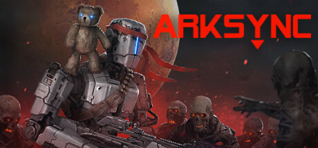
Wired from the ashes of twin stick Shooters, Arksync evolves the genre with breakneck player movement and combat. Survive and buy weapons, utilities, and upgrades; then risk it all as you fight to survive, and take a toy bear home.
$14.99Very Positive(54)
ActionPixel GraphicsDifficult
Dykom SoftwareMar 4, 2026