Scoring genre clarity...
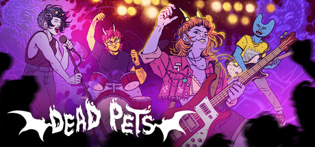
Gordy and her punk band, Dead Pets, haven't hit it big but they will any day now! Go to band practice, crush a diner shift, chat with friends and manage Gordy’s mess of a life. Unleash your inner demon in a feminist, slice-of-life, management-lite, minigame-heavy narrative rhythm game!
$13.49Positive(44)
Dialogue HeavyRock MusicIndie
Triple Topping, Akupara GamesFeb 6, 2026