Scoring genre clarity...
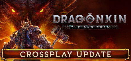
Dragonkin: The Banished capsule

Dragonkin: The Banished

The draconic threat is once again upon us. Legendary heroes rise up to face the legions from the depths. Tame your wyrmlings, create unique power builds with the Ancestral Grid, expand your city and destroy the Dragons!

$17.49Mostly Positive(68)
Hack and SlashAction RPGAction
Eko SoftwareMar 16, 2026

Dragonkin: The Banished scores 80/100 — better than 91% of Hack and Slash capsules (n=995).

Mostly Positive (68 reviews) · $17.49 · Released Mar 16, 2026 · By Eko Software

Quick text summary

Dragonkin: The Banished scored 80/100 on Steam Analyzer — Good for a Hack and Slash capsule. Top priority fix: [title_readability] Remove or significantly enlarge THE BANISHED subtitle, or integrate it into the main DRAGONKIN wordmark to maintain legibility at tiny size

Capsule scores by dimension

  • Genre Clarity: 8/10 — Dragon fantasy action immediately clear. The massive armored dragon figure with glowing eyes and intense fire effects communicates action-fantasy genre instantly. At tiny size, the silhouette of the beast and orange flame backdrop remain legible enough to signal combat focus. Genre-specific iconography (draconic threat, legendary hero pose) is clear without ambiguity.
  • Title Readability: 8/10 — Title readable with minor size stress. DRAGONKIN text is rendered in bold metallic lettering with strong contrast against the dark background. The subtitle 'THE BANISHED' is considerably smaller and becomes difficult to parse at tiny size. At small capsule size (231x87), the main title remains legible, but the subtitle drops to marginal readability and may disappear entirely at thumbnail view.
  • Contrast & Color: 9/10 — Excellent value separation and pop. The warm orange and yellow fire gradients create dramatic contrast against the dark red-brown background and Steam's #1b2838 surface. The dragon's metallic armor and glowing eyes provide sharp focal points with clear edge definition that holds even when squinting. Silhouette remains clean in grayscale and the lighting separation between subject and background is strong throughout all viewing sizes.
  • Uniqueness & Polish: 8/10 — Premium draconic presentation, well-crafted. The dragon character model appears high-fidelity with detailed armor plating, dynamic pose, and integrated fire VFX that suggests combat intensity. The rendering quality and atmospheric fire treatment elevate it above generic fantasy templates. Execution feels polished and intentional, though the composition is relatively traditional for action-fantasy rather than distinctly surprising.
  • Brand Consistency: 7/10 — Cohesive but generic fantasy branding. The metallic typography, draconic motif, and fire palette are internally consistent and reinforce the core fantasy-action identity. However, without reference to store screenshots, the visual identity reads as competent but not particularly iconic or immediately distinguishable from other dragon-themed action games. The brand signals are functional but lack a memorable signature element.
  • Composition: 8/10 — Strong focal point, balanced layout. The dragon dominates the left-center composition with clear primary focus, while the title anchors the right side creating good asymmetrical balance. Fire effects provide depth layering and guide the eye naturally through the frame. At small size, the dragon remains the clear hero despite compression, and the title placement avoids edge-hugging, though safe margin at the top could be slightly generous.

What works

  • Dramatic contrast and visual impact. The warm orange fire against dark background creates immediate eye-catching pop that holds across all viewing sizes including tiny thumbnail.
  • Clear genre and mood communication. Dragon silhouette, armor detail, and fire effects instantly convey action-fantasy combat without ambiguity.
  • Legible primary title treatment. DRAGONKIN text is bold, well-spaced, and maintains readability even at small capsule compression.
  • Professional rendering quality. Character model and fire VFX suggest high production value rather than asset-placeholder or template quality.

What hurts the capsule

  • Subtitle readability collapse. THE BANISHED drops to unreadable at tiny thumbnail size due to small point size and thin letterforms.
  • Generic composition within genre. While well-executed, the dragon-center-with-fire setup is a familiar formula in action-fantasy without distinctive layout innovation.
  • Limited brand identity distinctiveness. The visual language relies on expected fantasy-action tropes without a clear iconic motif or signature element that would stand out in a genre lineup.

Priority fixes

  1. [title_readability] Remove or significantly enlarge THE BANISHED subtitle, or integrate it into the main DRAGONKIN wordmark to maintain legibility at tiny size
  2. [brand_consistency] Develop a distinctive iconographic element (unique dragon mark, signature rune, or motif from the Ancestral Grid system) that appears consistently across store assets to build memorable brand identity
  3. [composition] Consider slight title repositioning to increase top safe margin and ensure no clipping during potential Steam UI overlap at various resolutions

Store copy priority fixes

  1. [hook_strength] Replace "Legendary heroes rise up" in the short description with a more specific, evocative verb phrase that hints at the unique Ancestral Grid mechanic or the stakes of the world (e.g., "Harness dragon blood to craft legendary power builds and liberate a ravaged world").
  2. [uniqueness] Add one sentence to the detailed description that explicitly contrasts the Ancestral Grid with traditional skill trees—e.g., how modifier combinations create emergent builds—and why this matters to players choosing between similar action-RPGs.
  3. [tone_match] Remove or reframe the "Digital Deluxe Edition" label and replace formal section headers with narrative-forward language that maintains the epic adventure tone throughout (e.g., "THE CALL TO ADVENTURE" instead of "JOIN THE DRAGONKIN ADVENTURE IN CO-OP").
  4. [audience_targeting] Add one sentence clarifying the ideal player: e.g., "Perfect for co-op enthusiasts and build-crafting fans who love optimizing power combinations" to help self-selection and reduce mismatched purchases.

Related guides

Steam app ID: 1863430 · Tags: Hack and Slash, Action RPG, Action, Loot, Adventure