Scoring genre clarity...

Periphery Online capsule

Periphery Online

A refugee capsule lands on an uninhabited planet. You have to survive, rebuild civilization and, if possible, regain control over the Earth. One big universe, one endless pvp session for all players.

$4.99Mostly Positive(43)
RTSSpaceFuturistic
Aleksandr NagaevApr 10, 2026

Periphery Online scores 72/100 — better than 49% of RTS capsules (n=504).

Mostly Positive (43 reviews) · $4.99 · Released Apr 10, 2026 · By Aleksandr Nagaev

Quick text summary

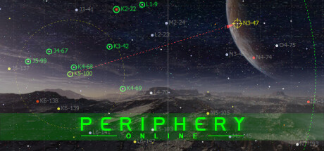
Periphery Online scored 72/100 on Steam Analyzer — Good for a RTS capsule. Top priority fix: [composition] Reduce coordinate label density in the upper orbital region to minimize visual noise and strengthen the planet as a clear secondary focal point.

Capsule scores by dimension

  • Genre Clarity: 7/10 — Space strategy with survival elements clear. The planetary landscape, orbital mechanics UI with coordinate markers, and sci-fi HUD overlay immediately signal a space-based strategy or MMO game. At TINY size, the planet silhouette and green sci-fi text remain readable enough to convey the genre, though the specific PvP survival angle requires prior knowledge to fully grasp.
  • Title Readability: 8/10 — Bold green title legible at all sizes. The all-caps "PERIPHERY ONLINE" uses a bright neon green color with solid letterforms that maintain clarity from full header down to TINY thumbnail. The horizontal centering on a darker sky region ensures the text doesn't compete with noisy background detail, though the small "ONLINE" subtitle is difficult to parse at TINY size.
  • Contrast & Color: 8/10 — Strong green-to-dark value separation. The bright lime-green title pops decisively against the dark blue-purple sky and creates excellent silhouette separation even at TINY size. The planet, landscape midground, and orbital grid lines use warm and cool tones that layer well with the Steam dark background, though the overall midtone density in the landscape could be slightly higher for maximum pop.
  • Uniqueness & Polish: 7/10 — Polished sci-fi aesthetic with MMO appeal. The blend of alien landscape, orbital mechanics, and neon UI text feels intentional and cohesive rather than generic. The coordinate labels and crosshair markers hint at gameplay strategy and positioning, elevating it above a simple landscape shot, though the core concept of 'planet with sci-fi overlay' is familiar in the space-MMO space.
  • Brand Consistency: 6/10 — Sci-fi identity clear but generic application. The neon green color palette, HUD overlays, and coordinate markers are internally consistent and suggest a recognizable brand direction for a space MMO. However, without reference to other Periphery Online materials, the design feels like a competent template execution rather than a truly distinctive identity hook that would be uniquely memorable.
  • Composition: 7/10 — Clear hierarchy with strategic focal point. The landscape occupies the lower two-thirds, the planet anchors the upper right, and the green title sits horizontally centered in the middle, creating a three-layer depth structure. At SMALL and TINY sizes the title remains the primary focal point and the planet silhouette serves as a secondary anchor, though the scattered UI markers add some visual noise that slightly competes for attention in the upper region.

What works

  • Neon title legibility across sizes. The bright green "PERIPHERY ONLINE" text maintains excellent readability from full header to TINY thumbnail due to high contrast and bold letterforms.
  • Layered depth composition. Foreground landscape, midground planet, and background starfield create clear visual separation and guide the eye through multiple focal points.
  • Genre signals via UI elements. Coordinate markers, crosshairs, and HUD-style overlays immediately communicate space strategy and MMO mechanics without needing additional context.
  • Strong color contrast against Steam background. The neon green and blue-purple palette creates excellent value separation that ensures the capsule will stand out in a store browse feed.

What hurts the capsule

  • Scattered UI noise in upper region. The numerous coordinate labels and orbital markers create visual clutter that competes with the planet as a secondary focal point, reducing compositional clarity.
  • "ONLINE" subtitle illegible at TINY. The small secondary text below the main title becomes unreadable at thumbnail size, limiting the complete brand message delivery.
  • Generic space-MMO template feeling. While polished, the combination of alien landscape plus sci-fi HUD overlay follows a familiar formula that doesn't distinguish Periphery Online from other space strategy titles.
  • Limited brand identity markers. No iconic character, faction symbol, or signature motif is visible that would make the capsule uniquely recognizable as Periphery Online specifically versus any space MMO.

Priority fixes

  1. [composition] Reduce coordinate label density in the upper orbital region to minimize visual noise and strengthen the planet as a clear secondary focal point.
  2. [title_readability] Remove or significantly enlarge the "ONLINE" subtitle, or integrate it into the main title lock-up to ensure full brand message legibility at TINY size.
  3. [uniqueness_polish] Introduce a faction-specific symbol, ship silhouette, or character element that creates a memorable identity hook distinct from generic space-MMO conventions.
  4. [brand_consistency] Add a consistent color accent or motif that reinforces Periphery Online's unique visual signature across all marketing materials.

Store copy priority fixes

  1. [hook_strength] Rewrite the short description to lead with the core hook: 'One endless PvP universe where wars rage for months, offline progress continues, and a single victory condition drives all competition' instead of the generic survival premise.
  2. [audience_targeting] Add explicit clarity about PvP safety: specify whether beginners have protection periods, whether safe-zone planets exist long-term, or whether 'quiet play' means accepting slow progression.
  3. [tone_match] Remove or reframe the 'don't be alarmed' reassurance in the final paragraph to sound confident rather than defensive—e.g., 'Start small on a sprawling beginner world with time to master the core loop before major conflicts emerge.'
  4. [feature_communication] Add one sentence explaining the diplomacy system mentioned in the feature list, as it is listed but never explained in the detailed description.

Related guides

Steam app ID: 1873750 · Tags: RTS, Space, Futuristic, Massively Multiplayer, Sci-fi