Scoring genre clarity...

Babushka's Glitch Dungeon capsule

Babushka's Glitch Dungeon

Oh hello dearie.. Babushka needs to clean up her big magical cellar. Use hag magic, or just hit stuff with your broom.

$2.99Very Positive(10)
Exploration2D PlatformerFemale Protagonist
pets club 2Apr 4, 2025

Babushka's Glitch Dungeon scores 63/100 — better than 7% of Exploration capsules (n=4,872).

Very Positive (10 reviews) · $2.99 · Released Apr 4, 2025 · By pets club 2

Quick text summary

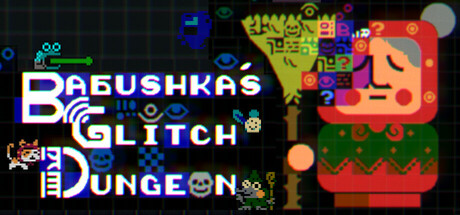
Babushka's Glitch Dungeon scored 63/100 on Steam Analyzer — Solid for a Exploration capsule. Top priority fix: [contrast_color] Increase value separation between dungeon tile colors and dark background by brightening greens and browns or adding outline edges to mid-tone elements.

Capsule scores by dimension

  • Genre Clarity: 7/10 — Retro indie action with magical theme. The pixelated art style, glitchy visual effects, and broom-wielding character silhouette clearly signal retro indie game aesthetics. The magical cellar setting with colorful dungeon elements and spell effects communicate action-adventure gameplay, though the casual, whimsical tone reads more adventure-lite than hardcore action. At TINY size, the chunky pixel art and bright color bursts still convey 'indie action game' effectively, though the specific 'Babushka magic' hook becomes less readable.
  • Title Readability: 6/10 — Title readable but composition obscures clarity. The title 'BABUSHKA'S GLITCH DUNGEON' uses clean white lettering with blue and purple accent colors on a dark background, which provides adequate contrast at FULL size. However, at SMALL and TINY sizes, the multi-line layout and decorative glitch effects make the text harder to parse quickly, and the word spacing becomes cramped. The title competes with busy background elements rather than sitting on a controlled region, reducing impact during quick scroll.
  • Contrast & Color: 7/10 — Strong pops with minor mid-tone blending. Bright neon blues, yellows, reds, and greens create clear separation against the dark grid background (#1b2838 equivalent). The character and dungeon elements have vivid silhouettes that read well even at reduced sizes. However, some mid-tone green and brown dungeon tiles blend slightly with the darker background areas, and the glitch effect overlay adds visual noise that reduces overall clarity in grayscale compression.
  • Uniqueness & Polish: 6/10 — Competent retro aesthetic without standout hook. The capsule executes a familiar retro pixel-art style cleanly with thematic glitch overlays that fit the game title. The Babushka character and broom-wielding pose provide character identity, but the overall composition feels like a well-crafted generic indie dungeon crawler rather than a distinctive visual statement. The glitch effects and neon color choices are trendy in indie games but do not communicate a unique mechanic or memorable selling point that sets this apart from the genre.
  • Brand Consistency: 6/10 — Consistent retro style with recognizable protagonist. The pixelated art direction, neon palette, and glitch effects are internally cohesive and would be recognizable across marketing materials. The Babushka character model provides a memorable identity anchor. However, the capsule does not establish a signature visual motif or distinctive brand symbol beyond 'retro pixel + glitch effect,' which is common across indie games and lacks a unique identity cue that would allow player recall without the title text.
  • Composition: 6/10 — Balanced but scattered focal point. The Babushka character occupies the left-center area and serves as the primary subject, while the dungeon tileset and UI elements fill the right side with supporting visual weight. The layout is reasonably balanced, but the title competes for attention in the upper left, and the scattered glitch particles create equal emphasis across the canvas rather than guiding the eye in a clear hierarchy. At TINY size, the composition reads as 'busy retro game scene' rather than immediately clarifying the protagonist or core gameplay loop.

What works

  • Strong silhouette contrast. Bright neon colors and crisp pixelated edges create clear visual separation from the dark Steam background, maintaining readability even at small thumbnail sizes.
  • Character identity present. The Babushka protagonist with broom is visually distinct and memorable, providing a clear character anchor for brand recognition across store materials.
  • Thematic coherence. Glitch effects, dungeon tileset, and magical UI elements align well with the game's title and premise, creating a unified retro-magical aesthetic.

What hurts the capsule

  • Mid-tone background blending. Green and brown dungeon tiles lack sufficient contrast separation from darker background areas, reducing clarity in grayscale compression and at thumbnail sizes.
  • Cluttered focal point hierarchy. Glitch particles, decorative effects, and supporting UI elements compete for attention rather than guiding the eye to a single clear subject, weakening composition at small sizes.
  • Generic indie visual language. While well-executed, the retro pixel + neon glitch aesthetic is common across indie titles and does not establish a distinctive visual hook or unique selling point.

Priority fixes

  1. [contrast_color] Increase value separation between dungeon tile colors and dark background by brightening greens and browns or adding outline edges to mid-tone elements.
  2. [composition] Reposition title to a clean top region with solid backing, moving glitch effects away from text to improve readability at SMALL and TINY sizes.
  3. [uniqueness_polish] Add a signature visual motif or distinctive character pose/animation frame that differentiates Babushka from generic retro dungeon crawlers.

Store copy priority fixes

  1. [feature_communication] Clarify the death-loop mechanic in one sentence: specify whether it is a roguelike checkpoint system, a story mechanic, or permanent progression, e.g., 'Each death resets the dungeon but permanently teaches you new spells' or similar.
  2. [uniqueness] Add one sentence explicitly contrasting this from other puzzle-platformers, e.g., 'Unlike typical dungeon crawlers, you progress not through combat but by mastering colorful spells that rewrite the rules of each room.'
  3. [audience_targeting] Include a brief difficulty or playstyle signal in the detailed description, e.g., 'Perfect for players who love exploration and discovery over twitch reflexes' or 'Designed for curious, patient explorers.'
  4. [feature_communication] Expand the spell system description to mention a rough count or example of spell types, e.g., 'Master over X spells like [example] and [example] that fundamentally change how you interact with the dungeon.'

Related guides

Steam app ID: 1876850 · Tags: Exploration, 2D Platformer, Female Protagonist, Puzzle Platformer, Nonlinear