Scoring genre clarity...

Below the Crown capsule

Below the Crown

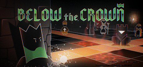
Explore the dungeons Below the Crown, in this love letter to Roguelikes, Dungeon Crawlers, and Chess. Prepare for strategy, game-changing spells, psychological tests, and challenges from your fellow players. From the award-winning creators of Duskers & A Virus Named TOM.

$14.99Very Positive(59)
StrategyTurn-Based TacticsRoguelite
Misfits AtticApr 21, 2026

Below the Crown scores 72/100 — better than 44% of Strategy capsules (n=5,103).

Very Positive (59 reviews) · $14.99 · Released Apr 21, 2026 · By Misfits Attic

Quick text summary

Below the Crown scored 72/100 on Steam Analyzer — Good for a Strategy capsule. Top priority fix: [brand_consistency] Introduce or emphasize a distinctive visual motif (character silhouette, iconic crown design, or signature spell effect) that becomes recognizable as the game's signature across marketing materials.

Capsule scores by dimension

  • Genre Clarity: 7/10 — Strategy dungeon crawler evident. The chess-like board floor, dungeon architecture, and mystical casting effects clearly signal strategy-RPG gameplay at full size. At TINY size, the geometric floor and glowing spell effect remain readable as a tactics game, though the roguelike/chess fusion specificity becomes less distinct. The green crown icon and dungeon setting support genre recognition but don't scream 'chess-strategy hybrid' at smallest sizes.
  • Title Readability: 8/10 — Title legible with strong outline. The green outlined 'BELOW the CROWN' title uses clear letter forms with strong contrast against the dark background and is readable at both SMALL and TINY sizes. The mixed-case treatment (all caps for major words, lowercase for 'the') adds visual interest without hurting legibility. At TINY size, the lettering maintains clarity due to the outline weight, though fine serifs become harder to parse.
  • Contrast & Color: 8/10 — Strong green-amber color separation. The neon green title and UI elements contrast sharply against the #1b2838 background, with warm orange floor lighting providing secondary contrast separation. The value difference between the bright green crown/text and dark dungeon maintains silhouette clarity across all sizes including TINY. In grayscale, the bright green reads as light while the dark dungeon reads as deep shadow, creating strong edge definition.
  • Uniqueness & Polish: 7/10 — Thematic but moderately distinctive. The capsule effectively communicates a chess-dungeon aesthetic with intentional art direction—the geometric board floor, gothic architecture, and arcane spell effects show cohesive craft rather than template assembly. However, the scene is somewhat standard for strategy-dungeon games; the visual hook relies heavily on theme rather than a unique mechanical or narrative twist that would elevate it to premium tier. The execution is clean and polished but doesn't have the iconic visual signature of top-tier indie strategy games like Balatro or Hades II.
  • Brand Consistency: 6/10 — Consistent palette, generic iconography. The green-and-orange color scheme and dungeon-chess aesthetic appear consistent across the visible scene with coherent lighting and rendering style. However, there are no immediately iconic character, symbol, or motif that would make this recognizable as 'Below the Crown' specifically rather than a generic strategy-dungeon game. The crown element is visible but subtle; a more prominent or distinctive brand mark would strengthen recognition across the store.
  • Composition: 7/10 — Clear focal point with good depth. The glowing spell effect in the lower-left foreground serves as a strong primary focal point, with the geometric board and dungeon architecture creating clear background-to-foreground layering. The title anchors the top without interfering with the game scene, and the right side shows secondary detail (NPCs/enemies) that support without competing. At SMALL size, the composition reads well; at TINY, the focal point remains clear though architectural detail becomes abstract.

What works

  • Strong legible title treatment. Green outlined lettering with sufficient weight and contrast maintains readability from FULL down to TINY sizes without collapsing.
  • High contrast against dark background. Neon green and warm orange elements create clear separation in both color and value that supports quick recognition during fast scrolling.
  • Clear focal depth and hierarchy. Foreground spell effect, midground floor, and background dungeon create visual layering that guides eye movement and prevents clutter.
  • Thematic art direction. Chess-board floor, gothic dungeon setting, and arcane effects coherently communicate the strategy-roguelike blend without visual noise.

What hurts the capsule

  • Generic dungeon-strategy look. While competently executed, the scene lacks a distinctive hook or iconic visual element that would differentiate it from other strategy-dungeon competitors.
  • Weak brand identity signal. The crown element is present but visually subtle; there's no immediately memorable icon or character that would make this recognizable as 'Below the Crown' on repeat exposure.
  • Limited narrative hook in visuals. The capsule communicates genre well but does not visually suggest the unique psychological/multiplayer challenge or award-winning pedigree that differentiates it from genre peers.

Priority fixes

  1. [brand_consistency] Introduce or emphasize a distinctive visual motif (character silhouette, iconic crown design, or signature spell effect) that becomes recognizable as the game's signature across marketing materials.
  2. [uniqueness_polish] Add a visual storytelling element that hints at the unique selling points—e.g., a tense multiplayer interaction, psychological test visual, or award winner call-out—to elevate beyond generic dungeon-crawler positioning.
  3. [contrast_color] Consider slightly boosting the saturation or brightness of the green title to ensure it reads distinctly at the tiniest Steam thumbnail size (120x45) during scrolling.

Store copy priority fixes

  1. [feature_communication] Expand the spell mechanics section with 1-2 concrete examples: e.g., 'Cast spells like Fireball to chain damage or Teleport to reposition your pieces' to clarify tactical depth.
  2. [feature_communication] Clarify the purpose of psychological tests in a new sentence within or after 'This is a Test': e.g., 'These reflections shape your character's growth and narrative progression' to justify their inclusion.
  3. [audience_targeting] Add a sentence addressing solo vs. multiplayer play explicitly: e.g., 'Single-player campaign with optional asynchronous community challenges for those who want them' to set expectations.

Related guides

  • Steam page optimisationCapsule, copy, screenshots, tags — the full Steam page conversion stack.
  • Steam tags guideTag selection, ordering, and how it shapes Steam's recommendation rails.

Steam app ID: 1883920 · Tags: Strategy, Turn-Based Tactics, Roguelite, Dungeon Crawler, Turn-Based Strategy