Scoring genre clarity...
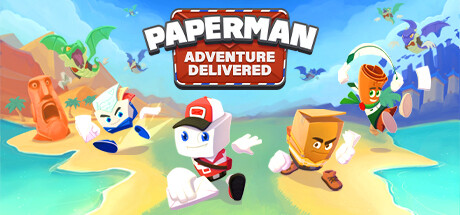
Paperman: Adventure Delivered capsule

Paperman: Adventure Delivered

Explore colorful worlds, uncover secrets, and collect all golden letters in this 3D collectathon platformer. Go on an adventure with Paperman and the team, find the lost mail and defeat the greedy dragon!

$9.99Mixed(19)
Family FriendlyOpen WorldAction
Secret Item GamesSep 21, 2023

Paperman: Adventure Delivered scores 87/100 — better than 97% of Family Friendly capsules (n=3,045).

Mixed (19 reviews) · $9.99 · Released Sep 21, 2023 · By Secret Item Games

Quick text summary

Paperman: Adventure Delivered scored 87/100 on Steam Analyzer — Excellent for a Family Friendly capsule. Top priority fix: [composition] Consider simplifying the background environment clutter or increasing contrast between foreground characters and background elements to strengthen focal clarity at tiny sizes.

Capsule scores by dimension

  • Genre Clarity: 9/10 — Vibrant 3D collectathon platformer. The capsule immediately communicates a colorful, whimsical 3D platformer through the bright cheerful landscape, multiple playable characters in distinct poses, and scattered collectibles like the golden letter visible on the right. At tiny size, the vibrant color palette, character silhouettes, and action-focused staging clearly signal a casual adventure platformer rather than any other genre.
  • Title Readability: 9/10 — Bold, clear, instantly legible. The main title 'PAPERMAN' uses a thick, white-outlined bold sans-serif font positioned prominently in the upper-center against a controlled red banner background, ensuring readability at all sizes including tiny. The subtitle 'ADVENTURE DELIVERED' maintains similar treatment and remains readable at small size, with no decorative collapse or micro-detail loss.
  • Contrast & Color: 9/10 — Excellent pop and silhouette clarity. The bright, saturated cyan-blue sky, vibrant greens, yellows, and warm oranges create strong value separation against the Steam dark background. Character silhouettes stand out distinctly with white and bold color accents; the golden box and white paperman character maintain crisp edge definition even at tiny size, and the overall warm-to-cool color hierarchy guides the eye naturally.
  • Uniqueness & Polish: 8/10 — Polished, charming, distinctive art. The capsule demonstrates excellent craft with clean 3D rendering, intentional character design, coherent lighting, and a memorable paper-craft art style that differentiates it from generic platformers. The whimsical tone, multiple character personalities, and detailed scenic depth create visual storytelling that communicates the core mechanic of exploration and collection, though the style follows established casual indie conventions rather than breaking completely new ground.
  • Brand Consistency: 8/10 — Cohesive, recognizable identity. The capsule establishes a clear brand identity through the iconic Paperman character design, consistent warm-bright color palette, and playful paper-craft aesthetic visible across the scene. The art direction is internally consistent with coherent rendering style and a distinctive visual hook that would be recognizable in future marketing; however, without access to all 6 screenshots, brand signal strength at recall level cannot be fully verified.
  • Composition: 9/10 — Excellent hierarchy and focal clarity. The composition uses clear depth layering with a background sky, mid-ground landscape platforms, and foreground character group that create natural hierarchy. The Paperman character in center-bottom serves as the primary focal point, while supporting characters and collectibles guide the eye without competing; title placement at top is safe from crop, and negative space is minimal and intentional, maintaining strong visual balance at small and tiny sizes.

What works

  • Genre clarity and visual communication. Bright, cheerful palette and multiple characters in action poses immediately signal a colorful 3D platformer collectathon at any size.
  • Title legibility across all sizes. Bold white-outlined sans-serif on red banner ensures the main title remains crisp and readable from full header down to tiny thumbnail.
  • Strong silhouette separation and contrast. Characters and collectibles maintain distinct outlines and value separation against both the in-game background and Steam dark theme, supporting discoverability at small sizes.
  • Coherent art direction and polish. Consistent 3D rendering, intentional character personality, and paper-craft aesthetic create a premium, distinctive look that stands apart from generic platform games.

What hurts the capsule

  • Subtle supporting character detail loss at tiny. The smaller characters on the left and right edges lose fine personality cues and visual distinctiveness when compressed to thumbnail size, reducing character recognition.
  • Crowded scene risks information overload. Multiple characters, collectibles, and environmental objects compete for attention in the composition, which could dilute focus in peripheral scanning.

Priority fixes

  1. [composition] Consider simplifying the background environment clutter or increasing contrast between foreground characters and background elements to strengthen focal clarity at tiny sizes.
  2. [brand_consistency] Establish and reinforce a signature character pose or icon that can serve as a memorable brand anchor across all marketing touchpoints.

Related guides

Steam app ID: 1887310 · Tags: Family Friendly, Open World, Action, Co-op, 3D Platformer