Scoring genre clarity...

Another Crab's Treasure capsule

Another Crab's Treasure

In a vibrant undersea kingdom on the verge of collapse, a hermit crab embarks on a treasure hunt to buy back his repossessed shell. The second game from AGGRO CRAB.

$11.99Very Positive(219)
Souls-like3D PlatformerFunny
Aggro CrabApr 25, 2024

Another Crab's Treasure scores 87/100 — better than 97% of Souls-like capsules (n=474).

Very Positive (219 reviews) · $11.99 · Released Apr 25, 2024 · By Aggro Crab

Quick text summary

Another Crab's Treasure scored 87/100 on Steam Analyzer — Excellent for a Souls-like capsule. Top priority fix: [composition] Consider subtle emphasis enhancement on the crab silhouette through a thin glow or outline at tiny size to ensure protagonist remains the dominant focal point amid the treasure scatter

Capsule scores by dimension

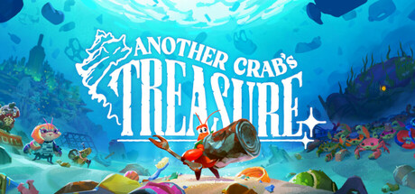
  • Genre Clarity: 9/10 — Underwater adventure perfectly clear. The hermit crab protagonist in an action pose with treasure hunting tools, vibrant coral reef setting with scattered treasures, and playful art style immediately signal an undersea adventure game. At tiny size, the crab silhouette and ocean environment remain unmistakably readable and genre-specific. The visual language—colorful marine life, sand floor littered with loot, dynamic posture—communicates action-adventure indie sensibility without ambiguity.
  • Title Readability: 9/10 — Bold title excellent legibility. The 'ANOTHER CRAB'S TREASURE' text uses a thick, all-caps sans-serif with strong white letterforms and a clean crab icon integrated into the logo, positioned prominently in the upper third on a solid cyan-to-blue gradient background. At tiny size the title remains fully readable with crisp contrast and no letterform collapse. The logo design is cohesive, memorable, and maintains clarity across all viewing scales.
  • Contrast & Color: 9/10 — Vibrant palette pops strongly. The composition uses a rich cyan-to-deep-blue gradient background with warm orange and coral accents on the crab and treasures, creating strong value separation against the dark Steam background. Bright pinks, yellows, and warm metallics in the scattered loot create multiple focal points with excellent legibility even in grayscale contrast simulation. The saturation is controlled but punchy, avoiding muddiness while maintaining visual harmony.
  • Uniqueness & Polish: 9/10 — Distinctive indie art direction. The hand-crafted illustration style with a charming hermit crab protagonist, whimsical treasure pile, and cohesive underwater color grading convey premium indie polish and clear artistic vision. The integration of the crab icon into the title and the dynamic action pose show intentional design craft beyond a generic asset placement. The visual storytelling—a crab searching for treasure in a colorful reef—communicates the core mechanic and unique premise without feeling derivative.
  • Brand Consistency: 8/10 — Strong character identity established. The orange hermit crab with distinctive pose and proportions serves as a recognizable brand icon, consistent with AGGRO CRAB's indie studio identity and the game's whimsical tone. The coral-and-treasure visual motif and the warm-to-cool color palette reinforce a cohesive brand voice. Internal consistency is strong across the title logo, character design, and environmental palette, though without access to other marketing materials the score cannot reach 9.
  • Composition: 8/10 — Clear hierarchy with layered depth. The crab is positioned center-right as the primary focal point with dynamic action pose, the title dominates the upper portion with strong prominence, and the scattered treasure creates visual depth and interest in the foreground without cluttering. At small and tiny sizes the crab and title remain the clear primary subjects while the background coral reef recedes appropriately. The composition uses safe margins and avoids edge-hugging; the layered depth from ocean floor through scattered treasure to background rocks creates natural eye flow.

What works

  • Iconic crab character. The orange hermit crab is instantly recognizable, distinctive, and serves as a memorable visual anchor that will help players identify the game at a glance.
  • Excellent color harmony. The cyan-to-blue ocean gradient paired with warm orange and coral accents creates a vibrant, appealing palette that stands out against the dark Steam background without feeling garish.
  • Strong visual storytelling. The treasure pile, crab protagonist, and underwater setting communicate the game's core premise—a treasure hunt adventure—in seconds without requiring text.
  • Polished indie presentation. Hand-drawn illustration quality and intentional design craft convey premium indie polish that elevates the capsule above generic asset compilations.

What hurts the capsule

  • Busy foreground clutter. The scattered treasure pile, while visually interesting, creates considerable noise that could potentially compete with the crab focal point at very small sizes if not carefully managed.
  • Title placement competes with art. The title occupies significant vertical space in the upper-middle area, which while readable, limits the prominence of the crab character in the composition hierarchy.

Priority fixes

  1. [composition] Consider subtle emphasis enhancement on the crab silhouette through a thin glow or outline at tiny size to ensure protagonist remains the dominant focal point amid the treasure scatter
  2. [uniqueness_polish] Verify the illustration maintains character consistency across all game marketing materials and in-game visuals to reinforce brand identity across platforms

Related guides

Steam app ID: 1887840 · Tags: Souls-like, 3D Platformer, Funny, Action RPG, Cartoony