Scoring genre clarity...
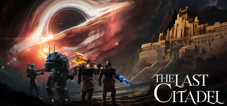
The Last Citadel is a Roguelite, Role-Based, Third-Person shooter. Embark in an expedition to uncover artifacts inside a Citadel suspended above a black hole where many challenges and deadly encounters await. Explore the ever-changing citadel alone, or with a group of up to 4 players.
$14.99Very Positive(64)
ActionThird-Person ShooterStylized
Honest DemonFeb 16, 2026