Scoring genre clarity...
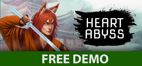
HEART ABYSS capsule

HEART ABYSS

Heart Abyss is a brutal action-platformer inspired by Japan during the 17th and 18th centuries. Wake up your inner beast and take vengeance on those who put a collar around your neck. Find your sister and uncover the mystery behind the disappearance of all jinkos.

2D PlatformerGoreViolent
DEADMAPComing soon

HEART ABYSS scores 78/100 — better than 86% of 2D Platformer capsules (n=2,001).

Released Coming soon · By DEADMAP

Quick text summary

HEART ABYSS scored 78/100 on Steam Analyzer — Good for a 2D Platformer capsule. Top priority fix: [uniqueness_polish] Add a distinctive visual hook that communicates the 'beast awakening' or 'collar removal' core mechanic—consider a subtle glowing aura, rupture effect, or chain imagery that sets this apart from generic character-with-weapon capsules

Capsule scores by dimension

  • Genre Clarity: 8/10 — Strong action-adventure martial theme. The red-haired character wielding a blue blade against an Asian architectural backdrop clearly signals action-adventure with Eastern martial aesthetics. At TINY size, the character silhouette, weapon pose, and misty Japanese setting remain legible and communicate the genre effectively. The visual language aligns well with samurai/revenge narratives and brutal action games.
  • Title Readability: 9/10 — Excellent contrast and placement. HEART ABYSS uses white sans-serif typography on a black ink-splatter background, creating strong value separation against the dark Steam background (#1b2838). The title maintains clarity at SMALL and TINY sizes due to the clean sans-serif letterforms and intentional contrast framing. Strategic placement on the right side avoids competing with the character focal point.
  • Contrast & Color: 8/10 — Strong warm-cool value separation. The warm orange-red character and clothing create excellent contrast against cool misty blues and grays in the background, with the black title splatter adding additional punch. At TINY size, the warm figure reads clearly against the cool atmospheric backdrop. The value range is well-controlled with distinct lighting separation between subject and environment.
  • Uniqueness & Polish: 7/10 — Polished anime-art aesthetic, somewhat familiar. The digital illustration demonstrates solid craft with clean rendering, expressive character design, and intentional color theory. The black ink-splatter typography effect adds personality and breaks from generic title treatment. However, the overall composition—anime character with weapon against moody background—follows familiar action-game capsule patterns, limiting distinctiveness despite competent execution.
  • Brand Consistency: 7/10 — Coherent jinko character identity. The distinctive red-haired jinko (beast character) with feline features and warrior stance establishes a recognizable protagonist icon that could anchor the game's visual identity. The warm color palette, Asian architectural setting, and character design create internal cohesion across visual elements. Without access to other marketing materials, internal consistency appears strong, though the identity feels somewhat similar to other anime-style action games.
  • Composition: 8/10 — Clear hierarchy with strong focal point. The character occupies the left-center focal point with weapon raised, drawing immediate attention, while the title occupies the right side in secondary position creating natural eye flow. Depth layering is evident with foreground character, midground architecture, and background mist establishing spatial clarity. The composition remains effective at SMALL and TINY sizes with no critical elements approaching unsafe margins.

What works

  • Excellent title contrast and legibility. White text on black splatter background maintains readability at all sizes, from FULL to TINY, with clean sans-serif letterforms that don't collapse.
  • Strong character focal point and pose. The jinko character's weapon-raised stance and distinct silhouette immediately communicate action-adventure intent and create a memorable protagonist hook.
  • Effective warm-cool color contrast. Orange-red character values pop distinctly against cool blue-gray atmospheric background, creating visual separation that reads at small sizes.
  • Coherent Eastern martial aesthetic. Japanese architecture, character design, and weapon styling create unified visual language that reinforces genre and setting authenticity.

What hurts the capsule

  • Familiar anime action composition pattern. Character-with-weapon against moody background follows well-worn genre template seen in many competing action titles, reducing visual distinctiveness.
  • Limited environmental storytelling specificity. While the misty Asian setting is clear, the capsule doesn't distinctly communicate the 'brutal' or 'vengeance' narrative hooks that differentiate the premise.
  • Generic mist effects reduce visual clarity. Heavy atmospheric fog treatment, while atmospheric, slightly obscures background detail and could be read as a standard template effect rather than intentional design choice.

Priority fixes

  1. [uniqueness_polish] Add a distinctive visual hook that communicates the 'beast awakening' or 'collar removal' core mechanic—consider a subtle glowing aura, rupture effect, or chain imagery that sets this apart from generic character-with-weapon capsules
  2. [genre_clarity] Enhance the 'brutal' violence messaging through more dynamic action pose or visual impact effect (weapon glow, slash trail, energy discharge) to differentiate from standard martial-arts action games
  3. [composition] Reduce or stylize atmospheric mist density in the background to increase silhouette clarity and character readability at TINY thumbnail size

Related guides

Steam app ID: 1892100 · Tags: 2D Platformer, Gore, Violent, Samurai, Pixel Graphics