Scoring genre clarity...
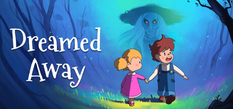
Dreamed Away is an emotional action-adventure RPG with psychological horror elements. Play as Théo, a boy lost in a dark, mysterious world. Explore a unique reality, duel against darkness in a unique, fast paced combat system and mind your choices.
$18.99Very Positive(58)
Story RichPixel GraphicsRPG
WAKE UP GAMESOct 23, 2025