Scoring genre clarity...
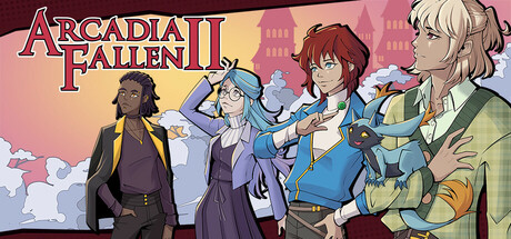
Arcadia Fallen II capsule

Arcadia Fallen II

In this sequel to the award-winning roleplay visual novel, Arcadia Fallen, you play as a senior student at the Seven Winds Academy. Choose from three different magical disciplines, and let your choices shape the personality of your character as you navigate school life during a time of great change.

$29.99Very Positive(161)
Choose Your Own AdventureVisual NovelDating Sim
Galdra StudiosApr 9, 2026

Arcadia Fallen II scores 77/100 — better than 85% of Choose Your Own Adventure capsules (n=1,050).

Very Positive (161 reviews) · $29.99 · Released Apr 9, 2026 · By Galdra Studios

Quick text summary

Arcadia Fallen II scored 77/100 on Steam Analyzer — Good for a Choose Your Own Adventure capsule. Top priority fix: [genre_clarity] Add subtle visual novel mechanic cues such as a choice interface element or branching path symbol to differentiate from generic anime RPGs at thumbnail size

Capsule scores by dimension

  • Genre Clarity: 8/10 — Visual novel RPG identity clear. The capsule immediately communicates a narrative-driven anime RPG through character-focused composition, distinct character archetypes in school uniforms, and magical aura effects around figures. At TINY size, the silhouettes and character poses remain readable enough to signal a character-driven story game, though the specific visual novel subgenre is inferred rather than explicitly stated through UI or mechanical cues.
  • Title Readability: 8/10 — Title bold and well-positioned. ARCADIA FALLEN II uses a strong red and gold serif-style logo with white outline that contrasts sharply against the warm background and holds legibility at small sizes. The title placement in the upper left avoids character overlap and maintains clarity even at TINY size, though the decorative serif font requires slightly larger scale to distinguish fine details.
  • Contrast & Color: 8/10 — Warm palette pops cleanly. The warm peachy-gold background gradient with burgundy accents creates strong value separation against the Steam dark background #1b2838, while character silhouettes in cool purples, blues, and greens provide color contrast that reads at all sizes. Character outlines are crisp and the lighting separation between foreground figures and background is consistent, maintaining clarity even at TINY thumbnail size.
  • Uniqueness & Polish: 7/10 — Polished but genre-familiar aesthetic. The art direction shows professional anime-style rendering with clean linework, intentional character differentiation, and coherent warm color grading that suggests a premium visual novel experience. However, the composition and execution fall within expected visual novel design conventions; while well-executed, it lacks a distinctive hook or unique mechanical insight that would elevate it above the established genre baseline.
  • Brand Consistency: 7/10 — Recognizable visual novel identity. The capsule establishes clear brand identity through consistent anime character design, a signature warm color palette, and the recognizable serif logo treatment that should carry across marketing materials. The academy setting, character diversity, and romantic visual novel tropes create internal cohesion, though without exposure to other Arcadia Fallen II materials, the specific franchise identity cues are inferred rather than iconic.
  • Composition: 8/10 — Strong focal hierarchy with characters. Five distinct characters occupy the right and center zones with clear depth layering—brown-haired character anchors center-right, supporting cast arranged in overlapping poses that guide the eye naturally across the frame. Title placement in upper left provides balance without competing for attention, and character positioning maintains good spacing from edges, though at SMALL size some supporting character details begin to blur together slightly.

What works

  • Logo contrast and placement. Red and gold title with white outline sits cleanly in safe space away from character clutter and reads clearly at all viewing sizes.
  • Character silhouette clarity. Five distinct character poses with varied clothing colors and poses create instant visual interest and character-driven identity that communicates narrative focus.
  • Color harmony and mood. Warm peachy-gold gradient with cool character accents creates professional polish and strong contrast against dark Steam background without feeling chaotic.
  • Depth layering and composition. Clear foreground-to-background progression with characters at varying scales and overlap creates visual hierarchy that guides attention to central figures.

What hurts the capsule

  • Genre subgenre specificity. While the visual novel identity is clear, there are no explicit UI hints or mechanical iconography that differentiate this from generic anime RPGs at TINY size.
  • Unique selling point visibility. The capsule does not visually communicate what makes Arcadia Fallen II distinct from other visual novels—choice systems, branching narrative, or academy mechanics are not evident.
  • Supporting character legibility at small. At TINY size, the background character (far left in dark suit) and rear-positioned figures lose distinction and begin to merge into visual noise.

Priority fixes

  1. [genre_clarity] Add subtle visual novel mechanic cues such as a choice interface element or branching path symbol to differentiate from generic anime RPGs at thumbnail size
  2. [uniqueness_polish] Enhance the central character's focal emphasis or add a distinctive magical or academy-specific visual element that signals the sequel's unique hook
  3. [composition] Reduce visual complexity of background characters or increase their value separation so supporting cast remains readable at SMALL and TINY sizes without blending

Store copy priority fixes

  1. [hook_strength] Rewrite the short description to lead with the castle secret or political intrigue: 'When senior mages at the Seven Winds Academy uncover a hidden secret, their school year spirals into unexpected danger. Choose your magical path, make choices that define your character, and navigate romance, friendship, and mystery.' This front-loads narrative curiosity.
  2. [uniqueness] Add a sentence explicitly contrasting or expanding on the first game's legacy in the detailed description opening: e.g., 'Seven years later, the world has shifted—and so has the Academy. New magic, new companions, and consequences that ripple across the Empire await.' This clarifies what's new in the sequel.
  3. [feature_communication] Expand the puzzle section with a concrete example: 'Your discipline might unlock hidden passages a Pyromancer cannot access, or reveal clues only a Hydromancer's intuition can sense. Every path through the castle plays differently.' This makes the mechanic tangible and replayable.
  4. [tone_match] Strengthen the boarding school atmosphere by adding one line about the tone: 'Between curfew-breaking adventures and stolen moments at the Gala, you'll build relationships that matter.' This makes the school-life fantasy feel more vivid and emotionally present.

Related guides

Steam app ID: 1924070 · Tags: Choose Your Own Adventure, Visual Novel, Dating Sim, Otome, Immersive Sim