Dirt Bike Mini Racer scores 78/100 — better than 85% of Action capsules (n=8,534).

Quick text summary

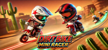
Dirt Bike Mini Racer scored 78/100 on Steam Analyzer — Good for a Action capsule. Top priority fix: [uniqueness_polish] Introduce a distinctive character trait or signature visual hook (e.g., a unique bike design, iconic helmet pattern, or environmental signature) that differentiates this from generic racing games.

Capsule scores by dimension

  • Genre Clarity: 8/10 — Clear racing action, vibrant casual tone. The capsule immediately communicates dirt bike racing through two characters on mini bikes in an action-ready pose on a street track with urban buildings in background. At tiny size, the bright green wheels, bike silhouettes, and dynamic positioning remain readable enough to identify the racing genre. The cartoonish art style signals casual arcade racing rather than simulation, which aligns with the 'mini' branding.
  • Title Readability: 9/10 — Bold, layered, excellent contrast. The title uses a three-tier hierarchy with 'DIRT BIKE' in red, 'MINI' in yellow, and 'RACERS' in blue, each with thick black outlines and white halos. At tiny size, all three words remain clearly legible due to strong color separation and outline weight. The logo sits on a clean white background panel that isolates it from the busy scene below, ensuring zero legibility collapse at any size.
  • Contrast & Color: 9/10 — Vivid palette, strong silhouette separation. The capsule uses a saturated, high-value color scheme with bright lime-green bike wheels, neon blue accents, red and yellow character clothes, and a vibrant yellow road that all pop sharply against the white background and dark Steam interface. In grayscale, the characters and bikes maintain clear tonal separation from the environment. At small and tiny sizes, the glowing bike rims and character outlines remain distinctly readable.
  • Uniqueness & Polish: 7/10 — Polished cartoon aesthetic, minor generic feel. The capsule demonstrates clean 3D cartoon rendering with well-defined character proportions, smooth shading, and intentional color choices that feel premium for the free-to-play casual market. However, the scene composition—two characters facing off on a street—is a common promotional trope seen in many mobile and casual racing titles. The visual execution is solid but the core concept lacks a distinctive hook or unique selling point that would make it memorable.
  • Brand Consistency: 6/10 — Cohesive art style, limited identity signals. The capsule maintains consistent cartoon rendering, consistent palette saturation, and a coherent art direction that should match the in-game aesthetic across other screenshots. However, there are no iconic character designs, signature motifs, or recognizable visual symbols that create a strong brand identity memory cue. The style is generic enough that it could represent any casual racing title without additional context.
  • Composition: 8/10 — Clear focal symmetry, balanced layout. The composition uses bilateral symmetry with two characters facing each other across the center, creating a natural competitive dynamic that reads instantly at all sizes. The title occupies the top third with the logo panel, and the action scene fills the lower two-thirds without clutter or dead zones. Safe margins are respected, no critical elements sit at cropping edges, and the layered depth (buildings, road, characters) guides the eye effectively from background to foreground.

What works

  • Title legibility at all sizes. Black outlines, white halos, and contrasting color blocks (red, yellow, blue) ensure the title remains sharp and readable even at tiny thumbnail size.
  • Strong value contrast against dark background. Bright saturated colors and the white logo background create excellent separation from the #1b2838 Steam interface, making the capsule pop in scrolling contexts.
  • Balanced symmetric composition. The two-character facing layout creates instant visual interest and conveys competitive action without clutter or awkward empty space.
  • Clean execution and polish. 3D rendering is smooth, proportions are well-defined, and the overall craft quality signals a competent free-to-play title.

What hurts the capsule

  • Generic scene composition. The two-character standoff on a street is a overused trope in casual racing games that lacks distinctive visual storytelling.
  • Weak brand identity signals. No iconic character designs, signature colors, or memorable motifs that would help players recognize the title in future promotional materials.
  • Limited unique selling point cue. The capsule shows racing action but does not visually communicate what makes 'Dirt Bike Mini Racers' different from other casual racing titles.

Priority fixes

  1. [uniqueness_polish] Introduce a distinctive character trait or signature visual hook (e.g., a unique bike design, iconic helmet pattern, or environmental signature) that differentiates this from generic racing games.
  2. [brand_consistency] Establish a memorable color motif or character icon that can be recognized across all promotional materials and screenshots to build brand recall.
  3. [genre_clarity] Add subtle UI or environmental elements (e.g., a visible dirt-bike-specific mechanic like dust trails, terrain variety, or trick indicators) to emphasize the 'dirt' element and racing depth beyond basic arcade racing.

Store copy priority fixes

  1. [hook_strength] Rewrite the short description to lead with a specific gameplay action or unique hook: 'Race gravity-defying dirt bikes while dodging rocket attacks and pulling off mid-air stunts' instead of 'test your nerves.'
  2. [uniqueness] Add a specific differentiator in the opening paragraph or 'What Makes' section: explain what single mechanic or progression system sets this apart (e.g., 'the only casual racer where every special power changes track physics differently' or 'build your perfect bike loadout').
  3. [genre_clarity] Remove or explain the conflicting tags (4X, Strategy RPG, 3D Platformer) in the detailed description, or clarify that this is a pure arcade racer to avoid category confusion.
  4. [hook_strength] Replace the opening 'fun for players of all ages' with a more evocative first sentence that hints at the core loop: 'Unlock dozens of wild vehicles, master 10 dynamic power-ups, and out-race opponents in bite-sized tracks.'

Related guides

Steam app ID: 1927170 · Tags: Action, Adventure, Casual, Racing, Sports