Scoring genre clarity...
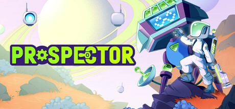
Land on a distant planet in this chill resource management game. Harvest alien resources, build and automate machinery, uncover secrets across the stars and strike shipping deals with distant colonies for exclusive rewards!
$14.99Mixed(110)
Resource ManagementBase BuildingSandbox
Loonworks GamesJul 31, 2025