Scoring genre clarity...
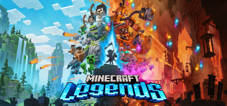
Minecraft Legends capsule

Minecraft Legends

Discover the mysteries of Minecraft Legends, a new action strategy game. Explore a gentle land of rich resources and lush biomes on the brink of destruction. The ravaging piglins have arrived, and it’s up to you to inspire your allies and lead them in strategic battles to save the Overworld!

$39.99Mixed(17)
StrategyActionMultiplayer
Mojang Studios, Blackbird InteractiveApr 18, 2023

Minecraft Legends scores 87/100 — better than 99% of Strategy capsules (n=5,436).

Mixed (17 reviews) · $39.99 · Released Apr 18, 2023 · By Mojang Studios

Quick text summary

Minecraft Legends scored 87/100 on Steam Analyzer — Excellent for a Strategy capsule. Top priority fix: [contrast_color] Verify the cyan neon glow maintains its brightness and saturation in Steam's actual compression pipeline to ensure the title pops at thumbnail sizes.

Capsule scores by dimension

  • Genre Clarity: 8/10 — Action strategy with clear visual split. The capsule effectively communicates action-strategy through a stark left-right visual divide: peaceful green Minecraft biomes on the left versus fiery destructive chaos on the right, with silhouetted armies and structures in conflict. At tiny size, the environmental contrast and central conflict still read as strategic warfare, though the exact genre blend becomes less clear due to compression. The Minecraft aesthetic is unmistakable, immediately signaling the franchise and action focus.
  • Title Readability: 9/10 — Bold neon logo with excellent contrast. The title 'MINECRAFT LEGENDS' uses a thick, glowing blue-to-cyan neon sans-serif typeface placed in the lower center with a strong dark silhouette backdrop and white outline that ensures legibility. At small and tiny sizes, the compact bold letterforms and bright cyan glow maintain excellent readability against the dark lower third, and the iconic Minecraft wordmark is recognizable even at extreme reduction. The strategic placement on a relatively clean background zone avoids text collision with busy details.
  • Contrast & Color: 9/10 — Vibrant dual palette with strong separation. The capsule uses a striking cool-to-warm color progression—bright cyan and green on the left shifting to fiery orange, red, and magenta on the right—creating exceptional value separation and silhouette clarity against the dark Steam background. At tiny size, the warm-cool split remains instantly recognizable and the neon title pops with high saturation and edge definition. Grayscale simulation shows clear light-dark layering with the bright title, burning structures, and glowing elements maintaining strong separation from mid-tone skies and dark foreground.
  • Uniqueness & Polish: 8/10 — Polished iconic Minecraft visual storytelling. The capsule demonstrates premium execution of Minecraft's block-based aesthetic blended with dramatic action-strategy visual language—the split-world destruction concept is a distinctive narrative hook communicating the core conflict immediately. The glowing neon title treatment, particle effects, and intentional color grading elevate it beyond generic Minecraft fanart into branded promotional material. While it leans on recognizable Minecraft visual identity rather than inventing a wholly new style, the execution and composition are crafted with clear intentionality and polish.
  • Brand Consistency: 9/10 — Strong Minecraft identity with strategic polish. The capsule reinforces Minecraft brand through iconic green-grass biome aesthetics, recognizable block architecture, and silhouetted creeper/mob shapes on the left side, paired with Legends-specific visual language of neon glow effects and strategic warfare imagery. The color palette and environmental rendering style are instantly recognizable as Minecraft, and the neon cyan typography extends the brand into a premium, action-focused subgenre differentiation. Internal cohesion is excellent—art direction, rendering style, and narrative framing align seamlessly as a unified 'Minecraft Legends' identity.
  • Composition: 9/10 — Excellent balance with clear focal conflict. The composition creates a powerful split-screen hierarchy: peaceful creation (left) versus destruction (right) with the title anchoring the visual center-bottom as the primary focal point. At small and tiny sizes, the stark left-right balance remains instantly readable, and the vertical axis with sky above and structures below creates natural depth layering. The design respects safe margins, avoids edge-hugging text, and the central conflict naturally draws the eye while supporting elements (silhouettes, particles, glow) guide rather than compete.

What works

  • Neon title with exceptional legibility. The cyan glowing text uses thick, bold letterforms with white outline that remain crystal-clear at all sizes, even at tiny 120×45 pixel view.
  • Strong visual narrative clarity. The left-versus-right composition immediately communicates conflict and stakes—peaceful world vs. burning destruction—making the strategic action premise unmistakable.
  • Premium color grading and effects. The warm-cool gradient, neon glow effects, and particle details create a polished, branded look that distinguishes Legends from base Minecraft.
  • Iconic Minecraft identity reinforcement. Recognizable green biomes, block silhouettes, and environment design instantly signal the Minecraft franchise while the new visual language conveys premium strategic action positioning.

What hurts the capsule

  • Right-side detail complexity at tiny size. The intricate burning structures and particle effects on the right side lose definition at tiny size, reducing visual impact in extreme compression despite strong overall composition.
  • Tagline or subtitle not readable. If any supporting text exists beneath or around the main title, it is not legible at small or tiny sizes and should be removed or integrated into the main mark.

Priority fixes

  1. [contrast_color] Verify the cyan neon glow maintains its brightness and saturation in Steam's actual compression pipeline to ensure the title pops at thumbnail sizes.
  2. [composition] Test edge-safety across all Steam display sizes to ensure no critical elements (right-side burning structures, title baseline) get clipped by cropping.
  3. [genre_clarity] Consider adding a subtle iconographic element (flag, sword, or stone) to strengthen the 'strategy' visual read at tiny size, as the conflict alone reads slightly more action-focused.

Related guides

  • Steam page optimisationCapsule, copy, screenshots, tags — the full Steam page conversion stack.
  • Steam tags guideTag selection, ordering, and how it shapes Steam's recommendation rails.

Steam app ID: 1928870 · Tags: Strategy, Action, Multiplayer, Fantasy, Tactical