Scoring genre clarity...

Virtue's Heaven capsule

Virtue's Heaven

The world ends tomorrow, your friends are imprisoned and those responsible for both have stolen the future. The time for deliberation is over. It is time to be reckless, irresponsible and beautiful.

$19.99Positive(12)
MetroidvaniaAtmosphericExploration
MOKKOGRADMay 20, 2025

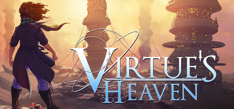
Virtue's Heaven scores 72/100 — better than 37% of Metroidvania capsules (n=361).

Positive (12 reviews) · $19.99 · Released May 20, 2025 · By MOKKOGRAD

Quick text summary

Virtue's Heaven scored 72/100 on Steam Analyzer — Good for a Metroidvania capsule. Top priority fix: [uniqueness_polish] Introduce a distinctive visual element or character design detail that appears nowhere else in the genre—consider the blue accent clothing or a unique character silhouette feature that becomes iconic.

Capsule scores by dimension

  • Genre Clarity: 7/10 — Action adventure with sci-fi stakes. The character silhouette in dynamic action pose with wind-blown hair against towering futuristic structures clearly signals action-adventure gameplay. At tiny size, the sci-fi architecture and character motion read as adventure-focused, though the specific genre blend (action vs. narrative-driven vs. exploration) remains slightly ambiguous without stronger visual gameplay hooks like weapons or combat poses.
  • Title Readability: 8/10 — Clear, elegant, well-positioned. The title 'Virtue's Heaven' uses a clean, elegant serif-based font with good letter spacing and sits in the lower half on a semi-transparent dark overlay, ensuring legibility against the bright background. At small size it remains readable; at tiny size the text holds its form with only minor detail loss in decorative flourishes. The ornamental symbol connecting the words adds visual interest without compromising clarity.
  • Contrast & Color: 8/10 — Warm glow creates strong separation. The warm golden-amber atmospheric gradient with bright sky creates excellent value contrast against the Steam dark background, making the entire composition pop immediately on scroll. The character's dark silhouette and blue accent clothing provide clear separation from the saturated warm midtones. In grayscale, the silhouette reads distinctly with clean edges and strong light-to-dark hierarchy maintained even at tiny size.
  • Uniqueness & Polish: 7/10 — Polished aesthetic, familiar archetype. The art direction is clean and professionally rendered with intentional lighting and atmospheric depth that communicates a story-driven, character-focused adventure. The composition and style feel premium and deliberate, though the lone figure against futuristic landscape is a recognizable visual archetype across indie and AAA games alike. The warm, hopeful lighting tone contrasts interestingly with the narrative's darker premise (world ending, friends imprisoned).
  • Brand Consistency: 6/10 — Coherent but not distinctive identity. The capsule maintains internal consistency with a unified warm-gold color palette, atmospheric rendering style, and cohesive art direction that should extend to in-game visuals based on typical indie game standards. However, without seeing the 12 store screenshots, there are no immediately obvious iconic symbols, recurring motifs, or signature visual elements that would make this capsule distinctly recognizable as 'Virtue's Heaven' versus other sci-fi adventure titles. The character design and color language read as memorable but not yet branded.
  • Composition: 7/10 — Strong focal point, safe margins. The character positioned in the lower-left third creates a natural primary focal point with towers drawing the eye upward and rightward, establishing clear hierarchy and depth layering (foreground character, midground structures, background haze). Title placement in the lower-right avoids competing with the character and maintains safe margins from edge crop zones. At tiny size the composition still reads as intentional, though the separation between character and background architecture becomes slightly tighter.

What works

  • Excellent atmospheric contrast. The warm golden light creates immediate visual separation against dark Steam background and reads strongly at all sizes through clean silhouette and saturated glow.
  • Clear visual hierarchy. Character is the obvious primary focus with architectural elements supporting the composition, avoiding scattered attention and maintaining strong focal point at small and tiny sizes.
  • Professional polish and depth. Layered background, intentional lighting, and smooth gradients create a premium look that signals quality and care in visual presentation.
  • Readable title treatment. Elegant font with strategic placement on semi-transparent overlay ensures legibility across viewing sizes without competing with primary subject.

What hurts the capsule

  • Generic hero archetype. The lone character against alien landscape is a familiar visual across dozens of indie and AAA titles, making it less distinctive at quick scroll.
  • Tonal disconnect. The warm, hopeful aesthetic tone contrasts with the narrative's dark premise (world ending, friends imprisoned), creating mild confusion about the game's core emotional experience.
  • Limited branded iconography. No immediately recognizable symbol, character design hook, or visual motif that would signal 'Virtue's Heaven' specifically versus other sci-fi adventure games.

Priority fixes

  1. [uniqueness_polish] Introduce a distinctive visual element or character design detail that appears nowhere else in the genre—consider the blue accent clothing or a unique character silhouette feature that becomes iconic.
  2. [brand_consistency] Verify that the warm gold palette and atmospheric style appear consistently across store screenshots and in-game assets to establish a cohesive brand identity.
  3. [genre_clarity] Consider adding a subtle gameplay-specific visual cue (e.g., energy effects, a unique item, or pose) that hints at the core mechanic beyond 'character in landscape'.

Store copy priority fixes

  1. [audience_targeting] Add a sentence clarifying skill expectations: e.g., 'Designed for players seeking challenge without excessive grinding' or 'An accessible metroidvania with skill-based combat depth' to set expectations for difficulty.
  2. [feature_communication] Expand on the 'dense, interconnected space' with 1-2 sentences describing environmental themes or aesthetic (neon futuristic, organic decay, etc.) to reinforce immersion messaging in the tags.
  3. [hook_strength] Add 1-2 words to the short description about the aesthetic or mood (e.g., 'neon world' or 'corrupt haven') to strengthen visual intrigue alongside the emotional hook.

Related guides

Steam app ID: 1929860 · Tags: Metroidvania, Atmospheric, Exploration, Action, 2D