Scoring genre clarity...

Paper Kingdom capsule

Paper Kingdom

Paper Kingdom is a colony management game. Stack cards to gather resources, build structures, explore and fight invaders. Turn a nomadic tribe into an empire.

$3.89Mixed(61)
Card GameManagementSurvival
obeceOct 23, 2025

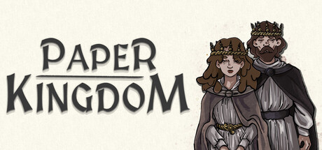
Paper Kingdom scores 67/100 — better than 16% of Card Game capsules (n=1,019).

Mixed (61 reviews) · $3.89 · Released Oct 23, 2025 · By obece

Quick text summary

Paper Kingdom scored 67/100 on Steam Analyzer — Solid for a Card Game capsule. Top priority fix: [genre_clarity] Integrate a visual card or stacked card motif into the composition (e.g., cards in hand, cards in play field) to immediately signal the card-stacking mechanic at all sizes.

Capsule scores by dimension

  • Genre Clarity: 6/10 — Fantasy setting readable, mechanics unclear. The illustrated medieval/fantasy characters with crowns and robes clearly signal a fantasy or strategy game, but the card-stacking core mechanic is not visually apparent at any size. At tiny size, you see royal figures but nothing that communicates 'colony management' or 'card-based' gameplay—it reads as generic fantasy RPG rather than the specific casual simulation genre.
  • Title Readability: 8/10 — Strong serif lettering, excellent legibility. The title 'PAPER KINGDOM' uses a bold, uppercase serif font with clear spacing and dark gray-black letterforms that maintain readability at full, small, and tiny sizes. The word 'PAPER' anchors the left side on clean cream background, and even at tiny size the two-word structure with distinct letterforms remains recognizable, though 'PAPER' is the stronger identifier.
  • Contrast & Color: 7/10 — Good value separation, warm palette works. The cream/off-white background provides strong contrast against the dark charcoal title and the brown-toned illustrated characters on the right. The warm color palette avoids muddy mid-tones and maintains clear silhouettes even at small size, though the characters' brown robes don't pop as vividly as they could against the light background in grayscale squint test. Overall reads cleanly at all sizes against Steam's dark background.
  • Uniqueness & Polish: 6/10 — Competent illustration, generic fantasy presentation. The character artwork shows decent illustrative polish with detailed crown work and fabric rendering, but the overall presentation—two royals standing in formal pose—feels like a standard fantasy game cover rather than communicating what makes Paper Kingdom unique (card stacking, colony building). There is no visual hook that distinguishes it from dozens of other indie fantasy sims; the craft is solid but the concept execution is generic.
  • Brand Consistency: 6/10 — Medieval aesthetic present but not distinctive. The medieval crown-and-robe visual language is internally consistent and supports a fantasy kingdom theme, but it lacks a memorable identity marker—no iconic character archetype, signature symbol, or distinctive palette that would make this recognizable as Paper Kingdom specifically. The warm earth tones and serif typography are tasteful but not unique enough to stand apart from similar games referenced in the genre benchmark.
  • Composition: 7/10 — Clear hierarchy, safe layout, minimal wasted space. Title is anchored left with strong visual weight, characters positioned right creating good balance and depth. The composition avoids center clutter and respects safe margins; at tiny size the two main elements (text left, characters right) remain clearly separated and scannable. However, the characters occupy prime real estate without adding mechanical clarity, and the composition doesn't hint at the card-stacking core gameplay.

What works

  • Readable serif title treatment. Bold uppercase lettering maintains legibility at small and tiny sizes with strong contrast against the cream background.
  • Balanced asymmetric layout. Text anchored left and characters positioned right create visual hierarchy and depth without feeling scattered or cluttered.
  • Warm, cohesive color palette. Earth tones and cream background work harmoniously and provide adequate contrast against Steam's dark interface.

What hurts the capsule

  • No gameplay mechanic clarity. The card-stacking and colony-building core mechanics are completely invisible; visual language reads as generic fantasy rather than strategy or card-based simulation.
  • Generic fantasy presentation. Two formal royals in regal pose feels like a stock fantasy game aesthetic with no distinctive visual hook or memorable identity marker.
  • Missed opportunity for unique selling point. The composition prioritizes character beauty over communicating what makes Paper Kingdom different from other indie sims in the crowded genre.

Priority fixes

  1. [genre_clarity] Integrate a visual card or stacked card motif into the composition (e.g., cards in hand, cards in play field) to immediately signal the card-stacking mechanic at all sizes.
  2. [uniqueness_polish] Add a distinctive visual element or symbol (icon, signature palette accent, or graphic motif) that signals Paper Kingdom's unique card-colony hybrid identity rather than generic fantasy.
  3. [composition] Reposition or scale characters to create visual space for a gameplay-relevant prop or icon that communicates 'colony management' or 'card strategy' without cluttering the layout.

Store copy priority fixes

  1. [hook_strength] Replace 'Stack cards to gather resources, build structures, explore and fight invaders' with a verb-forward hook that emphasizes the emotional payoff: e.g., 'Grow your paper empire from a scattered tribe—stack cards to gather resources, build mighty structures, and defend against invasion.'
  2. [uniqueness] Add 1–2 sentences explaining what makes Paper Kingdom's card-stacking system or settlement progression distinct: e.g., clarify how card mechanics create meaningful decisions, or highlight an unusual combination of solitaire-style play with city-building depth.
  3. [feature_communication] Expand one or two features with brief examples or context—e.g., 'Assign jobs to your settlers to activate special card effects' or 'Strategic building unlocks new resource types'—to show how mechanics interconnect.
  4. [audience_targeting] Add a sentence signaling the intended player: e.g., 'Perfect for players who love cozy management games with light strategy' or 'Blend of turn-based card play and city-building for relaxed, solo gameplay.'

Related guides

Steam app ID: 1930390 · Tags: Card Game, Management, Survival, Card Battler, City Builder