Scoring genre clarity...

Subsequence capsule

Subsequence

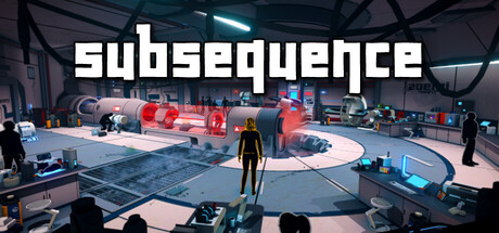
Subsequence is a story-driven adventure focused on exploration and discovery. Featuring light logic puzzles and a touch of humor, you’ll uncover hidden secrets as Vicky tries to escape the aftermath of a mysterious incident in an underground laboratory.

$4.99Positive(31)
Female ProtagonistExplorationWalking Simulator
Zoemi GamesMar 13, 2026

Subsequence scores 70/100 — better than 32% of Female Protagonist capsules (n=1,715).

Positive (31 reviews) · $4.99 · Released Mar 13, 2026 · By Zoemi Games

Quick text summary

Subsequence scored 70/100 on Steam Analyzer — Good for a Female Protagonist capsule. Top priority fix: [uniqueness_polish] Introduce a distinctive visual signature—either a unique character design detail, recognizable prop, or signature visual effect (e.g., anomalous visual distortion, unique UI element) that immediately identifies Subsequence within the sci-fi adventure space

Capsule scores by dimension

  • Genre Clarity: 7/10 — Adventure exploration clearly signaled. The capsule shows a first-person perspective in a sci-fi underground laboratory with a protagonist in the center, immediately suggesting exploration-based adventure gameplay. At tiny size, the futuristic setting, industrial environment, and solitary figure remain recognizable as adventure/exploration genre. However, the puzzle or narrative elements are not visually apparent, leaving some ambiguity about the game's specific focus beyond general exploration.
  • Title Readability: 8/10 — Bold sans-serif reads well across sizes. The title 'SUBSEQUENCE' uses clean, thick white sans-serif lettering positioned prominently across the top center, with excellent contrast against the darker mid-tones of the laboratory setting. The text maintains legibility even at small and tiny sizes due to its bold weight and generous letter spacing. The title placement on a relatively clear background region avoids heavy texture interference and supports quick recognition during scrolling.
  • Contrast & Color: 7/10 — Good value separation with pop accents. The capsule features a strong dark blue-gray base (laboratory walls, floor) with bright cyan-blue neon accents and warm orange-red glow from machinery that create clear focal points. The protagonist figure in dark clothing stands out against the mid-tone floor. At tiny size, the neon cyan and red elements maintain their pop against the Steam dark background, though the overall mid-tone balance could push values further apart for maximum impact at thumbnail scale.
  • Uniqueness & Polish: 7/10 — Polished sci-fi aesthetic with distinctive mood. The capsule demonstrates solid professional craft with a cohesive sci-fi laboratory aesthetic, clean lighting, and intentional color grading that feels premium and deliberate. The composition and rendering quality suggest significant production effort. However, the visual presentation is somewhat aligned with established sci-fi adventure conventions (seen in comparable titles like DREDGE and The Invincible), so while well-executed, it lacks a truly distinctive hook or unique visual identity that would separate it from similar underground-facility exploration games.
  • Brand Consistency: 6/10 — Competent sci-fi branding, limited distinctiveness. The capsule establishes a consistent sci-fi/industrial brand identity through color palette, architectural style, and atmosphere that aligns with the game's underground laboratory setting. The protagonist figure and neon lighting are consistent with the game's visual direction. However, there are no immediately iconic characters, symbols, or signature visual motifs that would make this capsule uniquely recognizable as 'Subsequence' rather than another sci-fi adventure; the identity is thematically correct but generically executed within the sci-fi genre.
  • Composition: 7/10 — Clear focal point with balanced depth layering. The composition uses effective depth layering with foreground floor elements, mid-ground protagonist, and background laboratory machinery, creating a natural eye flow toward the center character. The title anchors the top without obscuring the main scene. At small and tiny sizes, the central protagonist remains the clear primary focal point, and supporting machinery elements guide rather than distract. Safe margins are generally respected, though some background elements near the edges approach potential crop areas without significant loss of core message.

What works

  • Strong title contrast and legibility. Bold white sans-serif 'SUBSEQUENCE' maintains excellent readability across all viewing sizes from full header to tiny thumbnail.
  • Effective depth and focal hierarchy. Foreground-to-background layering creates natural eye guidance toward the protagonist, maintaining clear focus at small sizes.
  • Professional lighting and color grading. Neon cyan and warm orange accents create visual interest and pop against the dark Steam background while maintaining cohesive sci-fi aesthetics.
  • Genre-appropriate setting and mood. The underground laboratory environment immediately communicates exploration-adventure genre expectations aligned with the game's narrative premise.

What hurts the capsule

  • Generic sci-fi visual language. While professionally executed, the lab-and-neon aesthetic shares visual conventions with many established sci-fi adventure titles, limiting distinctive brand recognition.
  • Lack of iconic visual hook. No immediately memorable character trait, symbol, or unique design element distinguishes this capsule from similar underground-facility exploration games.
  • Limited gameplay clarity. The capsule does not visually communicate the game's core mechanics (logic puzzles, humor, narrative focus), appearing as a general exploration showcase.

Priority fixes

  1. [uniqueness_polish] Introduce a distinctive visual signature—either a unique character design detail, recognizable prop, or signature visual effect (e.g., anomalous visual distortion, unique UI element) that immediately identifies Subsequence within the sci-fi adventure space
  2. [genre_clarity] Add subtle visual cues that hint at puzzle-solving or narrative discovery mechanics, such as interactive environmental elements, glowing puzzle components, or layered foreground visual clues that distinguish this from pure exploration games
  3. [contrast_color] Increase color saturation or value separation between mid-tone laboratory elements to maximize pop at tiny thumbnail size, ensuring the neon accents read more vividly during quick Steam scrolling

Store copy priority fixes

  1. [hook_strength] Rewrite the opening line to lead with a sensory or emotional detail from the setting (e.g., 'Navigate a crumbling underground laboratory where every step could be your last—and humor keeps you sane') instead of generic 'escape' framing.
  2. [uniqueness] Add a sentence explaining what makes Subsequence's puzzle logic or narrative voice stand out (e.g., 'Unlike typical walking simulators, Subsequence pairs environmental storytelling with absurdist humor that subverts lab-escape tropes').
  3. [feature_communication] Provide 1-2 concrete puzzle examples or mechanics beyond the laser beam (e.g., types of logic involved, whether puzzles involve item combinations or environmental observation) so players can visualize gameplay.
  4. [audience_targeting] Add a single sentence about the ideal player profile (e.g., 'Perfect for fans of Portal's dark humor or players who loved What Remains of Edith Finch') to strengthen audience resonance.

Related guides

Steam app ID: 1936530 · Tags: Female Protagonist, Exploration, Walking Simulator, 3D, Mystery