Scoring genre clarity...

Shadows Over Loathing capsule

Shadows Over Loathing

Shadows over Loathing — a slapstick-figure comedy adventure-RPG full of mobsters, monsters, and mysteries.

$13.33Overwhelmingly Positive(16)
AdventureRPGPoint & Click
AsymmetricNov 11, 2022

Shadows Over Loathing scores 83/100 — better than 97% of Adventure capsules (n=8,231).

Overwhelmingly Positive (16 reviews) · $13.33 · Released Nov 11, 2022 · By Asymmetric

Quick text summary

Shadows Over Loathing scored 83/100 on Steam Analyzer — Good for a Adventure capsule. Top priority fix: [title_readability] Monitor tiny-size rendering of the decorative serpent 'S' to ensure it doesn't collapse into an unreadable blob below 100px width.

Capsule scores by dimension

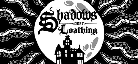
  • Genre Clarity: 8/10 — Adventure comedy RPG reads clearly. The whimsical art style, slapstick character illustrations, and mystical moon imagery immediately signal a comedic adventure game with genre-specific visual language. At tiny size, the distinctive stick-figure aesthetic and surreal monster composition still convey 'quirky indie RPG' despite detail loss. The moon and chaotic character pile-up communicate adventure-comedy tone without ambiguity.
  • Title Readability: 9/10 — Bold gothic title stands out. The 'Shadows over Loathing' title uses a strong decorative gothic serif font with excellent contrast against the black starfield background, and the white outline ensures legibility at all sizes. At small and tiny sizes, the letterforms remain distinct and readable; the serpent motif in the 'S' adds memorable branding. The hierarchical placement of 'Shadows over' above 'Loathing' with the decorative underline maintains clarity even under 1-second glance conditions.
  • Contrast & Color: 9/10 — Exceptional white-on-black separation. Pure white title and character silhouettes against deep black starfield create maximum value separation with no muddy mid-tones; the design pops aggressively on Steam's dark background. The grayscale test confirms crisp edges throughout—moon, text, and characters all maintain sharp silhouettes. At tiny size, the high contrast ensures no legibility collapse and makes the capsule highly discoverable in quick scrolls.
  • Uniqueness & Polish: 8/10 — Distinctive hand-drawn comedic style. The slapstick character pile-up and hand-drawn gothic aesthetic set this apart from generic RPG templates; the art style is immediately recognizable and communicates the game's irreverent tone. The serpent 'S', the starry nighttime setting, and the chaotic character arrangement all feel intentionally designed rather than assembled from stock elements. The visual storytelling—misfits, monsters, and mobsters in silhouette form—suggests a unique narrative experience without feeling derivative.
  • Brand Consistency: 8/10 — Coherent gothic-comedic visual identity. The palette (black, white, gray), gothic typography, and surreal character art create a consistent internal identity that would be recognizable across other brand touchpoints. The serpent motif, decorative fonts, and hand-drawn illustration style form signature cues. The tone—darkly comedic yet playful—stays coherent from title through character design and background elements.
  • Composition: 8/10 — Balanced focal hierarchy with strong anchors. The title 'Shadows over Loathing' dominates the left-center as primary focal point, the large moon anchors the right side, and the character pile occupies the lower right, creating clear depth layering without clutter. The starfield background provides texture without competing for attention. At small and tiny sizes, the moon and title remain the unmissable elements; safe margins protect the composition from Steam cropping, and the eye naturally reads title-first, then moon-and-characters as supporting detail.

What works

  • Maximum contrast legibility. Pure white elements on black background ensure the capsule pops immediately in scrolls and remains readable at thumbnail size without any contrast loss.
  • Memorable stylistic signature. The hand-drawn slapstick aesthetic, serpent 'S', and gothic typeface create a distinctive brand identity that stands out in the RPG category.
  • Clear focal hierarchy. Title, moon, and characters create intentional depth layers that guide the eye without scattered attention or competing focal points.
  • Genre-specific visual language. Whimsical character design, mystical moon, and chaotic composition immediately communicate 'comedic adventure' without ambiguity.

What hurts the capsule

  • Decorative font style complexity. While readable, the ornate gothic serif letterforms lose some crispness at extreme tiny sizes due to thin serifs and decorative flourishes.
  • Character silhouette density. The pile of characters, while visually fun, creates a busy lower-right region that could feel chaotic rather than organized at very small scales.

Priority fixes

  1. [title_readability] Monitor tiny-size rendering of the decorative serpent 'S' to ensure it doesn't collapse into an unreadable blob below 100px width.
  2. [composition] Verify Steam's cropping behavior at various aspect ratios does not cut off the moon or character pile edges that sit near frame boundaries.

Store copy priority fixes

  1. [feature_communication] Add an estimated playtime or scope descriptor (e.g., '30-40+ hours of content') to help solo players gauge investment expectations without diluting comedic tone.
  2. [audience_targeting] Include a brief note that the game is standalone-friendly despite being a sequel, reassuring new players unfamiliar with West of Loathing that prior knowledge is not required.
  3. [genre_clarity] Clarify the balance between exploration, combat, and puzzle-solving in the opening paragraph to set mechanical expectations alongside the narrative hook.

Related guides

Steam app ID: 1939160 · Tags: Adventure, RPG, Point & Click, Puzzle, Turn-Based Strategy