Scoring genre clarity...
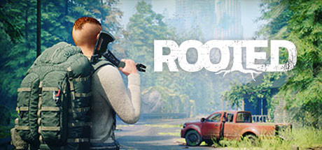
Rooted capsule

Rooted

In this solo and multiplayer survival game, explore an ancient overgrown world full of dangers. Salvage, build, craft, hunt,.. and try to survive alone or with your friends in an evolving and fascinating post-apocalyptic environment. Powered by Unreal Engine 5.

CraftingOpen WorldMultiplayer
Headlight Studio2027

Rooted scores 70/100 — better than 26% of Dogs capsules (n=232).

Released 2027 · By Headlight Studio

Quick text summary

Rooted scored 70/100 on Steam Analyzer — Good for a Dogs capsule. Top priority fix: [brand_consistency] Introduce a distinctive character silhouette, iconic survivor gear detail, or signature visual motif that becomes the visual anchor for Rooted's identity across all marketing.

Capsule scores by dimension

  • Genre Clarity: 7/10 — Post-apocalyptic survival with clear threats. The capsule communicates survival and scavenging through a tactical-posed character with rifle and heavy backpack in a nature-reclaimed environment with an abandoned vehicle. At tiny size, the overgrown setting and armed figure still read as post-apocalyptic survival, though the specific multiplayer or crafting mechanics are not visually evident. The green vegetation choking the road and derelict truck reinforce the 'nature reclaims civilization' theme central to the genre.
  • Title Readability: 8/10 — Bold white sans-serif, clear at all sizes. The title 'ROOTED' is rendered in large, clean white capital letters with good contrast against the mid-tone background. Even at tiny size, the letterforms remain readable and the title maintains hierarchy. The placement in the upper-right quadrant avoids the character's head and keeps the text on a relatively clean sky-to-foliage background region, maximizing legibility.
  • Contrast & Color: 8/10 — Strong value separation, warm-cool balance. The character's warm tan backpack and skin tones contrast well against the cool blue-green foliage and water backdrop. The white title pops sharply against the mid-tone environment. In grayscale, the silhouette of the figure remains distinct from the background, and the composition avoids muddy mid-tone blending. The orange-red vehicle adds a warm accent that prevents the palette from feeling flat.
  • Uniqueness & Polish: 6/10 — Competent but familiar post-apocalyptic theme. The image is well-executed with high production values (evident from the Unreal Engine 5 polish and photorealistic rendering), but the composition—lone survivor with rifle in overgrown ruins—is a recognizable trope in survival games. The scene communicates the core loop of exploration and danger without a distinctive hook or unique visual storytelling that would elevate it above the solid baseline. It feels premium but not visually distinctive compared to other post-apocalyptic survival titles.
  • Brand Consistency: 6/10 — No iconic character or signature motif yet. The capsule presents a generic survivor archetype without a memorable character face, trademark symbol, or distinctive visual signature that would be recognizable across other marketing materials. While the environment and color palette are cohesive, there are no brand identity anchors—no logo, no iconic character silhouette, no signature UI or gameplay visual—that would allow players to recognize 'Rooted' from the visual alone on subsequent encounters.
  • Composition: 7/10 — Clear focal point, good depth layering. The character in the left-center foreground serves as a strong primary focal point, with the landscape and vehicle creating supporting depth layers that guide the eye. The title placement in the upper right balances the composition without competing for attention. At small and tiny sizes, the silhouette of the armed figure remains the clear anchor, though some fine detail in the backpack and rifle texture becomes less readable at extreme reduction.

What works

  • Clean title typography and placement. The white 'ROOTED' text is large, sans-serif, and positioned on a controlled background region that ensures readability even at tiny sizes without fighting the character silhouette.
  • Strong environmental storytelling. The overgrown ruins, abandoned truck, and verdant foliage immediately communicate the post-apocalyptic survival setting and the game's core theme of nature reclaiming civilization.
  • High-quality production rendering. The Unreal Engine 5 polish creates a premium, detailed visual that conveys AAA-level production values and technical competence.
  • Effective contrast and silhouette clarity. The character's warm-toned gear stands out distinctly against the cool blue-green environment, and the focal figure remains readable in grayscale at all zoom levels.

What hurts the capsule

  • Generic survivor archetype. The protagonist lacks a distinctive or memorable face and character design, appearing as an interchangeable tactical survivor without visual identity that could be leveraged for brand recognition.
  • Familiar post-apocalyptic composition. The 'lone armed survivor in overgrown ruins' visual is a well-worn trope in survival games that does not distinguish Rooted from its competitors in visual messaging or unique selling point.
  • No iconic brand identity signals. The capsule lacks a signature logo, symbol, color palette, or visual motif that would make Rooted immediately recognizable in subsequent marketing or community contexts.

Priority fixes

  1. [brand_consistency] Introduce a distinctive character silhouette, iconic survivor gear detail, or signature visual motif that becomes the visual anchor for Rooted's identity across all marketing.
  2. [uniqueness_polish] Consider featuring a unique environmental hazard, creature threat, or mechanic-specific visual (e.g., a crafting interface element, mutant wildlife, or faction-specific gear) to differentiate from generic post-apocalyptic imagery.
  3. [genre_clarity] If multiplayer is a core feature, add subtle visual cues like multiple characters or a base/camp structure in the background to communicate the survival + community aspect more directly.

Store copy priority fixes

  1. [feature_communication] Replace 'Some foes may be stronger than you think' with specific mechanics: 'Face zombies, mutant animals, and hostile NPCs with adaptive AI; combat scales with co-op player count' to clarify enemy types and difficulty progression.
  2. [uniqueness] Add a differentiation sentence after the Salvage & Learn section: 'Unlike games where crafting is linear, Rooted's learning-by-salvage system means each playthrough discovers items in a different order, creating unique progression paths' to highlight what separates it from competitors.
  3. [tone_match] Move or reframe the Discord paragraph to the footer or end it with in-game benefits (e.g., 'Join our community for early access to seasonal events and craftable cosmetics') rather than positioning it as a mid-narrative break.

Related guides

Steam app ID: 1940080 · Tags: Dogs, Crafting, Open World, Multiplayer, Base Building