Scoring genre clarity...
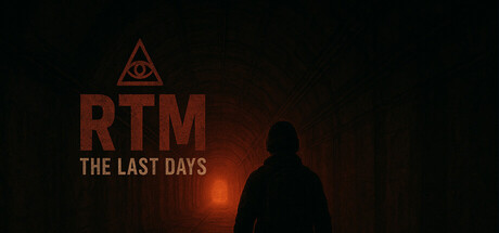
Born underground and trained by the mysterious RTM Facility, you guard a forgotten checkpoint. Scan arrivals, face unseen horrors, and uncover a dark conspiracy. Survival is not enough, discover the truth in RTM – The Last Days.
$2.994 user reviews
ActionAction RPGFPS
SaltRTMMar 14, 2026