Scoring genre clarity...

Autogame Deluxe capsule

Autogame Deluxe

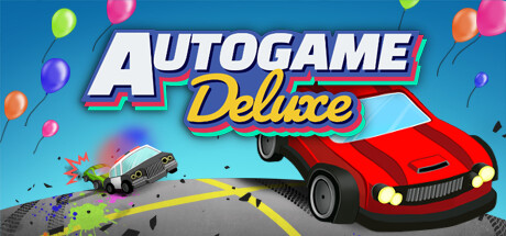
Control a tiny car with one button in this 1-10 player party game! Evade cops, commuters, and chaos. Every press turns you left and every turn speeds you up. Battle it out with 10 cars at a time or beat single player challenges.

$5.99Positive(20)
Party GameFamily FriendlyParty
BoterJanJul 21, 2025

Autogame Deluxe scores 78/100 — better than 77% of Party Game capsules (n=394).

Positive (20 reviews) · $5.99 · Released Jul 21, 2025 · By BoterJan

Quick text summary

Autogame Deluxe scored 78/100 on Steam Analyzer — Good for a Party Game capsule. Top priority fix: [contrast_color] Increase terrain value contrast by deepening the blue sky section and lightening the sand section to maximize separation from the neutral background for improved TINY size readability.

Capsule scores by dimension

  • Genre Clarity: 8/10 — Clear casual party game vibe. The aerial top-down perspective of colorful toy cars scattered across a map immediately signals a casual, arcade-style driving game with multiplayer chaos. The vibrant, isometric car sprites and grid-like road layout clearly communicate a party/arcade game rather than a simulation or story-driven title. At TINY size, the bold title and cheerful car density still read as lighthearted arcade action.
  • Title Readability: 9/10 — Excellent legibility and visual hierarchy. The large, bold 'AUTOGAME' text in thick white with a strong blue and red stroke outline maintains exceptional clarity at all sizes, including TINY. The supporting 'Deluxe' in yellow script sits directly below with complementary contrast and remains distinguishable at small sizes. The title placement sits on a clean background region and does not compete with visual noise, ensuring consistent readability across viewing conditions.
  • Contrast & Color: 8/10 — Strong value separation and saturation. The bold white and gold title contrasts sharply against the mid-tone beige and blue background map, creating clear silhouette separation even in grayscale. The colorful cars (purple, green, red, blue) pop distinctly against the neutral terrain. At SMALL and TINY sizes, the title remains the clear focal point with no muddy blending; however, the subtle gradient in the background terrain could be slightly bolder for maximum impact.
  • Uniqueness & Polish: 7/10 — Polished casual aesthetic, moderate distinctiveness. The design demonstrates clean craft with intentional typography choices, consistent color blocking, and a cohesive 90s arcade/party game style that feels premium for an indie title. The top-down car perspective and scattered vehicle placement convey the core mechanic (multi-car chaos) effectively without being generic. The execution is solid, but the overall visual language (pastel terrain, toy cars, bold geometric title) aligns closely with common indie party game aesthetics, limiting standout uniqueness.
  • Brand Consistency: 7/10 — Coherent art direction, moderate identity signals. The capsule maintains a consistent isometric rendering style, unified color palette (pastels with primary accent colors), and recognizable toy car visual language that should translate across in-game assets. The bold, playful typography in the title is distinctive and would be recognizable in marketing materials. Without access to store screenshots, the internal cohesion feels intentional, though the palette and style are shared with several contemporary indie casual titles.
  • Composition: 8/10 — Clear hierarchy with effective focal point. The title occupies the prime upper-center region with strong visual weight, while the scattered cars below create supporting detail that guides the eye downward without competing. The composition uses foreground (cars), midground (grid/terrain), and implicit background depth effectively. At SMALL and TINY sizes, the title remains the undisputed focal point and the car density reads as intentional visual interest rather than clutter; however, the left and right edges are slightly crowded, which could impact Steam crop resilience.

What works

  • Title clarity at all sizes. Bold white and gold lettering with strong stroke outline remains legible and impactful from full header down to TINY thumbnail without degradation.
  • Genre immediately recognizable. Top-down perspective, colorful toy cars, and grid-based terrain instantly communicate a casual party/arcade driving game without ambiguity.
  • Cohesive color and rendering style. Pastel terrain, consistent isometric car sprites, and unified accent palette create a polished, intentional visual identity that feels premium for indie.
  • Effective visual storytelling of core mechanic. The scattered multi-colored cars and aerial view directly communicate the multi-player chaos and one-button control premise of the game.

What hurts the capsule

  • Limited visual distinctiveness. The pastel casual aesthetic and toy car style are competently executed but align closely with many contemporary indie party games, reducing uniqueness.
  • Edge density may suffer in Steam crops. Several cars cluster near the left and right margins, risking loss of visual balance if the capsule is cropped on different store placements.
  • Terrain gradient lacks punch. The subtle beige-to-blue gradient background is pleasant but slightly soft; stronger value separation would increase contrast impact at small sizes.

Priority fixes

  1. [contrast_color] Increase terrain value contrast by deepening the blue sky section and lightening the sand section to maximize separation from the neutral background for improved TINY size readability.
  2. [composition] Distribute foreground cars more evenly toward the center to reduce edge clustering and improve resilience to Steam crop variations across store placements.
  3. [uniqueness_polish] Add a distinctive visual signature—such as a unique UI element, mascot character, or signature effect—to differentiate the capsule from other casual indie titles and strengthen brand recall.

Store copy priority fixes

  1. [feature_communication] Replace the repeated opening paragraph with an expanded hook that previews the chaos escalation and high scores—e.g., 'As roads fill with wrecks and your car only accelerates, nail the timing to be the last car standing.'
  2. [uniqueness] Add 1-2 sentences explaining what unlocking challenge events adds to regular play and how the progression system keeps players coming back.
  3. [hook_strength] In the detailed description, open with a vivid gameplay scenario (e.g., 'One button. Ten players. Chaos.') rather than repeating the short description word-for-word.

Related guides

Steam app ID: 1952450 · Tags: Party Game, Family Friendly, Party, Local Multiplayer, Funny