Scoring genre clarity...
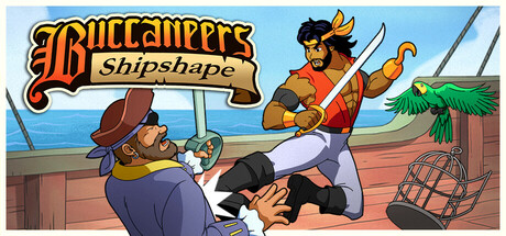
Beat-‘em-up action on the high seas! Play as pirate on a mission to reclaim your stolen ship. Fight rival marauders, steal from uppity civilians, and unleash fierce companion parrots in this fast-paced, belt-scrolling brawler packed with humor and mayhem!
$9.09Positive(30)
Beat 'em upSide ScrollerPixel Graphics
Merso EntertainmentJul 22, 2025