Scoring genre clarity...

No One Survived capsule

No One Survived

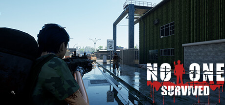
This is a multiplayer cooperative open world construction survival sandbox game, where you and your friends must find supplies and build shelters in this world. You have to keep an eye on your character's needs state at all times, a bad state is likely to lead to death.

$16.99Mixed(27)
SurvivalOpen WorldZombies
Cat Play StudioDec 27, 2025

No One Survived scores 68/100 — better than 19% of Survival capsules (n=1,799).

Mixed (27 reviews) · $16.99 · Released Dec 27, 2025 · By Cat Play Studio

Quick text summary

No One Survived scored 68/100 on Steam Analyzer — Solid for a Survival capsule. Top priority fix: [uniqueness_polish] Introduce a signature visual element or color treatment that differentiates the art style from generic survival titles—consider stylized lighting, a distinctive UI overlay, or environmental props that hint at the construction mechanic.

Capsule scores by dimension

  • Genre Clarity: 7/10 — Survival setting clear, genre mixed. The first-person perspective, urban post-apocalyptic setting, and character gazing at an abandoned cityscape strongly signal survival gameplay. However, the cooperative sandbox/construction aspect is not visually obvious from this single screenshot—it reads more like a first-person exploration or survival-horror title. At tiny size, the silhouette and window framing communicate desolation and survival tone effectively, though the specific sandbox-building mechanic remains unclear.
  • Title Readability: 7/10 — Logo readable, placement slightly awkward. The 'NO ONE SURVIVED' logo in the lower left uses high-contrast white text with a red skull and blood splatter motif, making it legible at small and tiny sizes. The placement in the lower left corner is functional but does not integrate cohesively with the full composition. At tiny size, the text remains readable due to strong contrast, though the bottom-left anchor position creates some layout tension.
  • Contrast & Color: 8/10 — Strong light-dark separation, clean silhouette. The character in dark olive/brown jacket stands out clearly against the bright window and light blue sky beyond, creating excellent value separation. The red skull logo pops distinctly against the dark lower-left region. In grayscale, the character silhouette is well-defined against the bright background, and the overall composition maintains clear edge separation even when squinted or viewed at tiny size.
  • Uniqueness & Polish: 6/10 — Competent atmosphere, generic survival trope. The image delivers convincing first-person environmental storytelling—a lone character overlooking an abandoned, sprawling city with evidence of decay is a classic survival-game visual hook. However, this specific perspective and abandoned-cityscape composition are well-trodden in the survival and post-apocalyptic genre, lacking a distinctive visual hook that sets this title apart from peers like Lethal Company or similar sandbox survivors. The rendering quality is solid but does not signal a premium or innovative art direction.
  • Brand Consistency: 6/10 — Logo iconic, overall identity underdeveloped. The red skull with blood splatter is a memorable and recognizable brand mark for No One Survived. However, this single screenshot does not establish a coherent visual identity beyond the logo—the urban environment, color palette, and art style feel generic and could apply to many survival titles. To build stronger brand consistency, additional visual cues (unique UI design, signature color grading, or recurring environmental motifs) would need to appear across marketing materials, reinforcing a distinctive identity.
  • Composition: 7/10 — Clear focal point, strong depth layering. The character's back and gaze directed through the large window frame create a clear primary focal point—the eye naturally follows the sight line to the cityscape beyond. The composition uses three distinct layers: character in foreground, window frame in midground, and urban landscape in background, creating visual depth. At small size, the focal point reads well; at tiny size, the character silhouette and window structure remain the primary draw, though environmental detail fades appropriately into secondary importance.

What works

  • Strong contrast and silhouette clarity. The dark character figure against the bright window and sky creates excellent value separation that reads at all sizes, including tiny scale.
  • Logo legibility and memorability. The red skull with blood-splatter 'NO ONE SURVIVED' mark is high-contrast and recognizable, remaining visible even at small sizes.
  • Effective depth and focal point. The composition uses the character's sight line through the window to create a natural visual hierarchy that guides attention to the cityscape narrative.

What hurts the capsule

  • Generic survival-game aesthetic. The abandoned urban setting and first-person perspective are well-worn tropes that do not visually distinguish this title from established competitors in the genre.
  • Logo placement integration. The lower-left corner placement of the logo feels anchored and somewhat disconnected from the main scene composition rather than integrated into a cohesive layout.
  • No visible indication of cooperative or sandbox mechanics. The capsule communicates survival and exploration tone but fails to hint at the unique cooperative sandbox-building gameplay that differentiates this title.

Priority fixes

  1. [uniqueness_polish] Introduce a signature visual element or color treatment that differentiates the art style from generic survival titles—consider stylized lighting, a distinctive UI overlay, or environmental props that hint at the construction mechanic.
  2. [composition] Integrate the logo and title more cohesively into the scene—explore repositioning or layering it as a textured overlay element rather than a separate graphical block.
  3. [genre_clarity] Add subtle visual indicators of the sandbox-building or cooperative mechanic—such as construction materials, building outlines, or a second character silhouette—to communicate the unique gameplay hook at a glance.

Store copy priority fixes

  1. [hook_strength] Rewrite the short description to lead with a concrete, exciting gameplay moment or dilemma (e.g., 'Survive the undead wasteland with friends—scavenge, build, craft, and defend your shelter through brutal seasons') rather than listing genres.
  2. [uniqueness] Add a 1-2 sentence section after the opening that explicitly differentiates the game (e.g., 'The only survival sandbox with a physics-based beam-column building system that demands strategic base design' or 'Combines Valheim's building freedom with Project Zomboid's unforgiving seasons').
  3. [tone_match] Revise the detailed description to remove mechanical phrasing and injection more active, immersive language that mirrors the survival horror mood (e.g., replace 'Always pay attention to your character status and those dangerous zombies' with a more visceral opening).
  4. [audience_targeting] Add a dedicated paragraph early in the detailed description clarifying the intended player type (e.g., 'For co-op survival fans who love building, crafting, and systems depth—and for hardcore players who want total control over difficulty and resource scarcity').

Related guides

Steam app ID: 1963370 · Tags: Survival, Open World, Zombies, Multiplayer, Crafting