Scoring genre clarity...

Plow the Snow! capsule

Plow the Snow!

Fight the cold, plow the snow and rescue the city in this arcade 1-4 player co-op experience! Clear the streets, parks, cemeteries, lunaparks and other parts of the city and become its hero!

Casual3DSimulation
Baked GamesTo be announced

Plow the Snow! scores 77/100 — better than 74% of Casual capsules (n=10,512).

Released To be announced · By Baked Games

Quick text summary

Plow the Snow! scored 77/100 on Steam Analyzer — Good for a Casual capsule. Top priority fix: [title_readability] Simplify or enlarge the tagline icon below main title to maintain readability at 120x45 thumbnail resolution.

Capsule scores by dimension

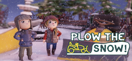
  • Genre Clarity: 8/10 — Clear casual co-op gameplay signal. The capsule immediately communicates a cozy, family-friendly simulation through the stylized characters in winter gear, snowy environment, and prominent yellow snowplow vehicle. At tiny size, the two figures and plow silhouette remain recognizable, establishing the snow-management theme without ambiguity. The cheerful art style and winter setting align perfectly with casual simulation expectations.
  • Title Readability: 8/10 — Strong title with minor tag clarity. The main title 'PLOW THE SNOW!' uses bold white letterforms with black outline that maintain legibility at small and tiny sizes, positioned strategically in the right portion of the image against a semi-clear background. The icon and tagline below add personality but the icon becomes slightly soft at tiny size; however, the core title remains crisp and readable throughout all viewing conditions.
  • Contrast & Color: 8/10 — Excellent value separation against dark. The capsule uses a strong value range with bright whites, yellows, and pastels in the characters and plow vehicle contrasting sharply against the cooler purple-blue evening sky and darker background elements. Even in grayscale, the light clothing and yellow plow create clear silhouettes that pop against #1b2838 during quick scroll, with the white title outline further enhancing separation.
  • Uniqueness & Polish: 7/10 — Polished indie charm, somewhat familiar. The capsule demonstrates clean 3D character modeling, professional lighting with soft snow particles, and cohesive winter atmosphere that feels intentional and crafted. While the cute character aesthetic and winter village setting align with popular indie titles, the specific snowplow mechanic and two-character co-op framing provide a memorable hook that distinguishes it from generic casual sims.
  • Brand Consistency: 7/10 — Consistent character style, recognizable theme. The two characters maintain a consistent cute, proportional stylization that likely appears across promotional materials and the game itself, establishing a recognizable visual identity. The yellow snowplow serves as a memorable color accent and branded vehicle element; the snowy town aesthetic reinforces the core brand promise of winter-themed city management without deviation.
  • Composition: 8/10 — Strong focal hierarchy with balanced layout. The two characters occupy the left-center as primary focal point, the yellow plow creates a secondary visual anchor on the right, and the title anchors to the upper right without competing for attention. The depth layering (foreground characters, midground plow, background buildings and trees) creates clear visual hierarchy that reads well at tiny size, with no wasted real estate or awkward gaps.

What works

  • Title readability and outline strategy. Bold white text with black outline maintains crisp legibility across all viewing sizes, from full header to tiny thumbnail.
  • Strong contrast against Steam dark background. Light values in characters, plow, and sky create excellent silhouette separation that doesn't fade during quick scroll or in grayscale.
  • Clear genre and mechanic communication. The snowplow vehicle, winter setting, and cheerful character poses immediately signal casual co-op simulation gameplay without ambiguity.
  • Professional render quality and depth. Multi-layered composition with soft lighting, snow particles, and background town elements feels polished and intentional rather than template-based.

What hurts the capsule

  • Tagline icon legibility at tiny size. The small bicycle-like icon below the main title loses definition at tiny thumbnail viewing and may not communicate its intended meaning.
  • Limited uniqueness in character design. While charming, the cute character proportions and winter clothing aesthetic align closely with established indie game conventions, reducing distinctive visual memory.
  • Potential background clutter at medium distances. The busy town buildings and trees in the background, while contributing to atmosphere, create visual noise that could distract from core elements at small sizes.

Priority fixes

  1. [title_readability] Simplify or enlarge the tagline icon below main title to maintain readability at 120x45 thumbnail resolution.
  2. [composition] Reduce background building and tree detail or slightly darken them to strengthen focus on the two main characters and plow vehicle at small viewing sizes.
  3. [uniqueness_polish] Consider adding a subtle game-specific element (mascot character detail or branded UI hint) to increase visual distinctiveness from similar casual sims.

Related guides

Steam app ID: 1967530 · Tags: Casual, 3D, Simulation, Arcade, Action