DIGGERGUN scores 70/100 — better than 30% of Singleplayer capsules (n=16,133).

Quick text summary

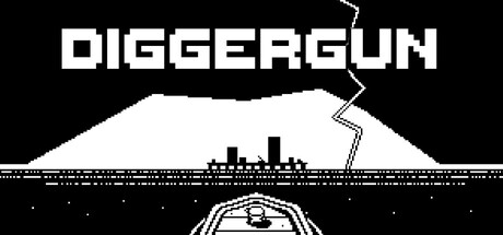
DIGGERGUN scored 70/100 on Steam Analyzer — Good for a Singleplayer capsule. Top priority fix: [uniqueness_polish] Add a distinctive visual element or character silhouette that signals the game's satirical corporate exploitation angle and differentiates it from generic mining platformers.

Capsule scores by dimension

  • Genre Clarity: 7/10 — Mining action platformer with indie retro style. The pixel art aesthetic and mining vehicle silhouette clearly communicate a resource extraction gameplay loop, while the stark black-and-white contrast suggests a retro indie platformer. At tiny size, the digger vehicle and industrial mountain setting remain visually distinct enough to signal action-adventure gameplay, though the corporate exploitation theme is not immediately apparent from visuals alone.
  • Title Readability: 8/10 — Bold geometric type, excellent contrast. DIGGERGUN uses a strong blocky sans-serif font in white with crisp black outlines positioned at the top against the dark background, maintaining legibility across all viewing sizes. Even at tiny thumbnail size, the geometric letterforms remain recognizable due to their weight and spacing, with minimal detail loss during scaling.
  • Contrast & Color: 8/10 — Clean monochrome with strong silhouettes. The stark white-on-black palette creates excellent value separation against Steam's #1b2838 background, with the digger vehicle and mountain forming clear, distinct silhouettes. The high contrast is maintained even at tiny size, and grayscale conversion shows no muddy mid-tones—pure value clarity throughout the composition.
  • Uniqueness & Polish: 6/10 — Clean retro pixel aesthetic, somewhat generic setup. The execution is polished with confident retro pixel art rendering and intentional minimalist design, but the mining vehicle plus mountain composition is a familiar indie game visual trope. While the craft is solid and the monochrome style is distinctive, the core concept lacks a memorable hook or unique visual storytelling that distinguishes it from other resource-extraction indies.
  • Brand Consistency: 6/10 — Consistent retro style, limited identity markers. The pixel art style and monochrome palette are internally cohesive and would likely carry through the store screenshots and in-game presentation based on the description. However, there are no iconic character designs, memorable motifs, or distinctive color schemes that would make this capsule instantly recognizable as DIGGERGUN versus other retro mining platformers.
  • Composition: 7/10 — Clear hierarchy with title and central vehicle focus. The title anchors the top safely within margins, the digger vehicle commands center focus with the mountain as supporting background, and the lightning bolt provides directional accent without clutter. At small and tiny sizes, the focal point remains clear, though the mountain's slight softness at edges could risk minor clipping depending on Steam's exact crop boundaries.

What works

  • Readable title at all sizes. DIGGERGUN's bold geometric sans-serif maintains perfect legibility from full header down to tiny thumbnail, with strong weight and outline protecting against scale collapse.
  • Excellent monochrome contrast. Pure white-on-black silhouettes create maximum visual pop against Steam's dark background and remain instantly clear even under quick scroll or at grayscale viewing.
  • Intentional minimalist design. Clean pixel art rendering with zero decorative clutter or noisy effects shows disciplined craft and communicates immediately what the game is about.

What hurts the capsule

  • Generic mining platformer visual. The digger vehicle plus mountain composition is a recognizable indie game cliché that offers no unique selling point or memorable visual hook beyond solid execution.
  • No brand identity markers. The capsule lacks distinctive character designs, symbolic motifs, or unique palette cues that would allow players to recognize DIGGERGUN in a lineup of similar retro indies.
  • Limited narrative communication. The corporate exploitation theme and oppressive tone mentioned in the description are not visually represented—the capsule reads as a neutral mining sim rather than a satirical statement game.

Priority fixes

  1. [uniqueness_polish] Add a distinctive visual element or character silhouette that signals the game's satirical corporate exploitation angle and differentiates it from generic mining platformers.
  2. [brand_consistency] Introduce a memorable color accent or iconic motif within the monochrome frame that creates an instantly recognizable brand identity.
  3. [genre_clarity] Consider subtle visual cues (corporate logos, oppressive architecture, or unsettling atmosphere) that communicate the game's thematic core alongside the mining mechanic.

Related guides

Steam app ID: 1968180 · Tags: Singleplayer, 2D Platformer, Atmospheric, Mining, Life Sim