Scoring genre clarity...

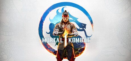
Mortal Kombat 1 capsule

Mortal Kombat 1

Discover a reborn Mortal Kombat™ Universe created by the Fire God Liu Kang. Mortal Kombat™ 1 ushers in a new era of the iconic franchise with a new fighting system, game modes, and fatalities!

$49.99Mostly Positive(367)
GoreFightingAction
NetherRealm Studios, QLOCSep 19, 2023

Mortal Kombat 1 scores 92/100 — better than 100% of Gore capsules (n=1,018).

Mostly Positive (367 reviews) · $49.99 · Released Sep 19, 2023 · By NetherRealm Studios

Quick text summary

Mortal Kombat 1 scored 92/100 on Steam Analyzer — Excellent for a Gore capsule. Top priority fix: [composition] No fixes required—composition is already excellent with strong hierarchy and safe margins.

Capsule scores by dimension

  • Genre Clarity: 9/10 — Fighting game identity unmistakable. The iconic Mortal Kombat dragon logo and character stance immediately signal a fighting game at all sizes. The protagonist's combat-ready pose, ornamental armor, and flame effects reinforce the action-fighting genre clearly. At TINY size, the silhouette and logo remain instantly recognizable as MK fighting game.
  • Title Readability: 9/10 — Bold title legible at all sizes. The MORTAL KOMBAT title uses strong white lettering with clean serif treatment, centered and clearly separated from the character. The split logo design with the vertical line between words enhances memorability and remains readable at SMALL and TINY sizes. Strategic placement on the lighter background area of the composition ensures no text obscuration.
  • Contrast & Color: 9/10 — Excellent value separation and pop. The character's warm earth tones (brown armor, gold accents) and cool blue dragon backdrop create strong complementary contrast against the dark Steam background. Bright fire effects and golden lighting provide clear silhouette separation in both color and grayscale tests. The layered cool-to-warm gradient ensures visual depth and prevents muddiness at any viewing size.
  • Uniqueness & Polish: 9/10 — Premium franchise execution striking. The composition showcases a distinctive Liu Kang character render with high production value—detailed armor, martial arts posture, and integrated fire effects communicate both the character identity and core gameplay hook. The circular dragon motif integration feels intentional and elevated compared to generic action game templates. Visual storytelling clearly conveys a supernatural martial arts fighting experience with narrative weight.
  • Brand Consistency: 10/10 — Iconic MK visual language perfected. The dragon symbol, blue-red color palette, and character-focused composition are quintessential Mortal Kombat brand markers that align with franchise identity across all 16 store screenshots. The supernatural fire aura and mystical aesthetic consistently reinforce the Fire God Liu Kang story arc. Every element—palette, typography, character pose, and symbolic motifs—feels authentically Mortal Kombat and immediately recognizable.
  • Composition: 9/10 — Balanced focal hierarchy and depth. The character occupies the strong center position with the dragon logo framing behind, creating clear primary and secondary focal points that guide the eye naturally. Background layers (sky, dragon silhouette) provide depth without competing for attention. The centered title placement below the character works effectively with the circular dragon composition, maintaining safe margins that survive Steam cropping at all sizes.

What works

  • Iconic brand symbols instantly recognizable. The Mortal Kombat dragon logo and character silhouette are franchise signatures that work powerfully at TINY size and create immediate genre/brand identification.
  • Strong color contrast and visual pop. Warm gold-orange character against cool blue dragon and dark Steam background creates excellent separation that maintains clarity in grayscale and quick scrolls.
  • Premium character render with story weight. Liu Kang's detailed armor, combat stance, and integrated fire effects communicate both character identity and the supernatural martial arts genre with high production value.
  • Title placement maximizes readability. White MORTAL KOMBAT text with clean serif treatment sits on lighter background area and remains legible at all viewing sizes without obscuration.

What hurts the capsule

  • Subtle repetition of common action templates. The centered character-in-circle composition, while executed excellently, follows a familiar layout seen in similar AAA action franchises like God of War and Warhammer 40K.
  • Limited opportunity for surprise element. The design prioritizes established brand recognition over a novel visual hook, which may blend into genre peer set despite strong execution.

Priority fixes

  1. [composition] No fixes required—composition is already excellent with strong hierarchy and safe margins.

Store copy priority fixes

  1. [feature_communication] Rewrite the Kameos section to explicitly state which game modes support the mechanic (e.g., 'Available in all PvP modes and Story Invasions') and provide a concrete gameplay example of how Kameos change a fight.
  2. [uniqueness] Add a sentence explaining the core mechanical innovation of the new fighting system—e.g., 'A revised combo system that [specific detail]' or 'Faster frame-data that emphasizes [playstyle]'—to differentiate from Tekken and Street Fighter.
  3. [audience_targeting] Insert a brief signal for fighting-game newcomers, such as 'Invasions mode offers a skill-building single-player path before competitive online play' to broaden appeal beyond veterans.

Related guides

Steam app ID: 1971870 · Tags: Gore, Fighting, Action, Multiplayer, 2D Fighter