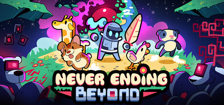
Never Ending Beyond scores 78/100 — better than 85% of Action Roguelike capsules (n=1,675).

Quick text summary

Never Ending Beyond scored 78/100 on Steam Analyzer — Good for a Action Roguelike capsule. Top priority fix: [genre_clarity] Increase visual prominence of the android threat by enlarging or repositioning one antagonist robot to share center stage with creatures, reinforcing the combat dynamic.

Capsule scores by dimension

  • Genre Clarity: 8/10 — Colorful action with creature companions. The capsule clearly communicates an action-adventure indie game through vibrant character silhouettes, multiple playable creatures in combat poses, and bright neon environments with hostile androids. At TINY size, the riot of color and distinct character shapes still read as a creature-collecting action game, though the android threat is less obvious. The visual language aligns well with the pet-collecting combat mechanic described.
  • Title Readability: 8/10 — Strong bold lettering, clear hierarchy. The title 'NEVER ENDING BEYOND' uses thick, uppercase sans-serif typography with sharp black outlines and bright yellow/cyan color blocking that stands out against the dark background. At SMALL size the text remains fully legible; at TINY size the outline may thin slightly but the chunky letterforms survive the compression. The two-line layout provides natural breathing room and avoids cluttered taglines.
  • Contrast & Color: 9/10 — Excellent value separation, vibrant palette. Neon magenta, cyan, yellow, and lime green characters and UI elements create strong silhouettes against the dark teal-to-purple gradient sky and deep navy background. The bright saturated hues pop dramatically on #1b2838, and the creatures have clear edge definition even at small scale. Grayscale squint test confirms strong value separation between characters and background.
  • Uniqueness & Polish: 7/10 — Polished indie aesthetic, distinctive energy. The capsule demonstrates intentional art direction with a consistent cartoon-retro style, custom character designs, and cohesive effects like glowing neon UI elements and stylized plant/tech hybrid environments. The visual hook of multiple colorful creatures in dynamic poses clearly signals the core mechanic, though the overall indie action-adventure look is fairly familiar within the current market of titles like Hades II and ANIMAL WELL. Polish is evident but not groundbreaking for its peer set.
  • Brand Consistency: 7/10 — Consistent cartoon style, clear identity. The capsule uses a distinctive retro-digital art style with rounded character forms, neon color accents, and a cohesive mix of organic and tech elements that should be recognizable across store pages and screenshots. The playful, colorful tone and creature-forward composition align with indie action expectations. Without reference to the 11 screenshots, internal cohesion feels strong but the style sits in a moderately crowded indie visual space.
  • Composition: 8/10 — Clear focal hierarchy, balanced layout. The four main creatures form a natural arc across the center with the largest character (tiger/cat) anchoring the left, creating a strong horizontal flow that reads immediately at SMALL and TINY sizes. The title bar sits below with good separation, and background elements (trees, androids, tech symbols) frame without competing for attention. Safe margins are respected and no critical elements risk Steam crop; the composition survives squinting with the creature group remaining the dominant focal point.

What works

  • Vibrant color pop against dark Steam background. Neon magenta, cyan, and yellow characters create instant visual separation and strong contrast that draws the eye in quick scroll.
  • Clear gameplay communication through visuals. Multiple distinctive creatures in dynamic poses immediately signal the pet-collecting combat mechanic without requiring text explanation.
  • Bold, readable title typography. Thick uppercase lettering with black outlines and bright color blocking remains legible from FULL down to TINY size.
  • Polished, cohesive art direction. Consistent cartoon-retro style with intentional effects and character design creates a premium indie feel.

What hurts the capsule

  • Android threat is visually subtle. The rogue androids mentioned in the description are small and placed at edges, making the combat conflict less immediately apparent than the creature focus.
  • Moderate originality within indie action space. While polished, the neon creature-collecting action aesthetic shares visual DNA with many recent successful indies like Hades II and ANIMAL WELL.
  • Dense background detail may distract. The scattered UI elements, trees, and tech symbols in the background add visual richness but create some competing texture that slightly reduces clarity at TINY size.

Priority fixes

  1. [genre_clarity] Increase visual prominence of the android threat by enlarging or repositioning one antagonist robot to share center stage with creatures, reinforcing the combat dynamic.
  2. [composition] Reduce background clutter by simplifying or subduing scattered UI squares and tech symbols so they fade behind the creature arc without losing polish.
  3. [uniqueness_polish] Add a signature visual motif or UI element that could become a recognizable brand identifier across future marketing and store presence.

Store copy priority fixes

  1. [hook_strength] Rewrite the opening line to 'Pet adorable creatures, build unstoppable weapon combos, and survive waves of rogue androids—each run, the story deepens' to add emotional resonance and narrative intrigue to the mechanic.
  2. [uniqueness] Add a 1-2 sentence comparison: explain specifically how pet combinations differ from standard roguelike builds (e.g., 'Each animal carries a unique weapon AND passive, forcing you to think about synergies, not just raw power') to justify the creature collector identity.
  3. [audience_targeting] Clarify tone and difficulty in the short description or opening: add a signal like 'casually challenging' or 'roguelike for everyone' to help players understand if this is hardcore or approachable.
  4. [feature_communication] Replace 'A story that unravels the more you play' with a concrete story hook (e.g., 'Discover why androids shattered the Beyond and what the CareTakerUnit's true purpose is') to give narrative weight.

Related guides

Steam app ID: 1973990 · Tags: Action Roguelike, Bullet Hell, Bullet Heaven, Creature Collector, Roguelite