Scoring genre clarity...
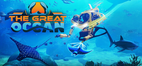
Dive into the earth’s oceans. Explore in your high-tech submarine fascinating spots like the Galapagos or the Deep Sea. Use your tools to solve quests when you free jailed whales, or explore sunken WW2 battleships. Swim with majestic whales, sharks and sea turtles.
$9.992 user reviews
Immersive SimVREducation
Actrio StudioFeb 11, 2026