Scoring genre clarity...
Scoring genre clarity...
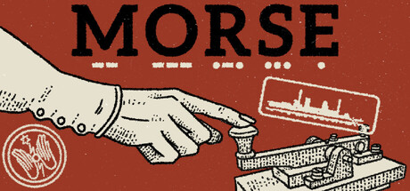
MORSE scores 73/100 — better than 56% of Strategy capsules (n=5,436).
Very Positive (120 reviews) · $13.99 · Released Nov 11, 2025 · By ALJO Games
MORSE scored 73/100 on Steam Analyzer — Good for a Strategy capsule. Top priority fix: [genre_clarity] Add a subtle gameplay UI element (e.g., a timeline, grid, or targeting reticle) to signal the strategic/tactical systems at play and clarify the real-time vs turn-based nature.
Steam app ID: 1976860 · Tags: Strategy, Typing, Action, Wargame, Word Game