Scoring genre clarity...
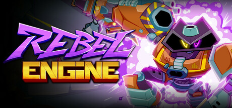
Rebel Engine mixes the stylish combat of a Hack n' Slash with the speed and gunplay of a '90s FPS in a unique, fast-paced action game. Combine gunshots with melee attacks to create devastating combos! Lead the rebellion against the Concrete megacorporation and liberate all of robot-kind!
$19.99Positive(27)
ActionFPSHack and Slash
Seven Leaf CloverNov 6, 2025